Ionic Range Slider with draggable tick icons on the scaling bar; In this Ionic 5 tutorial, you will learn how to add a Range slider using the build-in UI components in the Ionic Angular application.
A range slider component consists of draggable markers, which can be dragged on a defined bar to select a value. The range slider bar can have single or two markers to select a value from the minimum or maximum scale.
This interactive UI component is mainly used to allow a user to select a specif value for example price, temperature or any integer or string value. Users can simply drag the knobs provided on the bar to choose a value.
In Ionic, we can easily import the ion-range component to create a range slider. Moreover, there is a number of customizable configuration properties available.
Let’s go ahead and start the implementation of the Range slider with examples.
How to Add Range Slider bar in an Ionic application?
Step 1 – Create Ionic Application
Step 2 – Adding Ionic Range Slider
Step 3 – Customization of Ionic Range Slider
Step 1 – Create Ionic Application
To begin with, make sure you have installed the latest version of ionic CLI on your system.
npm install -g @ionic/cliCreate a new ionic application, execute the following:
ionic start ionic-range-slider-app
#? Framework: Angular
#? Starter template: blank
Move inside the application directory:
cd ionic-range-slider-appStep 2 – Adding Ionic Range Slider
Range Slider is created by adding the <ion-range/> component in the template HTML. Open the home.page.html file of the default component then update it as shown below:
<ion-range></ion-range>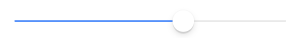
It will create the simplest range slider. Let’s have a look at various configuration properties and events. Also, the CSS properties are available to override the existing UI style in the next section.
Step 3 – Customization of Ionic Range Slider
Let’s have a look at various properties and output events available on ion-range component.
Range Labels
The ion-label component can be added to add custom start and end label string as shown below:
<ion-range min="0" max="1000" color="secondary">
  <ion-label slot="start">Min(0)</ion-label>
  <ion-label slot="end">Max(1000)</ion-label>
</ion-range>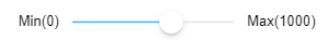
Icons instead of Labels
Instead of labels, we can also use icons as shown below. You can check the icons here.
<ion-range min="0" max="1000" step="2">
  <ion-icon size="small" slot="start" name="volume-mute-outline"></ion-icon>
  <ion-icon slot="end" name="volume-high-outline"></ion-icon>
</ion-range>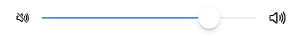
Input Properties
- color: The color to use from your application’s color palette. Default options are: “primary”, “secondary”,
"tertiary","success","warning","danger","light","medium", and"dark". - debounce: How long, in milliseconds, to wait to trigger the ionChange event after each change in the range value.
- disabled: If true, the user cannot interact with the range.
- dualKnobs: Show two knobs.
- max: Maximum integer value of the range.
- min: Minimum integer value of the range.
- mode: The mode determines which platform styles to use.
- name: The name of the control, which is submitted with the form data.
- pin: If true, a pin with integer value is shown when the knob is pressed.
- snaps: If true, the knob snaps to tick marks evenly spaced based on the step property value.
- step: Specifies the value granularity.
- ticks: If true, tick marks are displayed based on the step value. Only applies when snaps is true.
- value: the value of the range.
<ion-range min="0" max="1000" step="2" color="dark" pin="true" snaps="true" step="100">
  <ion-icon size="small" slot="start" name="volume-mute-outline"></ion-icon>
  <ion-icon slot="end" name="volume-high-outline"></ion-icon>
</ion-range>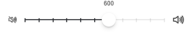
Output Events
To get the selected value out of ion-range, we can deploy the following output events:
- ionBlur: Emitted when the range loses focus.
- ionChange: Emitted when the value property has changed.
- ionFocus: Emitted when the range has focus.
<ion-range
  min="0"
  max="1000"
  step="2"
  color="dark"
  pin="true"
  snaps="true"
  step="100"
  (ionBlur)="onBlur($event)"
  (ionChange)="onChange($event)"
  (ionFocus)="onFocus($event)"
>
  <ion-icon
    size="small"
    slot="start"
    name="volume-mute-outline"
  ></ion-icon>
  <ion-icon slot="end" name="volume-high-outline"></ion-icon>
</ion-range>
In the component class, update methods as shown below:
export class HomePage {

  constructor() {}

  onBlur(event){
    console.log(event.target.value);
  }
  onChange(event){
    console.log(event.target.value);
  }
  onFocus(event){
    console.log(event.target.value);
  }

}
Customise UI CSS Style of IonRange Component
Now, we will discuss how to customise the CSS style of the IonRange component using the following exposed variables:
- –bar-background: Background of the range bar
- –bar-background-active: Background of the active range bar
- –bar-border-radius: Border radius of the range bar
- –bar-height: Height of the range bar
- –height: Height of the range
- –knob-background: Background of the range knob
- –knob-border-radius: Border radius of the range knob
- –knob-box-shadow: Box shadow of the range knob
- –knob-size: Size of the range knob
- –pin-background: Background of the range pin
- –pin-color: Color of the range pin
To add your custom style, add a class "custom-ion-range-slider" on the ion-range component as shown:
<ion-range class="custom-ion-range-slider"
  min="0"
  max="1000"
  step="2"
  color="dark"
  pin="true"
  snaps="true"
  step="100"
  (ionBlur)="onBlur($event)"
  (ionChange)="onChange($event)"
  (ionFocus)="onFocus($event)"
>
  <ion-icon
    size="small"
    slot="start"
    name="volume-mute-outline"
  ></ion-icon>
  <ion-icon slot="end" name="volume-high-outline"></ion-icon>
</ion-range>
Now, open the home.page.scss file and add the following style:
.custom-ion-range-slider{
  --bar-background:#ccc;
  --bar-background-active:blue;
  --bar-border-radius:50;
  --bar-height:10px;
  --height:30px;
  --knob-background:red;
  --knob-border-radius:30;
  --knob-size:20px;
}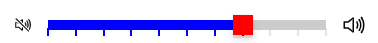
Conclusion
We have completed the tutorial on how to add the Ion Range component in the Ionic 5 Angular application. We discussed various Input and Output properties with examples, Moreover, to customise the component we discussed how to override the UI style by adding the exposed CSS property variables.