In this Ionic 5/4 tutorial, we’ll discuss how to implement toasts UI components in Ionic Angular application and customize it using CSS styles.
In most of the applications these days whether they are mobile or web-based show information notifications in the form of toasts. Toasts are used in application to notify users are operational feedbacks like an error message, success alert, or update information notification.
In the Ionic application as well we have beautiful Toast UI components that can be used without any plugin. In this post, we will add Ionic Toasts in few steps and also discuss some of the basic methods like Creating, Positioning, and Dismiss toasts.
We’ll discuss how to easily create an Ionic toast example and customize its behavior using properties available and also discuss how to customize it using CSS custom class.
Install or Update latest Ionic CLI
You can install or update the latest version of Ionic CLI package by executing below npm command
$ npm install -g @ionic/cliCreate an Ionic Application
Run the following command to create a new Ionic Angular application with a blank template
$ ionic start ionic-toasts-app blank --type=angularMove inside the application folder
$ cd ionic-toasts-app
Adding Toast in Ionic Application
In the Ionic application, we need to import the ToastController class inside out component to use its create() method to show a toast message.
In the home.page.ts file make following changes
import { Component } from '@angular/core';
import { ToastController } from '@ionic/angular';

@Component({
  selector: 'app-home',
  templateUrl: 'home.page.html',
  styleUrls: ['home.page.scss'],
})
export class HomePage {

  constructor(public toastController: ToastController) { }

  ...
  ...
}
How to create a Toast?
The ToastController class provides the create() method which returns a promise callback. Inside the then() callback we call present() method to show a toast message.
showToast() {
this.toastController.create({
header: 'Hurrayy!',
message: 'Added to Cart!',
position: 'middle',
cssClass: 'my-custom-class',
buttons: [
{
side: 'end',
icon: 'cart',
text: 'View Cart',
handler: () => {
console.log('Cart Button Clicked');
}
}, {
side: 'end',
text: 'Close',
role: 'cancel',
handler: () => {
console.log('Close clicked');
}
}
]
}).then((obj) => {
obj.present();
});
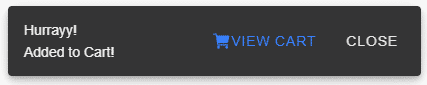
}Update template with a button
<ion-button color="primary" (click)="showToast()">Add to Cart</ion-button>It will look like this
Properties of create() method
In the method above we have used some options available using which we can modify toast behavior, look and feel.
animated: Iftrue, the toast will animate.buttons: An array of buttons for the toast.color: The color to use from your application’s color palette. Default options are: “primary“, “secondary“, “tertiary“, “success“, “warning“, “danger“, “light“, “medium“, and “dark“. For more information on colors, see theming.cssClass: Additional classes to apply for custom CSS. If multiple classes are provided they should be separated by spaces.duration: How many milliseconds to wait before hiding the toast. By default, it will show until dismiss() is called.enterAnimation: Animation to use when the toast is presented.header: Header to be shown in the toast.keyboardClose: Iftrue, the keyboard will be automatically dismissed when the overlay is presented.leaveAnimation: Animation to use when the toast is dismissed.message: Message to be shown in the toast.mode: The mode determines which platform styles to use.”ios” | “md“position: The position of the toast on the screen.”bottom” | “middle” | “top” Default ‘bottom‘translucent: Iftrue, the toast will be translucent. It only applies when the mode is “ios” and the device supports backdrop-filter.
You can check more options available here
How to show toast only once and not stack?
In common behavior, Ionic toasts are stacked on the previous one if we call the present method again and again.
The solution to prevent toast stacking
To prevent this and hide previous toast before next comes just modify the above code. Just call the showToastOnce() method after dismissing the any previous open toast.
showOnceToast() {
    this.toastController.dismiss().then((obj) => {
    }).catch(() => {
    }).finally(() => {
      this.showToast();
    });
  }
Here I am calling showToast() method on final callback which will be called in both cases if there is any open toast or not. Let me know if you have a better workaround for now 😛
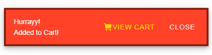
How to customize UI toast styling using custom class and CSS custom properties?
We can easily modify Toast by adding a custom class in option property
cssClass: “my-custom-class”
Add below CSS code in global.scss file as toast container is appended outside component page.
.my-custom-class{
    --background:#FF4127;
    --border-color:#852114;
    --border-radius:1px;
    --border-style:solid;
    --border-width:4px;
    --button-color:#FFDD00;
    --color:#fff;
}
you can check these CSS custom properties available here
Conclusion
We discussed how to create a toast message in the Ionic 5 application and customize the UI style by using the cssClass property of create() method.
I hope you liked the tutorial, do share your feedback in the comment section below