In this Angular Material tutorial, we’ll learn how to get Date and Time values from users using the Date and Time picker in Angular 12 application.
Sometimes in an application, we may have a requirement to add controls so that a user can easily select a particular Date or Date range and then Time with Hours, Minutes in general to schedule an appointment or set a Delivery Date or Time Slot or any other similar value.
Most of the Angular projects prefer the Material UI library due to its compatibility and ease of usage. We know by default the Material UI library only provides the Datepicker component using which we can get Date and Date range with custom date formats as well.
But Material doesn’t provide any component, that can be simply integrated to fetch Time values in a similar manner.
We’re going to discuss how to easily add a small npm package to add Datepickers with Integrated Timepicker for user selections.
How to Add Datepicker with Timepicker in Angular Material?
Create a New Angular Application
Run the following ng command to create a new Angular project
$ ng new angular-material-datetime-picker
# ? Would you like to add Angular routing? No
# ? Which stylesheet format would you like to use? SCSS
Enter the project directory
$ cd angular-material-datetime-pickerRun the application
$ ng serve --open
Install Material Package
After creating the Angular project, install the Material UI library by hitting the following ng command
$ ng add @angular/material
? Choose a prebuilt theme name, or "custom" for a custom theme: Indigo/Pink
? Set up global Angular Material typography styles? No
? Set up browser animations for Angular Material? Yes
Install Material Datepicker & Timepicker Package
Now install another package to add the Timepicker feature inside the default Datepicker provided by the Material UI component.
Run the following command to install the @angular-material-components/datetime-picker in the Angular project
$ npm install @angular-material-components/datetime-picker
Update App Module
For using the Datepicker with Time selection, we need to import Material’s default MatDatepickerModule and MatInputModule modules.
Other than these also import the FormsModule and ReactiveFormsModule to use the Date & Time picker in forms.
After that, we’ll import the NgxMatDatetimePickerModule,NgxMatTimepickerModule and NgxMatNativeDateModule to upgrade the default Datepicker with Time selection.
Finally, the app.module.ts file will look like this:
// app.module.ts
import { BrowserModule } from '@angular/platform-browser';
import { NgModule } from '@angular/core';

import { AppComponent } from './app.component';

import { BrowserAnimationsModule } from '@angular/platform-browser/animations';

import { FormsModule, ReactiveFormsModule } from '@angular/forms';

import { MatDatepickerModule } from '@angular/material/datepicker';
import { MatInputModule } from '@angular/material/input';

import {
  NgxMatDatetimePickerModule,
  NgxMatNativeDateModule,
  NgxMatTimepickerModule
} from '@angular-material-components/datetime-picker';

@NgModule({
  declarations: [
    AppComponent
  ],
  imports: [
    BrowserModule,
    BrowserAnimationsModule,

    FormsModule,
    ReactiveFormsModule,

    MatDatepickerModule,
    MatInputModule,

    NgxMatDatetimePickerModule,
    NgxMatTimepickerModule,
    NgxMatNativeDateModule
  ],
  providers: [],
  bootstrap: [AppComponent]
})
export class AppModule { }
Using Datepicker with Time Selection
The @angular-material-components/datetime-picker package provides components to add Datepicker with Time selection capabilities.
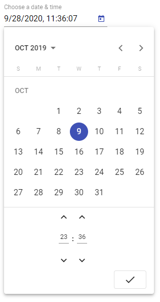
To create a Date and Time picker in Material, add the ngx-mat-datetime-picker component instead of <span class="hljs-tag"><span class="hljs-name">mat-datepicker</span></span>as shown below:
<mat-form-field>
    <input matInput [ngxMatDatetimePicker]="picker" placeholder="Choose a date & time" [(ngModel)]="myDatePicker">

    <mat-datepicker-toggle matSuffix [for]="picker"></mat-datepicker-toggle>

    <ngx-mat-datetime-picker #picker></ngx-mat-datetime-picker>
</mat-form-field>
This will create a default Date and Time picker component with 24 Hours as shown below:
Only Show Timepicker
To show only the Time selection, we add ngx-mat-timepicker component
<ngx-mat-timepicker [(ngModel)]="myTimePicker">
  </ngx-mat-timepicker>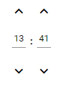
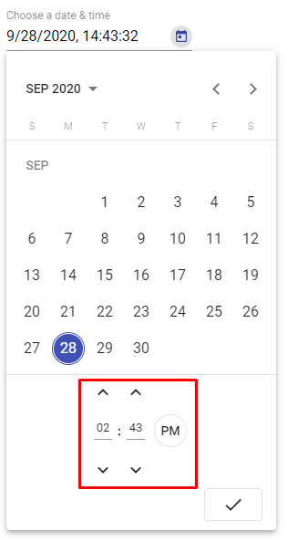
Change Time Format 24 Hrs to 12 Hrs with AM/ PM Selection
The enableMeridian property can set to true to display AM/ PM selection to make time selection more human friendly.
<ngx-mat-datetime-picker #picker [enableMeridian]="true"></ngx-mat-datetime-picker>
Date & Time Range Selection
The [min] and [max] properties can be used for validation in Date & Time selection. Here we have From and To Date selection where To date can’t be less than From.
<mat-form-field>
    <input matInput [ngxMatDatetimePicker]="pickerFrom" placeholder="From date & time" [(ngModel)]="myDatePickerFrom">

    <mat-datepicker-toggle matSuffix [for]="pickerFrom"></mat-datepicker-toggle>

    <ngx-mat-datetime-picker #pickerFrom [enableMeridian]="true"></ngx-mat-datetime-picker>
</mat-form-field>

<mat-form-field>
    <input matInput [ngxMatDatetimePicker]="pickerTo" placeholder="To date & time" [(ngModel)]="myDatePickerTo"
      [min]="myDatePickerFrom">

    <mat-datepicker-toggle matSuffix [for]="pickerTo"></mat-datepicker-toggle>

    <ngx-mat-datetime-picker #pickerTo [enableMeridian]="true"></ngx-mat-datetime-picker>
</mat-form-field>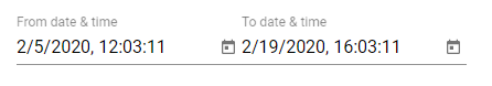
Change Date & Time Format using Moment Adapter
We can change date formats by using Moment library adapters due to more supported features and flexibility. You can check the detailed tutorial here.
To modify the Date and Time formats, follow these steps to incorporate the Moment date adapter.
Step 1: Install the Moment Adapter package
Run the following npm command to install the adapter package
$ npm install --save @angular-material-components/moment-adapterStep 2: Update the App Module
Add custom date format then update the providers array as shown:
// app.module.ts
import { BrowserModule } from '@angular/platform-browser';
import { NgModule } from '@angular/core';

import { AppComponent } from './app.component';

import { BrowserAnimationsModule } from '@angular/platform-browser/animations';

import { FormsModule, ReactiveFormsModule } from '@angular/forms';

import { MatDatepickerModule } from '@angular/material/datepicker';
import { MatInputModule } from '@angular/material/input';

import {
  NgxMatDateFormats,
  NgxMatDatetimePickerModule,
  NgxMatNativeDateModule,
  NgxMatTimepickerModule,
  NGX_MAT_DATE_FORMATS
} from '@angular-material-components/datetime-picker';

const CUSTOM_DATE_FORMATS: NgxMatDateFormats = {
  parse: {
    dateInput: "l, LTS"
  },
  display: {
    dateInput: "l, LTS",
    monthYearLabel: "MMM YYYY",
    dateA11yLabel: "LL",
    monthYearA11yLabel: "MMMM YYYY"
  }
};

@NgModule({
  declarations: [
    AppComponent
  ],
  imports: [
    BrowserModule,
    BrowserAnimationsModule,

    FormsModule,
    ReactiveFormsModule,

    MatDatepickerModule,
    MatInputModule,

    NgxMatDatetimePickerModule,
    NgxMatTimepickerModule,
    NgxMatNativeDateModule
  ],
  providers: [
    { provide: NGX_MAT_DATE_FORMATS, useValue: CUSTOM_DATE_FORMATS }
  ],
  bootstrap: [AppComponent]
})
export class AppModule { }
Other Useful Properties
The following are some other useful properties to customize date picker behavior:
disabled: If true, the picker is readonly and can’t be modifiedshowSpinners: If true, the spinners above and below input are visibleshowSeconds: If true, it is not possible to select secondsdisableMinute: If true, the minute is readonlydefaultTime: An array [hour, minute, second] for default time when the date is not yet definedstepHour: The number of hours to add/substract when clicking hour spinnersstepMinute: The number of minutes to add/substract when clicking minute spinnersstepSecond: The number of seconds to add/substract when clicking second spinnerscolor: Color palette to use on the datepicker’s calendarenableMeridian: Whether to display 12H or 24H modehideTime: If true, the time is hiddentouchUi: Whether the calendar UI is in touch mode. In touch mode, the calendar opens in a dialog rather than a popup and elements have more padding to allow for bigger touch targets.
Dental Implant Istanbul Hollywood Smile Istanbul
San Serif Fonts Modern Sans Font
Conclusion
If we already have Material UI in the Angular project, then @angular-material-components/datetime-pickercan be easily integrated to add Time selection capabilities to the default Datepicker.