The Angular Material datepicker component provides a flexible and customizable date selection experience for your Angular applications. With Angular Material’s datepicker, you can enable date selection in text input fields, display calendar views in popups or inline, and customize the date format and appearance.
Some key benefits of using Angular Material’s datepicker include:
- Easy integration into Angular forms and validation
- Localization support for various languages and date formats
- Customizable calendar views, colors, date ranges, etc.
- Accessible and mobile-friendly experience
- Integration with Material Design styles and components
The datepicker is useful for any application where users need to select dates, such as booking systems, calendars, schedulers, and date pickers.
Getting Started
To add the Angular Material date picker to your project, first install the @angular/material package:
ng add @angular/materialThen import the MatDatepickerModule in your app module:
import { NgModule } from '@angular/core';
import { BrowserModule } from '@angular/platform-browser';
import { AppComponent } from './app.component';
import { BrowserAnimationsModule } from '@angular/platform-browser/animations';
import { MatDatepickerModule } from '@angular/material/datepicker';
import { MatFormFieldModule } from '@angular/material/form-field';
import { MatNativeDateModule } from '@angular/material/core';
import { MatInputModule } from '@angular/material/input';

@NgModule({
  declarations: [AppComponent],
  imports: [
    BrowserModule,
    BrowserAnimationsModule,

    MatNativeDateModule,
    MatInputModule,
    MatDatepickerModule,
    MatFormFieldModule,
  ],
  providers: [],
  bootstrap: [AppComponent],
})
export class AppModule {}
Other than MatDatepickerModule, we have also added the MatNativeDateModule, MatInputModule and MatFormFieldModule for creating a datepicker component with Material Input inside the Mat Form Field component.
You can now add a datepicker input to your component’s template:
<mat-form-field>
  <input matInput [matDatepicker]="picker" placeholder="Choose a date">
  <mat-datepicker-toggle matSuffix [for]="picker"></mat-datepicker-toggle>
  <mat-datepicker #picker></mat-datepicker>
</mat-form-field>
This will display a text input with a calendar icon that pops up a datepicker when clicked.
Custom Toggle Icon
To toggle Calander popup, mat-datepicker-toggle is used to show/hide calendar which can have matDatepickerToggleIcon as a child to show custom icon.
    <input matInput [matDatepicker]="myicon" placeholder="Custom Icon Datepicker">
    <mat-datepicker-toggle matSuffix [for]="myicon">
      <mat-icon matDatepickerToggleIcon>settings</mat-icon>
    </mat-datepicker-toggle>
    <mat-datepicker #myicon></mat-datepicker>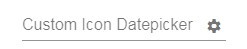
Note: To use mat-icon, add MatIconModule in app.module.ts file’s imports array and also include following material icons google fonts in the index.html. Check more material icons here
Setting a Start Date
By default, the datepicker starts with the current date selected. You can use the startAt property to set a different start date:
<mat-datepicker startAt="2010-01-01">The startAt property also allows you to set a minimum selectable date for the datepicker.
Changing the Calendar View
By default, the datepicker displays a month view calendar. You can change the start view using the startView property:
<!-- Shows a year view by default -->
<mat-datepicker startView="year">

<!-- Allows picking a month first -->
<mat-datepicker startView="multi-year">
startView=”year”
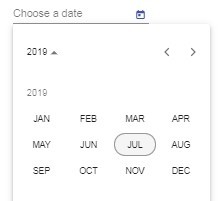
startView=”multi-year”

The startView property also allows you to set a multi-year initial view.
Applying Date Validation
You can apply validation rules to the datepicker input to restrict the selectable date range.
Using Min & Max Dates
Using min and max properties of Input field we can ser range of dates to make the selection available. A user cannot move before minand move after a max date.
<input matInput [min]="minDate" [max]="maxDate" [matDatepicker]="picker" placeholder="Choose a date"> minDate = new Date(1985, 4, 12);
maxDate = new Date(1985, 4, 22);
<input [min]="minDate" [max]="maxDate">This will disable dates outside the range in the calendar.
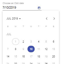
Disable Somedays from Angular Material
You can also use the matDatepickerFilter property to apply custom validation logic. It accepts a function that returns true or false for a date in the calendar popup. If it returns false for a date it will be shown a disabled for selection.
The advantage of using Filter over Min, Max is that the user can move over a period of dates even if disabled which is unlike behavior for previous validation.
<input matInput [matDatepicker]="picker" [matDatepickerFilter]="onlyOdds" placeholder="Choose an Odd date"> onlyOdds = (d: Date): boolean => {
const date = d.getDate();
// Even dates are disabled.
return date % 2 == 0;
}
Handling Date Selection
The dateChange and dateInput events can be used to respond to user selection:
<input (dateChange)="onDateChange($event)" (dateInput)="onDateInput($event)">onDateChange(e) {
// User picked a date from calendar
console.log(e.value);
}
onDateInput(e) {
// User typed date into input
console.log(e.value);
}Note that dateChange will fire even if the input value doesn’t change.
ReadOnly or Disabled date picker
disabled property can be added to all or any of the three <input>, <mat-datepicker-toggle> or <mat-datepicker>
To make it read-only or disabled just add it to all of them:
<mat-form-field>
  <input matInput [matDatepicker]="picker" placeholder="Choose a date" [disabled]="true">
  <mat-datepicker-toggle matSuffix [for]="picker" [disabled]="true"></mat-datepicker-toggle>
  <mat-datepicker #picker></mat-datepicker>
</mat-form-field>
Localizing the Datepicker
You can localize the datepicker to different languages and date formats using the DateAdapter and MAT_DATE_LOCALE providers.
First, update the App Module to override the default value of the locale using MAT_DATE_LOCALE. It receives the default value from @angular/core via LOCALE_ID.
import { MAT_DATE_LOCALE, MatNativeDateModule } from '@angular/material/core';
...

@NgModule({
  declarations: [AppComponent],
  imports: [
     ...
  ],
  providers: [{ provide: MAT_DATE_LOCALE, useValue: 'fr-FR' }],
  ...
})
export class AppModule {}
Now, open the App Component class, import the DateAdapter and instantiate inside the constructor:
import { Component } from '@angular/core';
import { DateAdapter } from '@angular/material/core';

@Component({
  selector: 'app-root',
  templateUrl: './app.component.html',
  styleUrls: ['./app.component.css'],
})
export class AppComponent {
  constructor(private dateAdapter: DateAdapter<any>) {
  }

  changeLocale(locale: any){
    this.dateAdapter.setLocale(locale);
  };
}
Here we also have the changeLocale method to update the local at runtime. Add the even handler on the template as shown below:
<div class="wrapper">
  <mat-form-field>
    <input matInput [matDatepicker]="picker" placeholder="Choose a date">
    <mat-datepicker-toggle matSuffix [for]="picker"></mat-datepicker-toggle>
    <mat-datepicker #picker></mat-datepicker>
  </mat-form-field>

    Change Datepicker Locale
    <button type="button" (click)="changeLocale('en-US')">English</button>
    <button type="button" (click)="changeLocale('fr-FR')">French</button>
</div>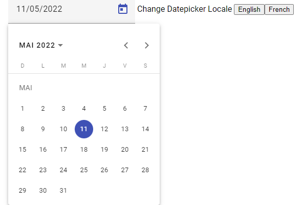
This is how we can add the i18n support to the date picker and handle localization of the material date picker.