In this React 16+ tutorial, we’ll learn How to implement Expandable and Collapsable components called Accordions in ReactJs application using React Bootstrap package.
What is an Accordion Component?
An Accordion component consists of various container elements with a title each container can be expanded or collapsed by clicking on the title. It is used to keep multiple data blocks at the same place on the page.
This type of structure consists of a special quality or feature because of which it is compared to a musical instrument called Accordion, only one container can be opened at once. If a user tries to open any other container the previous will be closed.
The React Bootstrap provides a wide variety of ready to use Bootstrap UI components which are exclusively converted and build for React applications.
Let’s go ahead and implement the Accordion component step by step
Create a React Application
First, we’ll create a new React application using npx create-react-app command
$ npx create-react-app react-bootstrap-accordion-appMove inside the react app
$ cd react-bootstrap-accordion-appRun application
$ npm start
Install React Bootstrap Package
After creating the react application, now we’ll install <strong>react-bootstrap</strong> and bootstrap packages by running below command
$ npm install react-bootstrap bootstrap
Adding Bootstrap Accordion in ReactJs App
The Bootstrap Accordion is created by adding the Accordion component. Which further provides the Accordion.Toggle and Accordion.Collapse components for title and body or each panel.
Also, import the bootstrap.min.css file to add style.
By default, React Bootstrap uses Card component to provide card like UI to the Accordion.
// App.js
import React from 'react';
import './App.css';
import { Accordion, Card, Button } from 'react-bootstrap'
import 'bootstrap/dist/css/bootstrap.min.css';
function App() {
return (
<div className="App">
<Accordion defaultActiveKey="0">
<Card>
<Card.Header>
<Accordion.Toggle as={Button} variant="link" eventKey="0">
Panel 1
</Accordion.Toggle>
</Card.Header>
<Accordion.Collapse eventKey="0">
<Card.Body>Body content for panel 1</Card.Body>
</Accordion.Collapse>
</Card>
<Card>
<Card.Header>
<Accordion.Toggle as={Button} variant="link" eventKey="1">
Panel 2
</Accordion.Toggle>
</Card.Header>
<Accordion.Collapse eventKey="1">
<Card.Body>Body content for panel 2</Card.Body>
</Accordion.Collapse>
</Card>
</Accordion>
</div>
);
}
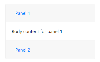
export default App;Now run React app by hitting $ npm start. It will look like this
Default Open a specific Panel in Accordion
To open an Accordion panel by default we set the defaultActiveKey property on the <Accordion />. If you don’t want any of the panels to open on load, just set it to null or simply remove the property.
Handle Event Listener on Accordion Click
The onClick event handler can be added on <Accordion.Toggle/>.
function App() {

  function handleOnClick(event) {
    console.log('onClick', event);
  };


  return (
    <div className="App">

      <Accordion defaultActiveKey="1">

        <div className="panel-wrap">
          <div className="panel-header">
            <Accordion.Toggle onClick={handleOnClick} className="panel-toggle" variant="link" eventKey="0">
              Panel 1
            </Accordion.Toggle>
          </div>

          <Accordion.Collapse eventKey="0">
            <div className="panel-body">Body content for panel 1</div>
          </Accordion.Collapse>
        </div>

        <div className="panel-wrap">
          <div className="panel-header">
            <Accordion.Toggle onClick={handleOnClick} className="panel-toggle" variant="link" eventKey="1">
              Panel 2
            </Accordion.Toggle>
          </div>

          <Accordion.Collapse eventKey="1">
            <div className="panel-body">Body content for panel 2</div>
          </Accordion.Collapse>
        </div>

      </Accordion>

    </div>
  );
}
Customize Style of React Bootstrap Accordion
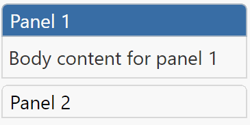
Now we will remove the Card component completely and implement our own style and added few classes with prefix panel-*. So it will look like this
// App.js
import React, { useState } from 'react';
import './App.css';

import { Accordion } from 'react-bootstrap'
import 'bootstrap/dist/css/bootstrap.min.css';

function App() {

  const [activeId, setActiveId] = useState('0');

  function toggleActive(id) {
    if (activeId === id) {
      setActiveId(null);
    } else {
      setActiveId(id);
    }
  }

  return (
    <div className="App">

      <Accordion defaultActiveKey={activeId}>

        <div className={activeId === '0' ? 'panel-wrap active-panel' : 'panel-wrap'}>
          <div className="panel-header">
            <Accordion.Toggle onClick={() => toggleActive('0')} className="panel-toggle" variant="link" eventKey="0">
              Panel 1
            </Accordion.Toggle>
          </div>

          <Accordion.Collapse eventKey="0">
            <div className="panel-body">Body content for panel 1</div>
          </Accordion.Collapse>
        </div>

        <div className={activeId === '1' ? 'panel-wrap active-panel' : 'panel-wrap'}>
          <div className="panel-header">
            <Accordion.Toggle onClick={() => toggleActive('1')} className="panel-toggle" variant="link" eventKey="1">
              Panel 2
            </Accordion.Toggle>
          </div>

          <Accordion.Collapse eventKey="1">
            <div className="panel-body">Body content for panel 2</div>
          </Accordion.Collapse>
        </div>

      </Accordion>

    </div>
  );
}

export default App;
In the browser with Card and Button components, it will be like this

Let’s add our own style to class added in the App.css
.panel-wrap {
  margin-bottom: 5px;
}

.panel-wrap.active-panel .panel-header {
  background: #396ea5;
}
.panel-wrap.active-panel .panel-header button {
  color: #ffffff;
}

.panel-header {
  border: 1px solid #cccc;
  font-weight: normal;
  border-radius: 5px 5px 0px 0px;
}

.panel-header button {
  border: none;
  background: transparent;
}
.panel-header button:focus {
  outline: 0px auto -webkit-focus-ring-color;
}

.panel-body {
  border: 1px solid #dddddd;
  background: #efefef;
  color: #333333;
  padding: 5px;
  border-top: none;
}
We have used state inside the function App component using the useState() and setting the value of activeId to '0'
The onClick event handler is setting the activeId to panel id defined in the eventKey property by calling the toggleActive function
Here we are adding the active-panel class on opened Accordion panel.
Conclusion
That’s it we discussed implement the Bootstrap Accordion component in the ReactJs application. Also how to customize the style with custom classes added instead of Card component.
Also used onClick event listeners to apply an active style to panels by adding and managing function state.
Hope you enjoyed this tutorial, feel free to share your thoughts …
Stay Safe!