In this React 16+ tutorial, we’ll learn how to implement Datepicker & Timepicker in React application with all required validation setting min and max date with days filter, for example, to disable weekends i.e Saturdays and Sundays using react-datepicker package.
Many of today’s applications add Datepickers in the forms or reporting sections to get input from users. So the layout of Datepickers should have easy navigation and good UI to take the least time to select a date.
In the ReactJs application, we have few on the top used Datepicker packages available which provide ease for developers as well as users to play with Calendar dates.
The package we are going to install is react-datepicker, it provides a good number of configurations that can be used to validate and customize date selection criteria for many scenarios.
Later we’ll also create a Datepicker component so that it can be used in any other parent component and share events and other properties using state and props.
Let’s start with the implementation…
Create a React Application
First, we’ll create a new React application using npx create-react-app command
$ npx create-react-app react-datepicker-tutorial-appMove inside the react app
$ cd react-datepicker-tutorial-appRun application
$ npm start
Install React Datepicker Package
After creating the react application, now we’ll install the react-datepicker package by running below command
$ npm install react-datepicker --save
Creating a React Datepicker Component
To keep the code DRY (don’t repeat yourself), create a separate new component MyDatepickerComponents under components folder at this path ~src/components/mydatepicker.component.js
For creating a React date picker, import the DatePicker class and also import the CSS style file provided by the react-datepicker package.
After that just add the <DatePicker /> component with properties and event handlers as shown below:
// ~src/components/mydatepicker.component.js
import React, { Component } from "react";

import DatePicker from "react-datepicker";
import "react-datepicker/dist/react-datepicker.css";

class MyDatepickerComponent extends Component {

    state = {
        startDate: new Date()
    };

    handleChange = date => {
        this.setState({
            startDate: date
        });
    };

    render() {

        return (
            <div>
                <DatePicker
                    selected={this.state.startDate}
                    onChange={this.handleChange}
                />
            </div>
        )
    };
}

export default MyDatepickerComponent;
Using Datepicker Component in App
To use MyDatepickerComponent in the App.js or any other components, just import it then update the JSX code as shown below
// ~src/App.js
import React from 'react';
import './App.css';

import MyDatepickerComponent from './components/mydatepicker.component';


function App() {
  return (
    <div className="App">
      <MyDatepickerComponent />
    </div>
  );
}

export default App;
Now run the application by hitting $ npm start to see it in action
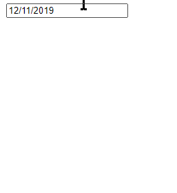
This is the most simple Datepicker with minimal and default configurations. Let’s move ahead to check more properties.
Event Handling Methods
For a date picker, adding Event handlers are required for a number of reasons like getting the Day of the week, change the format to show in the component, etc.
Let’s have a look at some important event handles and their usage.
onSelect(): Triggered when a date is selected by the user.onChange(): Triggered when input control value is changed by selecting a date.onBlur(): Triggered when the focus is removed from Datepicker input control.onFocus(): Triggered when the focus is moved inside the input control.onCalendarClose(): Triggered after the Calendar overlay is closed.onCalendarOpen(): Triggered after the Calendar overlay is opened.onWeekSelect(): Triggered when a week is selected.onMonthChange(): Triggered when a Month is changed.onYearChange(): Triggered when a Year is changed.onDayMouseEnter(): Triggered on hover of day box in the calendar.
Using Event handlers inside the component
// ~src/components/mydatepicker.component.js
import React, { Component } from "react";

import DatePicker from "react-datepicker";
import "react-datepicker/dist/react-datepicker.css";

class MyDatepickerComponent extends Component {

    state = {
        startDate: new Date()
    };

    handleSelect = (date, event) => {
        console.log('onSelect', date, event);
    };
    handleChange = (date, event) => {
        console.log('onChange', date, event);
        this.setState({
            startDate: date
        });
    };
    handleBlur = (event) => {
        console.log('onBlur', event);
    };
    handleFocus = (event) => {
        console.log('onFocus', event);
    };
    handleCalendarClose = () => {
        console.log('CalendarClose');
    };
    handleCalendarOpen = () => {
        console.log('CalendarOpen');
    };
    handleWeekSelect = (firstDayOfWeek, weekNumber, event) => {
        console.log('on', firstDayOfWeek, weekNumber, event);
    };
    handleMonthChange = (date) => {
        console.log('onMonthChange', date);
    };
    handleYearChange = (date) => {
        console.log('onYearChange', date);
    };
    handleDayMouseEnter = (date) => {
        console.log('onDayMouseEnter', date);
    };

    render() {

        return (
            <div>
                <DatePicker
                    onSelect={() => this.handleSelect}
                    onChange={this.handleChange}
                    onBlur={this.handleBlur}
                    onFocus={this.handleFocus}
                    onCalendarClose={this.handleCalendarClose}
                    onCalendarOpen={this.handleCalendarOpen}
                    onWeekSelect={this.handleWeekSelect}
                    onMonthChange={this.handleMonthChange}
                    onYearChange={this.handleYearChange}
                    onDayMouseEnter={this.handleDayMouseEnter}
                    selected={this.state.startDate}
                />
            </div>
        )
    };
}

export default MyDatepickerComponent;
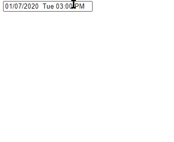
Timepicker in Calender
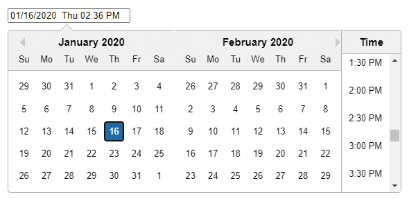
The Timepicker can be enabled by adding the showTimeSelect property then adding the dateFormat property with required date format.
                <DatePicker
                    onChange={this.handleChange}
                    selected={this.state.startDate}
                    showTimeSelect
                    dateFormat="MM/dd/yyyy  EE hh:mm a"
                />
Localization of Datepicker
The latest version of react-datepicker uses date-fns instead of moment.js. So it can easily be localized by setting the locale property
Following helper methods can be used to change the default English(es) localization:
registerLocale(): It loads an imported locale object fromdate-fnssetDefaultLocale(): Globally sets a registered locale as the default for all datepicker instancesgetDefaultLocale:This returns a string showing the currently set default locale
Setting for Roman
// ~src/components/mydatepicker.component.js
import React, { Component } from "react";

import DatePicker from "react-datepicker";
import "react-datepicker/dist/react-datepicker.css";

import { registerLocale } from "react-datepicker";
import ro from 'date-fns/locale/ro';
registerLocale('ro', ro)

class MyDatepickerComponent extends Component {

    state = {
        startDate: new Date()
    };

    handleChange = (date, event) => {
        console.log('onChange', date, event);
        this.setState({
            startDate: date
        });
    };

    render() {

        return (
            <div>
                <DatePicker
                    onChange={this.handleChange}
                    selected={this.state.startDate}
                    showTimeSelect
                    dateFormat="MM/dd/yyyy  EE hh:mm a"
                    locale="ro"
                />
            </div>
        )
    };
}

export default MyDatepickerComponent;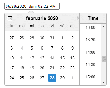
Change Date Format
The dateFormat property takes a format in the string to change.
<DatePicker
                    onChange={this.handleChange}
                    selected={this.state.startDate}
                    showTimeSelect
                    dateFormat="MM/dd/yyyy  EE hh:mm a"
                />
You can see this reference from the Angular date pipe to create your own format.
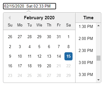
Validation in Datepicker
We can use maxDate, minDate, maxTime and minTime properties which take an instance of date to set a range for selection
   render() {
        let dt = new Date('02 15 2020');
        const maxDate = dt.setDate(dt.getDate() + 5);

        return (
            <div>
                <DatePicker
                    onChange={this.handleChange}
                    selected={this.state.startDate}
                    showTimeSelect
                    dateFormat="MM/dd/yyyy  EE hh:mm a"
                    maxDate={maxDate}
                />
            </div>
        )
    };
Show Multiple Months
The monthsShown property takes a number to show months for selection. This can be used to enable Range selection for From To dates at the same time
<DatePicker
                    onChange={this.handleChange}
                    selected={this.state.startDate}
                    showTimeSelect
                    dateFormat="MM/dd/yyyy  EE hh:mm a"
                    monthsShown="2"
                />
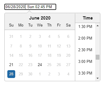
Including/ Excluding Specific Days or Time in the Calendar
Sometimes we may want to Enable or Disable some specific days or Time slots. There are four properties includeDates, includeTimes, excludeDates and excludeTimes that takes an Array of Date instances which can be produced statically or logically.
Here is a simple example to include only two dates which will disable other dates in the calendar.
render() {
        const includeDatesArray = [new Date('06-21-2020'), new Date('06-24-2020')]
        return (
            <div>
                <DatePicker
                    onChange={this.handleChange}
                    selected={this.state.startDate}
                    showTimeSelect
                    dateFormat="MM/dd/yyyy  EE hh:mm a"
                    includeDates={includeDatesArray}
                />
            </div>
        )
    };
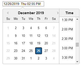
Filter Days to Disable Weekends like Saturdays or Sundays
Using the Filter methods we can conditionally enable or disable days showing in the Calendar. Let’s have a look on function to disable Saturdays and Sundays from Calendar selection.
class MyDatepickerComponent extends Component {

    state = {
        startDate: new Date()
    };

    handleChange = (date, event) => {
        console.log('onChange', date, event);
        this.setState({
            startDate: date
        });
    };

    filterDays = (date) => {
        // Disable Weekends
        if (date.getDay() === 0 || date.getDay() === 6) {
            return false;
        } else {
            return true;
        }
    }

    render() {

        return (
            <div>
                <DatePicker
                    onChange={this.handleChange}
                    selected={this.state.startDate}
                    showTimeSelect
                    dateFormat="MM/dd/yyyy  EE hh:mm a"
                    filterDate={this.filterDays}
                />
            </div>
        )
    };
}
Conclusion
Finally, we are done with the implementation of Datepicker and Timepicker in a Reactjs application. The react-datepicker package makes it very easy to apply any type of customization or validation.
Check other properties available on the official documentation.
Here we tried to cover most of the cases which are encountered in the application development regarding Datepickers. Do let us know your feedback and suggestions.
Stay Safe!