Adding Tabs in React using the react-tabs library; In this React 16+ tutorial, we are going to implement awsome looking Tabs components with sliding animation effect. To create Tabs we’ll use the rc-tabs package and apply our own CSS style with multiple themes.
Tabs component is useful for representing multiple sets of information at one place which can be easily switched by the user on clicking the Tabs buttons with the title.
We’ll create Tabs in React application with the help of the rc-tabs package module. The reasons I choose this package besides it provides an ugly looking default styling because of its powerful features:
- Draggable tabs to switch position
- Sliding tabs bottom border animation effect
- Freezable tab header
- Scrollable tabs when exceeding the visible area
- Horizontal and Vertical layout of tabs
and many more…
So let’s quickly start with the implementation.
Create a React Application
First, we’ll create a new React application using npx create-react-app command
$ npx create-react-app react-rc-tabs-appMove inside the react app
$ cd react-rc-tabs-appRun application
$ npm start
Install rc-tabs Package
After creating the React application ready, install the rc-tabs package by running below npm command
$ npm install rc-tabs
Using Tabs in Component
To implement tabs in a component, import the Tabs and TabPane from 'rc-tabs'. For adding the default styling import the index.css file as well
import Tabs, { TabPane } from 'rc-tabs';
import '../node_modules/rc-tabs/assets/index.css';
We’ll add tabs in the App.js function component as shown below:
// App.js
import React from 'react';
import './App.css';
import '../node_modules/rc-tabs/assets/index.css';
import Tabs, { TabPane } from 'rc-tabs';
function App() {
function callback(e) {
console.log(e);
}
return (
<div className="App">
<Tabs defaultActiveKey="2" onChange={callback}>
<TabPane tab="tab 1" key="1">
Lorem ipsum dolor sit amet, id duis noster delectus vis, at agam purto atqui usu. Eu eum sale choro. Ne quot equidem conclusionemque sed. Ludus referrentur ex quo. Fuisset disputando consequuntur ad nec, qui praesent postulant efficiendi ut.
</TabPane>
<TabPane tab="tab 2" key="2">
Est vidit deseruisse in, mei ullum blandit maluisset ad. Ut sea iriure dolores. Vel tollit eirmod dolores ea, errem periculis usu ut. Eum alii soleat dissentiet ne. Ridens acsan an, ei eum solum pertinacia democritum.
</TabPane>
<TabPane tab="tab 3" key="3">
Facete fierent ea mel, id nec delectus invenire elaboraret. Vel illum mollis eu, sit in latine theophrastus, mei nulla suscipit comprehensam ad.
</TabPane>
</Tabs>
</div>
);
}
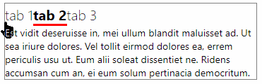
export default App;The tabset is created by adding the <Tabs> wrapped component with <TabPane> for each tab with content inside.
Title of each tab is provided using tab property and an identifier using key property.
To set an active tab on the load we pass key to the defaultActiveKey property available on <Tabs>.
Now run the application, the tabs will look like this:
Customize CSS Style of rc-tabs
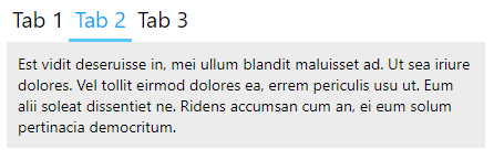
Let’ update the default style with our own CSS. Just add below in the App.css or anywhere you have these tabs
/* RC TABS START */

.rc-tabs {
  border: none !important;
}
.rc-tabs-tab {
  padding: 5px;
  text-transform: capitalize;
}
.rc-tabs-tab .rc-tabs-tab-btn {
  font-weight: normal;
}
.rc-tabs-tab.rc-tabs-tab-active {
  background: ececec;
  color: #00a6f8;
}
.rc-tabs-ink-bar {
  background: #59c7fd !important;
}
.rc-tabs-content-holder {
  padding: 10px;
  background: #ececec;
}
.rc-tabs-content {
}

/* RC TABS STOP */
You can change it according to your theme.
Now the tabs will look like this:
Change Tabs Position
The tabs can be placed on any side of the content block to a horizontal or vertical position. The tabPosition property takes ‘left‘, ‘right‘, ‘top‘(default), ‘bottom‘
<Tabs tabPosition="left">
...
</Tabs>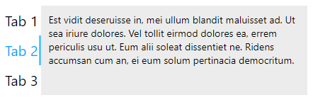
<Tabs tabPosition="right">
...
</Tabs>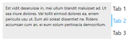
<Tabs tabPosition="bottom">
...
</Tabs>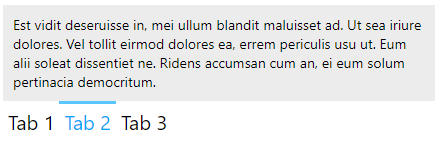
Tabs Gutter Spacing
Spacing between the Tabs can be changed by adding the tabBarGutter property
<Tabs tabBarGutter={100}>
...
</Tabs>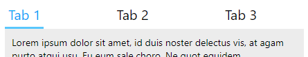
Methods and Event Handlers on <Tabs>
Following are the event handlers available on the <Tabs> component
onChange(): Triggered when tabPanel is changed.onTabClick(): Triggered when tab click.onTabScroll(): Triggered when tab scroll.
Editable Tab and Content
The Tab title and content can be made editable by setting the contentEditable={"true"}.

Conclusion
The rc-tabs package is fully featured tabs component available for React applications, here we discussed only a few features but there is a lot to have a look like draggable tabs, dynamically adding new and remove tabs, sticky tab panel, etc. you can check the official documentation here.