In this React 16+ tutorial, we’ll implement the Bootstrap Tabs component in a React application by installing the react-bootstrap package module. Tabs are used to place multiple content sections with only one visible at a time, these can be switched by clicking on a defined Tab button.
Bootstrap provides several UI components that make development lightning-fast and multiple layouts compatible.
Today we’ll integrate Bootstrap in our React application to use the Tabs component in the React 16 applications. For that, we’ll install the React Bootstrap package.
What is React Bootstrap?
React Bootstrap is a package module, which is built exclusively to use Bootstrap UI components in the React applications. Almost any Bootstrap component can be used inside the React application with ease by using this package module.
Here we’ll focus on the implementation of Bootstrap Tabs and explore properties and methods to modify the behavior and customize its layout.
Let’s start…
Create a React Application
First, we’ll create a new React application using npx create-react-app command
$ npx create-react-app react-bootstrap-tabset-appMove inside the react app
$ cd react-bootstrap-tabset-appRun application
$ npm start
Install React Bootstrap Package
After creating the react application, now we’ll install the React Bootstrap package by running below command
$ npm install react-bootstrap bootstrap
Implementing Bootstrap Tabs in React App
To implement Bootstrap Tabs, open the App.js file and import the Tabs and Tab class from 'react-bootstrap'.
import { Tabs, Tab } from 'react-bootstrap';Now, we need to import bootstrap.min.css file to happy Bootstrap styling to its components.
import 'bootstrap/dist/css/bootstrap.min.css';
Creating Bootstrap Tabs
After that add the <tabs> component wrapping the <tab> to represent each tab section for the tabset.
Update the App() function component inside the App.js file with the following code.
// src/App.js
import React from 'react';
import './App.css';

import { Tabs, Tab } from 'react-bootstrap';
import 'bootstrap/dist/css/bootstrap.min.css';

function App() {
  return (
    <div className="tab-wrapper">
      <div className='container-fluid' >
        <div className="row">
          <div className="col-sm-12">

            <Tabs defaultActiveKey="profile">
              <Tab eventKey="home" title="Home">
                <div className="tab-item-wrapper">
                  <h5>Home Dashbord</h5>
                  <p>At vero eos et accusamus et iusto odio dignissimos</p>
                </div>
              </Tab>

              <Tab eventKey="profile" title="Profile">
                <div className="tab-item-wrapper">
                  <h5>Profile Details</h5>
                  <p>At vero eos et accusamus et iusto odio dignissimos</p>
                </div>
              </Tab>

              <Tab eventKey="contact" title="Contact">
                <div className="tab-item-wrapper">
                  <h5>Contact Info</h5>
                  <p>At vero eos et accusamus et iusto odio dignissimos</p>
                </div>
              </Tab>
            </Tabs>

          </div>
        </div>
      </div>
    </div>
  );
}

export default App;
The defaultActiveKey can be used to set default active tab setting the entryKey property value defined on each <Tab> component.
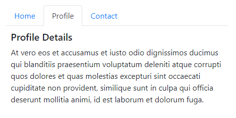
That will create a simple Tabset UI component in the application. Run React application by hitting $ npm start to see it working
Disable Fade Animation on React Bootstrap Tabs
To disable the Fade transition animation effect, we need to add the transition={false} on the <Tabs> component as shown below
<Tabs defaultActiveKey="profile" transition={false} >
...
</Tabs>
The transition property set to false, make tabs change instant without any fade effect.
Customized Bootstrap Tabs Layout
Instead of showing tabs in a traditional layout, we can customize it by using the TabContainer, TabContent, and TabPane components.
We will also be using the Row, Col, and Nav Bootstrap components.
// src/App.js
import React from 'react';
import './App.css';

import { Tabs, Tab, Row, Col, Nav } from 'react-bootstrap';
import 'bootstrap/dist/css/bootstrap.min.css';

function App() {
  return (
    <div className="tab-wrapper">
      <div className='container-fluid' >
        <div className="row">
          <div className="col-sm-12">

            <Tab.Container defaultActiveKey="profile">
              <Row>
                <Col sm={3}>

                  <Nav variant="pills" className="flex-column">

                    <Nav.Item>
                      <Nav.Link eventKey="home">Home</Nav.Link>
                    </Nav.Item>

                    <Nav.Item>
                      <Nav.Link eventKey="profile">Profile</Nav.Link>
                    </Nav.Item>

                    <Nav.Item>
                      <Nav.Link eventKey="contact">Contact</Nav.Link>
                    </Nav.Item>

                  </Nav>

                </Col>
                <Col sm={9}>
                  <Tab.Content>

                    <Tab.Pane eventKey="home">
                      <h5>Home Dashbord</h5>
                      <p>At vero eos et accusamus et iusto odio dignissimos ducimus qui blanditiis praesentium voluptatum deleniti atque corrupti quos dolores et quas molestias excepturi sint occaecati cupiditate non provident, similique sunt in culpa qui officia deserunt mollitia animi, id est laborum et dolorum fuga.</p>
                    </Tab.Pane>

                    <Tab.Pane eventKey="profile">
                      <h5>Profile Details</h5>
                      <p>At vero eos et accusamus et iusto odio dignissimos ducimus qui blanditiis praesentium voluptatum deleniti atque corrupti quos dolores et quas molestias excepturi sint occaecati cupiditate non provident, similique sunt in culpa qui officia deserunt mollitia animi, id est laborum et dolorum fuga.</p>
                    </Tab.Pane>

                    <Tab.Pane eventKey="contact">
                      <h5>Contact Info</h5>
                      <p>At vero eos et accusamus et iusto odio dignissimos ducimus qui blanditiis praesentium voluptatum deleniti atque corrupti quos dolores et quas molestias excepturi sint occaecati cupiditate non provident, similique sunt in culpa qui officia deserunt mollitia animi, id est laborum et dolorum fuga.</p>
                    </Tab.Pane>

                  </Tab.Content>
                </Col>
              </Row>
            </Tab.Container>


          </div>
        </div>
      </div>
    </div>
  );
}

export default App;
On running the application the Tabset will look like this

Properties and Methods on Tabs
The Tabs component supports the following properties and methods
defaultActiveKey: Used to set the default active key that is selected on startid: HTML id attribute, required if no generateChildId prop is specified.mountOnEnter: Wait until the first"enter"transition to mount tabs (add them to the DOM)onSelect: Callback fired when a Tab is selected.transition: Sets a default animation strategy for all children <TabPane>s. Defaults to <Fade> animation, else use false to disable.unmountOnExit: Unmount tabs (remove it from the DOM) when it is no longer visiblevariant: Set navigation style'tabs'|'pills'.Default is set to ‘tabs’
Conclusion
Above we discussed how to easily implement Bootstrap Tabs in ReactJs application with examples. Also, we created a customized layout of Tabs with the Pills variant.
Hope you enjoyed this tutorial, feel free to share your thoughts…