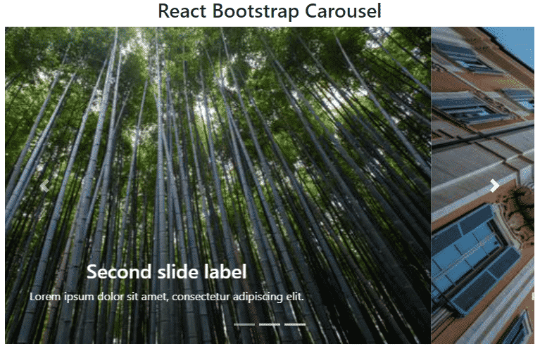
In this React 16+ tutorial, we’ll implement Bootstrap Carousel in a React application by installing the react-bootstrap package module.
Bootstrap provides several UI components that make development lightning-fast and multiple layouts compatible.
Today we’ll integrate Bootstrap in our React application to use the Carousel component in the React 16 applications. For that, we’ll install the React Bootstrap package.
What is React Bootstrap?
React Bootstrap is a package module, which is built exclusively to use Bootstrap UI components in the React applications. Almost any Bootstrap component can be used inside the React application with ease by using this package module.
Here we’ll focus on the implementation of Bootstrap Carousel and explore properties and methods to modify the behavior of Image Carousel as required.
Let’s start…
Create a React Application
First, we’ll create a new React application using npx create-react-app command
$ npx create-react-app react-bootstrap-carousel-appMove inside the react app
$ cd react-bootstrap-carousel-appRun application
$ npm start
Install React Bootstrap Package
After creating the react application, now we’ll install the React Bootstrap package by running below command
$ npm install react-bootstrap bootstrap
Create React Bootstrap carousel component
Now we’ll create a new carousel component BootstrapCarouselComponent in the “~src/components/
Carousel class from 'react-bootstrap'.import { Carousel } from 'react-bootstrap';Import bootstrap.min.css file to add style to the Carousel component or any other bootstrap UI component used.
import 'bootstrap/dist/css/bootstrap.min.css';To create a Bootstrap Carousel, add the <Carousel> component wrapping the <Carousel.Item> which represent each slide of the carousel.
The final BootsrapCarouselComponent will look like this:
// src/components/bootstrap-carousel.component.js
import React from "react";

import { Carousel } from 'react-bootstrap';
import 'bootstrap/dist/css/bootstrap.min.css';

class BootstrapCarouselComponent extends React.Component {

    render() {
        return (
            <div>
                <div className='container-fluid' >
                    <div className="row">
                        <div className="col-sm-12">
                            <h3>React Bootstrap Carousel</h3>
                        </div>
                    </div>
                    <div className="row">
                        <div className="col-12">
                            <Carousel>

                                <Carousel.Item>
                                    <img
                                        className="d-block w-100"
                                        src="https://picsum.photos/500/300?img=1"
                                        alt="First slide"
                                    />
                                    <Carousel.Caption>
                                        <h3>First slide label</h3>
                                        <p>Nulla vitae elit libero, a pharetra augue mollis interdum.</p>
                                    </Carousel.Caption>
                                </Carousel.Item>

                                <Carousel.Item>
                                    <img
                                        className="d-block w-100"
                                        src="https://picsum.photos/500/300?img=2"
                                        alt="Second slide"
                                    />

                                    <Carousel.Caption>
                                        <h3>Second slide label</h3>
                                        <p>Lorem ipsum dolor sit amet, consectetur adipiscing elit.</p>
                                    </Carousel.Caption>
                                </Carousel.Item>

                                <Carousel.Item>
                                    <img
                                        className="d-block w-100"
                                        src="https://picsum.photos/500/300?img=3"
                                        alt="Third slide"
                                    />
                                    <Carousel.Caption>
                                        <h3>Third slide label</h3>
                                        <p>Praesent commodo cursus magna, vel scelerisque nisl consectetur.</p>
                                    </Carousel.Caption>
                                </Carousel.Item>

                            </Carousel>
                        </div>
                    </div>
                </div>
            </div>
        )
    };
}

export default BootstrapCarouselComponent;
Adding Bootstrap Carousel in App.js
Finally, we’ll import the BootstrapCarouselComponent inside the App() function component in the App.js file at the root of the project in the src folder.
// src/App.js
import React from 'react';
import './App.css';
import BootstrapCarouselComponent from './components/bootstrap-carousel.component';

function App() {
  return (
    <div className="App">
      <BootstrapCarouselComponent></BootstrapCarouselComponent>
    </div>
  );
}

export default App;
That’s it now run the ReactJs application by hitting $ npm start to see you Carousel working.
Properties and Methods on <Carousel/>
Following are the properties and methods available on the Carousel component
Properties
controls: Show/ Hide the Navigation Next and Previous arrows on the carousel. Default is set to truefade: Crossfade slides instead of the default slide animation. The default is set to false to apply slide effect.slide: Enables animation on the Carousel as it transitions between slides. Default is set to trueindicators: To show/hide the horizontal pipe indicators on the carousel bottom. Default is set to trueinterval: The amount of time in milliseconds to delay between automatically cycling an item. If null, carousel will not automatically cycle. Default is set to 5000keyboard: Whether the carousel should react to keyboard events. Default is set to truepause: If set to “hover”, pauses the cycling of the carousel on mouseenter and resumes the cycling of the carousel on mouseleave. If set to false, hovering over the carousel won’t pause it.nextLabel: The label shown to screen readers only can be used to show the next element in the carousel. Set to null to deactivate. Default is set to ‘Next’prevLabel: The label shown to screen readers only can be used to show the previous element in the carousel. Set to null to deactivate. Default is set to ‘Previous’nextIcon: Override the default button icon for the “next” controlprevIcon: Override the default button icon for the “previous” controltouch: Whether the carousel should support left/right swipe interactions on touchscreen devices. Default is set to truewrap: Whether the carousel should cycle continuously or have hard stops. The default is set to true.bsPrefix: Change the underlying component CSS base class name and modifier class names prefix. Default is set to ‘carousel’
Methods
onSelect(): Callback fired when the active item changes.onSlid(): Callback fired when a slide transition ends.onSlide(): Callback fired when a slide transition starts.
Conclusion
So here we discussed how to easily implement Bootstrap carousel in the Reactjs application by installing the React Bootstrap package. We also discussed various configuration options which can be adding in the carousel to modify its behavior.
React Bootstrap included almost all types of Bootstrap components which can be created in the React application similarly. You can check more details on official documentation.
Hope you enjoyed this tutorial, feel free to share your feedback.
Thanks for reading…

