In this React 16+ tutorial, we’ll learn how to show Toast notification messages like a pro by using a cool package module Toastify.
What is Toast?
A toast in terms of an application is a floating container that can be shown anywhere over the content to display some message in the form of notification. These are shown to draw the attention of the user as it can have some important information.
The toast messages are generally shown in different colors for errors, warnings, information, etc. They are very popular in native mobile applications but these days they are preferred to show in Web applications too.
Why Toastify?
Installation and ease of use if quick. Toastify creates awesome toast notifications with animations and full colors for different message types. There are tons of configuration options available to customize its behavior.
Here we’ll create a new ReactJs application to discuss How to implement Toastify and configure it with different options available.
Let’s start…
Create a React Application
First, we’ll create a new React application using npx create-react-app command
$ npx create-react-app react-toastify-appMove inside the react app
$ cd react-toastify-appRun application
$ npm start
Install Toastify Package
After creating the react application, now we’ll install the Toastify package by running below command
$ npm install --save react-toastify
Show Toastify Notification
To create a Toast using Toastify component, we’ll import the ToastContainer and toast from 'react-toastify'.
import { ToastContainer, toast } from 'react-toastify';
For adding style, import the ReactToastify.css file
import 'react-toastify/dist/ReactToastify.css';
Finally, we need to update the App() function of any Component or function where you want the toast message to show up.
// App.js
import React from 'react';
import './App.css';
import { ToastContainer, toast } from 'react-toastify';
import 'react-toastify/dist/ReactToastify.css';
function App() {
const showToast = () => {
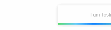
toast("I am Tostify!")
};
return (
<div className="App">
<div>
<button onClick={showToast}>Show Toast !</button>
<ToastContainer />
</div>
</div>
);
}
export default App;Here we have defined a method showToast to call the toast() function with text to display in the toast. A button is having a onClick event listener.
Now run react application by hitting $ npm start
The toast("text",{}) method takes two arguments, the first one takes the text and the second is the object to accept option properties. Let’s have a look at configuration settings
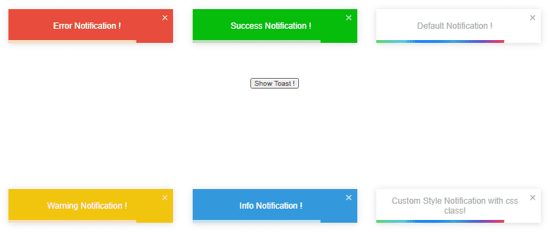
Type of Toast notification
Other then a normal toast, we can show Error, Warning, Success, and Information type of toast as shown below:
// Success
toast.success("Success Notification !");

// Error
toast.error("Error Notification !");

// Warning
toast.warn("Warning Notification !");

// Information
toast.info("Info Notification !");
Position of toast
Toastify notification can have six positions to show-up on the page.
toast("Default Notification !", {
      position: toast.POSITION.TOP_RIGHT
    });

    toast.success("Success Notification !", {
      position: toast.POSITION.TOP_CENTER
    });

    toast.error("Error Notification !", {
      position: toast.POSITION.TOP_LEFT
    });

    toast.warn("Warning Notification !", {
      position: toast.POSITION.BOTTOM_LEFT
    });

    toast.info("Info Notification !", {
      position: toast.POSITION.BOTTOM_CENTER
    });

    toast("Custom Style Notification with css class!", {
      position: toast.POSITION.BOTTOM_RIGHT,
    });
Auto Close Trimming
We can control the time after which the Toast message will be closed automatically. By setting the autoClose property.
const closeAfter15 = () => {
	toast("Will close after 15s", { autoClose: 15000 });
}
To disable the auto close, set it to false. Toast can be close by clicking the cross icon or clicking anywhere on the toast.
const disabledAutoClose = () => {
	toast("Will not be auto close ever", { autoClose: false });
}
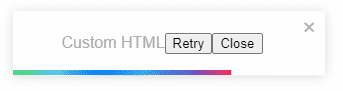
Custom HTML Template for Toastify
We can also define a custom template component for the Toastify notification. For that, we’ll define a const with JSX template then pass it to the toast() method.
const MyMsg = ({ closeToast }) => (
  <div>
    Custom HTML
    <button>Retry</button>
    <button onClick={closeToast}>Close</button>
  </div>
)

function App() {

  const showToast = () => {
    toast(MyMsg, {
      position: toast.POSITION.TOP_CENTER
    })
  };

  return (
    <div className="App">
      <div>
        <button style={{ marginTop: '150px' }} onClick={showToast}>Show Toast !</button>
        <ToastContainer />
      </div>
    </div>
  );
}
How to prevent duplicate Toasts?
To prevent more than one toast, we need to pass a unique identifier in the toastId property
const showToast = () => {
    toast("My Unique Toast", {
      toastId: '007'
    })
  };
Remove Single or All Toasts on Button Click
We can programmatically dismiss a single or All toasts by calling the dismiss() method. To dismiss a single specific Toast we need to keep its reference id in a variable using React.useRef(null) type.
function App() {

  const toastId = React.useRef(null);

  const notify = () => {
    toastId.current = toast("Lorem ipsum dolor");
  }

  const dismiss = () => {
    toast.dismiss(toastId.current);
  }

  const dismissAll = () => {
    toast.dismiss();
  }

  return (
    <div className="App">
      <div>
        <button onClick={notify}>Notify</button>
        <button onClick={dismiss}>Dismiss</button>
        <button onClick={dismissAll}>Dismiss All</button>
        <ToastContainer />
      </div>
    </div>
  );
}
Limit the number of Toasts show at a time
Instead of showing only one toast using an identifier, we can also force to limit the number of toasts that can be shown at once. For this, we add the limit property on <span class="token tag punctuation"><</span><span class="token tag class-name">ToastContainer</span> <strong><span class="token tag attr-name">limit</span><span class="token tag script language-javascript script-punctuation punctuation">=</span><span class="token tag script language-javascript punctuation">{</span><span class="token tag script language-javascript number">3</span><span class="token tag script language-javascript punctuation">}</span></strong><span class="token tag punctuation">></span>
If other toasts are there to be shown, they will show up after previous are closed.
Transition Animation of Toast
There are 4 types of awsome transition animation types for toasts Bounce, Slide, Zoom and Flip.
To change it we import them, then assign to the transition property.
import { Slide, Zoom, Flip, Bounce } from 'react-toastify';Can be added to the <span class="token tag punctuation"><</span><span class="token tag class-name">ToastContainer </span><strong><span class="token tag attr-name">transition</span><span class="token tag script language-javascript script-punctuation punctuation">=</span><span class="token tag script language-javascript punctuation">{</span><span class="token tag script language-javascript">Slide</span><span class="token tag script language-javascript punctuation">}</span></strong>/> or on each toast() method
toast("hello",
{
  transition: Slide
})
Swipe or Drag to dismiss
Toast notifications can have Swipe or Drag to dismiss feature, which can be useful in touch devices. By default, the draggable property is set to trueso it can be disabled by setting to false.
We can configure the percentage of drag over the toast to dismiss it by setting draggablePercent property.
<ToastContainer draggablePercent={60} />Or on each toast
toast('Hello', {
  draggablePercent: 60
});
Conclusion
Toastify is the best package module with awesome option configuration flexibility. I would recommend it over the those available in React Bootstrap UI components. Toastify toasts are highly customizable and provide the next level of configuration abilities. You can check more on official docs.
Do share your feedback…
Thanks for reading…