In this tutorial, you will learn how to open the Angular material accordion expansion panel at the click of a button. We will explore various properties provided by the extension panel component to achieve this functionality
Accordion or Expansion panels are used to represent data in collapsable UI structures, where each panel can have data like actionable form, detailed description, links details etc. There are useful to adjust huge information into multiple expandable sections to save viewable space.
We can easily create stepper-like behaviour in the material expansion panel using the input-output properties available on Material expansion panels.
How to expand/collapse Material Expansion panels on Click?
Step 1 – Create an Angular App
Step 2 – Add Material Library
Step 3 – Update App Module
Step 4 – Create Expansion Panel
Step 5 – See In Action
Create an Angular App
Before creating a new Angular app, make sure you have installed the latest version on Angular CLI tool:
npm install -g @angular/cli
Create a new Angular project of the name provided by executing the below command:
ng new angular-app
Move into the application directory:
cd angular-app
Add Material Library
next, we will be installing the Material UI library and NGX Mat select search library by executing below npm commands:
Install Material Library
ng add @angular/material

? Choose a prebuilt theme name, or "custom" for a custom theme: Indigo/Pink
? Set up global Angular Material typography styles? No
? Include the Angular animations module? Include and enable animations
Update App Module with Required Modules
After installing the required npm libraries, we need to import the modules in the App Module of the application. This will enable us to use various API components on our pages.
We will import the MatExpansionModule API module to use the expansion panel in our Angular application.
Open the app.module.ts file and update it as shown below:
import { NgModule } from '@angular/core';
import { BrowserModule } from '@angular/platform-browser';
import { AppComponent } from './app.component';
import { BrowserAnimationsModule } from '@angular/platform-browser/animations';

import { MatExpansionModule } from '@angular/material/expansion';

@NgModule({
  declarations: [AppComponent],
  imports: [BrowserModule, BrowserAnimationsModule, MatExpansionModule],
  providers: [],
  bootstrap: [AppComponent],
})
export class AppModule {}
Create Expansion Panel
This leads us to the next step where we will create the expansion panel with click controlled expand collapse.
Open the app.component.html file and update it with the following template:
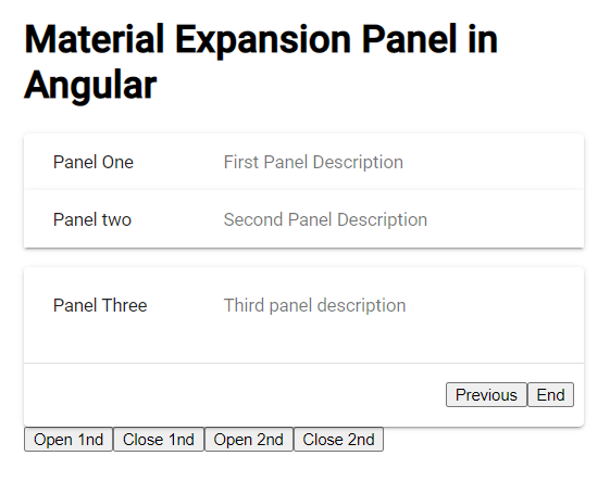
<div class="wrap">
  <h1>Material Expansion Panel in Angular</h1>

  <mat-accordion class="example-headers-align">
    <mat-expansion-panel
      [expanded]="step === 0"
      (opened)="setStep(0)"
      hideToggle
    >
      <mat-expansion-panel-header>
        <mat-panel-title> Panel One </mat-panel-title>
        <mat-panel-description> First Panel Description </mat-panel-description>
      </mat-expansion-panel-header>

      <mat-action-row>
        <button mat-button color="primary" (click)="nextStep()">Next</button>
      </mat-action-row>
    </mat-expansion-panel>

    <mat-expansion-panel
      [expanded]="step === 1"
      (opened)="setStep(1)"
      hideToggle
    >
      <mat-expansion-panel-header>
        <mat-panel-title> Panel two </mat-panel-title>
        <mat-panel-description>
          Second Panel Description
        </mat-panel-description>
      </mat-expansion-panel-header>

      <mat-action-row>
        <button mat-button color="warn" (click)="prevStep()">Previous</button>
        <button mat-button color="primary" (click)="nextStep()">Next</button>
      </mat-action-row>
    </mat-expansion-panel>

    <mat-expansion-panel
      [expanded]="step === 2"
      (opened)="setStep(2)"
      hideToggle
    >
      <mat-expansion-panel-header>
        <mat-panel-title> Panel Three </mat-panel-title>
        <mat-panel-description> Third panel description </mat-panel-description>
      </mat-expansion-panel-header>

      <mat-action-row>
        <button mat-button color="warn" (click)="prevStep()">Previous</button>
        <button mat-button color="primary" (click)="nextStep()">End</button>
      </mat-action-row>
    </mat-expansion-panel>
  </mat-accordion>

  <button (click)="setStep(1)">Open 1nd</button>
  <button (click)="setStep(-1)">Close 1nd</button>
  <button (click)="setStep(2)">Open 2nd</button>
  <button (click)="setStep(-1)">Close 2nd</button>
</div>
We have three panels with [expanded] and (opened) property and method. The [expanded] property takes care to open only that panel where step index is matching.
The (opened) method will update the step index value on the trigger. There are buttons below as well to trigger the open and close behaviour of panels in accordion.
Each panel is having the <mat-action-row> to define the Next and Previous buttons to demonstrate the in-panel expansion control to provide stepper behaviour.
Next, open the app.component.ts file to add the functions to control step index value.
import { Component, ViewChild } from '@angular/core';
import { MatAccordion } from '@angular/material/expansion';

@Component({
  selector: 'app-root',
  templateUrl: './app.component.html',
  styleUrls: ['./app.component.css'],
})
export class AppComponent {
  step = 0;

  setStep(index: number) {
    this.step = index;
  }

  nextStep() {
    this.step++;
  }

  prevStep() {
    this.step--;
  }
}
See In Action
We are done with the implementation stuff. Now you can run your application by hitting the following command:
npm startIt will start the development web server and run the application at the following URL: