React Toastify is a library that allows you to easily create and manage toasts (small notifications) in your React application. In this tutorial, we will be building a sample React application that demonstrates how to use the React Toastify library. We will be covering the following topics:
- Installing React Toastify in your application
- Creating different types of toasts (success, error, warning)
- Customizing the appearance and behavior of toasts
- Creating a “close all” button to dismiss all toasts
- Creating a “location” button to change the position of the toasts
- Creating an “action” button to perform an action when the toast is closed
To start, you will need to have a basic understanding of React and have a React application set up. If you don’t already have one, you can create a new React application using the create-react-app command.
Step 1: Install React Toastify in your application by running the following command:
npm install react-toastify
Step 2: Import the toast and ToastContainer components from the React Toastify library in your React functional component.
import { toast, ToastContainer } from 'react-toastify';
Step 3: Create a new function that will be used to create toasts. In this example, we will be creating three different types of toasts: success, error, and warning. Each type of toast will have its own button in the UI.
const handleClick = (toastType) => {
    switch(toastType){
        case 'success':
            toast.success('Success message');
            break;
        case 'error':
            toast.error('Error message');
            break;
        case 'warning':
            toast.warn('Warning message');
            break;
    }
}
Step 4: In your JSX, add the ToastContainer component at the root of your application. This component is responsible for rendering the toasts and managing their state.
<ToastContainer />
Step 5: Add the buttons for creating the different types of toasts in your JSX. These buttons will call the handleClick function when clicked, passing in the type of toast to create.
<button onClick={() => handleClick('success')}>Success Toast</button>
<button onClick={() => handleClick('error')}>Error Toast</button>
<button onClick={() => handleClick('warning')}>Warning Toast</button>
Let’s have a sample app example with the whole code in the App.jsx or App.js file:
import React, { useState } from "react";
import { toast, ToastContainer } from "react-toastify";
import "react-toastify/dist/ReactToastify.css";

function App() {
  const [location, setLocation] = useState("top-right");
  const [toastType, setToastType] = useState("success");

  const handleClick = () => {
    if (toastType === "success") {
      toast.success("Success message", {
        position: location,
        autoClose: 5000,
        hideProgressBar: false,
        closeOnClick: true,
        pauseOnHover: true,
        draggable: true,
        onClose: () => setToastType(""),
        action: <button onClick={() => toast.dismiss()}>dismiss</button>,
      });
    } else if (toastType === "error") {
      toast.error("Error message", {
        position: location,
        autoClose: 5000,
        hideProgressBar: false,
        closeOnClick: true,
        pauseOnHover: true,
        draggable: true,
        onClose: () => setToastType(""),
      });
    } else if (toastType === "warning") {
      toast.warn("Warning message", {
        position: location,
        autoClose: 5000,
        hideProgressBar: false,
        closeOnClick: true,
        pauseOnHover: true,
        draggable: true,
        onClose: () => setToastType(""),
      });
    }
  };

  return (
    <div>
      <button
        onClick={() => {
          setToastType("success");
          handleClick();
        }}
      >
        Show Success Toast
      </button>
      <button
        onClick={() => {
          setToastType("error");
          handleClick();
        }}
      >
        Show Error Toast
      </button>
      <button
        onClick={() => {
          setToastType("warning");
          handleClick();
        }}
      >
        Show Warning Toast
      </button>
      <button onClick={() => toast.dismiss()}>Close All Toasts</button>
      <button onClick={() => setLocation("top-left")}>
        Change Location to Top-Left
      </button>
      <button onClick={() => setLocation("bottom-right")}>
        Change Location to Bottom-Right
      </button>
      <ToastContainer />
    </div>
  );
}

export default App;
Now you can see the app in action by running : npm start command.
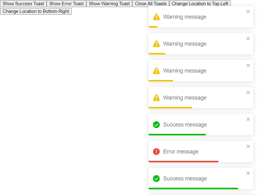
Conclusion
React Toastify is a powerful and easy-to-use library for creating and managing toasts in React applications. By following the steps outlined in this tutorial, you should now have a good understanding of how to use the library to create different types of toasts, customize their appearance and behavior, and create a centralized store for managing toasts using Redux. With the ability to create different types of toasts, location and action buttons, the library is a great tool for displaying notifications and alerts to the user.