In this tutorial, you will learn how to enable inline edit mode in Angular Material based data tables. You can put any type of fields in the edit mode like textbox, textarea, date pickers, slide toggle, select boxes etc.
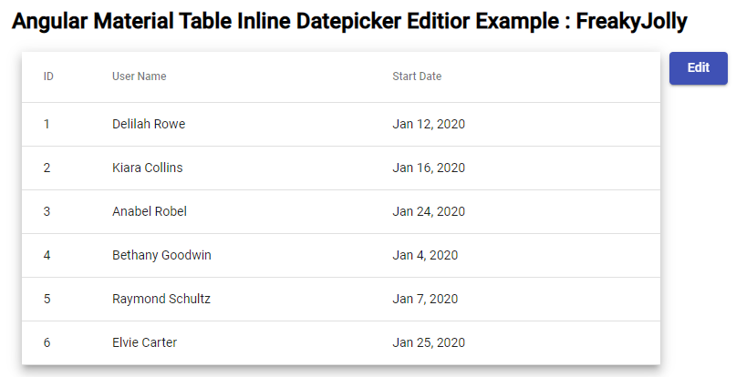
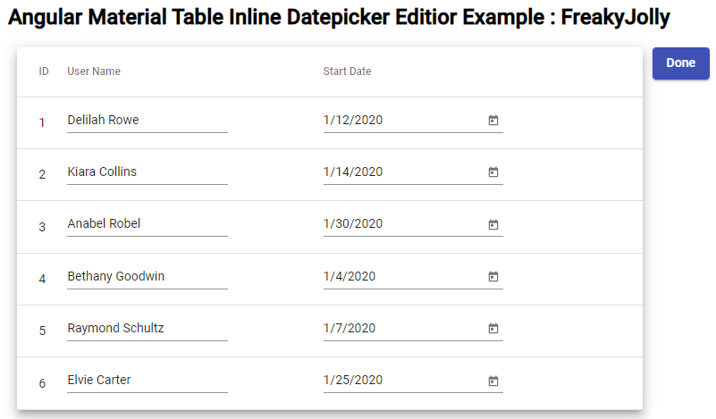
On the inline editable material data table we have an edit button, on clicking it the data table switches to edit mode which otherwise shows the viewable textual information like a normal table.
Today, we will create the Angular material data table with an inline edit feature for all the columns in the rows. When a user clicks the edit button, all rows and their columns become editable and reverted back to viewable mode. A simple implementation can be extended to the required number of columns with various editable form controls.
In our demo, we will have the textfield and datepicker in the data table row which will look like this:
How to Inline Edit Rows in Material Datatable?
We will follow these quick steps to add an inline edit feature in the Angular Material Datatable with datepicker and textbox:
Step 1 – Create Angular Project
Step 2 – Install Material Library
Step 3 – Import Material Modules in AppModule
Step 4 – Update Component Class TypeScript
Step 5 – Update Component Template HTML
Step 6 – See In Action
Step 1 – Create Angular App
To enable the ng command in the terminal window, make sure to instal the Angular CLI tool. If you already have, you can update it as well.
# Install NG CLI
npm install -g @angular/cli

#Update NG CLI
ng update
Afterwards, you can hit the following command to create a new angular project with the name provided:
ng new angular-material-table-appMove inside the application folder
cd angular-material-table-appStep 2 – Install Material Library
Thereafter creating and moving the terminal to the application folder, we will install the Material library by executing the ng add command. This makes the installation of the material library very easy, you can choose options while installation as shown below:
ng add @angular/material

# ? Choose a prebuilt theme name, or "custom" for a custom theme: Indigo/Pink
# ? Set up global Angular Material typography styles? No
# ? Set up browser animations for Angular Material? Yes
This will update the "styles" property array inside the angular.json file, which you can change anytime.
Step 3 – Import Material Modules in AppModule
We will be using the following modules to complete our edit feature within the data table.
MatButtonModule: Create a material edit button.MatTableModule: Add material tableMatDatepickerModule: Material datepicker componentMatFormFieldModule: For using FormGroupMatInputModule: Add material styled input controlsMatMomentDateModule: When using the Datepicker we need at least one Date Adapter
In Addition to the above, we need the ReactiveFormsModule to use the reaction forms approach in our demo.
Now open the app.module.ts file and update it as shown below:
import { NgModule } from '@angular/core';
import { BrowserModule } from '@angular/platform-browser';

import { AppComponent } from './app.component';
import { BrowserAnimationsModule } from '@angular/platform-browser/animations';
import { ReactiveFormsModule } from '@angular/forms';

// Material Modules
import { MatButtonModule } from '@angular/material/button';
import { MatTableModule } from '@angular/material/table';
import { MatDatepickerModule } from '@angular/material/datepicker';
import { MatFormFieldModule } from '@angular/material/form-field';
import { MatInputModule } from '@angular/material/input';
import { MatMomentDateModule } from '@angular/material-moment-adapter';

@NgModule({
  declarations: [AppComponent],
  imports: [
    BrowserModule,
    BrowserAnimationsModule,
    ReactiveFormsModule,

    MatButtonModule,
    MatTableModule,
    MatDatepickerModule,
    MatFormFieldModule,
    MatInputModule,
    MatMomentDateModule, // <- Added MatMomentDateModule
  ],
  providers: [],
  bootstrap: [AppComponent],
})
export class AppModule {}
Step 4 – Update Component Class TypeScript
Next, update the component class with all the stuff we need to create the basic material table and add an edit feature.
For creating the dataSource first add the dataSource and displayedColumns objects.
// Column definition object
  displayedColumns = [
    {
      name: 'id',
      title: 'ID',
      editType: '',
      disableEdit: false,
    },
    {
      name: 'username',
      title: 'User Name',
      editType: 'textbox',
      disableEdit: false,
    },
    {
      name: 'startDate',
      title: 'Start Date',
      editType: 'datepicker',
      disableEdit: false,
    },
  ];

  dataSource = [
    {
      id: '1',
      username: 'Delilah Rowe',
      startDate: '2020-01-12',
    },
    {
      id: '2',
      username: 'Kiara Collins',
      startDate: '2020-01-14',
    },
    {
      id: '3',
      username: 'Anabel Robel',
      startDate: '2020-01-30',
    },
    {
      id: '4',
      username: 'Bethany Goodwin',
      startDate: '2020-01-04',
    },
    {
      id: '5',
      username: 'Raymond Schultz',
      startDate: '2020-01-07',
    },
    {
      id: '6',
      username: 'Elvie Carter',
      startDate: '2020-01-25',
    },
  ];
The displayedColumns having more properties than simple array values of the name. The editType defines the type on form control to show when in edit mode. By using the disableEdit you can control the edit accessibility in edit mode.
The getFrmGrp() function will generate the form controls for editable fields in the table using the Row and Column index in addition to a map pointer.
getFrmGrp() {
    let formControls = {};
    for (let i = 0; i < this.dataSource.length; i++) {
      for (let j = 0; j < this.displayedColumns.length; j++) {
        let columnName = this.displayedColumns[j].name;
        formControls[columnName + i + j] = new FormControl({
          value: this.dataSource[i][columnName],
          disabled: this.displayedColumns[j].disableEdit,
        });
        this.controlIndex[this.dataSource[i][this.fcm] + j] =
          columnName + i + j;
      }
    }
    return formControls;
  }
The onValuechange() function will update the respective form control value in the data table source object.
onValueChange(columnName: any, colIndex: number, i: number) {
    const value =
      this.tableFromGroup.controls[
        this.controlIndex[this.dataSource[i][this.fcm] + colIndex]
      ].value;
    this.dataSource[i][columnName] = value;
  }
Now, open the app.component.ts file and update it with the following complete code:
import { Component } from '@angular/core';
import { FormBuilder, FormControl, FormGroup } from '@angular/forms';

@Component({
  selector: 'app-root',
  templateUrl: './app.component.html',
  styleUrls: ['./app.component.css'],
})
export class AppComponent {
  // Column definition object
  displayedColumns = [
    {
      name: 'id',
      title: 'ID',
      editType: '',
      disableEdit: false,
    },
    {
      name: 'username',
      title: 'User Name',
      editType: 'textbox',
      disableEdit: false,
    },
    {
      name: 'startDate',
      title: 'Start Date',
      editType: 'datepicker',
      disableEdit: false,
    },
  ];

  dataSource = [
    {
      id: '1',
      username: 'Delilah Rowe',
      startDate: '2020-01-12',
    },
    {
      id: '2',
      username: 'Kiara Collins',
      startDate: '2020-01-14',
    },
    {
      id: '3',
      username: 'Anabel Robel',
      startDate: '2020-01-30',
    },
    {
      id: '4',
      username: 'Bethany Goodwin',
      startDate: '2020-01-04',
    },
    {
      id: '5',
      username: 'Raymond Schultz',
      startDate: '2020-01-07',
    },
    {
      id: '6',
      username: 'Elvie Carter',
      startDate: '2020-01-25',
    },
  ];

  // To keep array of column names
  tableColumns!: string[];

  // Table edit feature variables
  date = new FormControl(new Date());
  tableFromGroup!: FormGroup;
  controlOffset: number = 0;
  controlIndex = {};
  isEditMode = false;
  fcm = ''; //formControlMapKey

  constructor(private fb: FormBuilder) {
    this.getColNames();
    this.getFirstColName();
  }

  ngOnInit() {
    this.tableFromGroup = this.fb.group(this.getFrmGrp());
  }

  // Get first key name from data source to generate FormControl Pointer
  getFirstColName() {
    this.fcm = Object.keys(this.dataSource[0])[0]; // id
  }

  // Toggle edit mode
  toggleEdit() {
    this.isEditMode = !this.isEditMode;
  }

  // Fetch column names from definition
  getColNames() {
    this.tableColumns = this.displayedColumns.map((col) => {
      return col.name;
    });
  }

  // Update respective form control value in datatable
  onValueChange(columnName: any, colIndex: number, i: number) {
    const value =
      this.tableFromGroup.controls[
        this.controlIndex[this.dataSource[i][this.fcm] + colIndex]
      ].value;
    this.dataSource[i][columnName] = value;
  }

  // Generate dynamic form control for editable fields in the table
  getFrmGrp() {
    let formControls = {};
    for (let i = 0; i < this.dataSource.length; i++) {
      for (let j = 0; j < this.displayedColumns.length; j++) {
        let columnName = this.displayedColumns[j].name;
        formControls[columnName + i + j] = new FormControl({
          value: this.dataSource[i][columnName],
          disabled: this.displayedColumns[j].disableEdit,
        });
        this.controlIndex[this.dataSource[i][this.fcm] + j] =
          columnName + i + j;
      }
    }
    return formControls;
  }
}
Step 5 – Update Component Template HTML
Afterwards, we will update the template HTML that will have a Material table with the edit button. Moreover, we used the ngTemplateOutlet and ngTemplateOutletContext properties on the TD tag to assign the custom template for mat-cell.
Open the app.component.html and update the complete HTML template as shown below:
<h2>Angular Material Table Inline Datepicker Editior Example : FreakyJolly</h2>

  <button mat-raised-button color="primary" (click)="toggleEdit()">{{isEditMode?'Done':'Edit'}}</button>

  <div >

    <form [formGroup]="tableFromGroup">
      <table mat-table [dataSource]="dataSource" class="mat-elevation-z8" *ngIf="dataSource">
        <ng-container matColumnDef="{{ col.name }}" *ngFor="let col of displayedColumns; let colIndex = index">
          <th mat-header-cell *matHeaderCellDef>{{ col.title }}</th>
          <td mat-cell *matCellDef="let element; let i = index">
            <ng-template [ngTemplateOutlet]="testTemp" [ngTemplateOutletContext]="{
            context: {
                element: element,
                index: i
              }
            }"></ng-template>

            <ng-template #testTemp let-context="context">
              <ng-container *ngIf="isEditMode; else elseEditModeTemplate">
                <!-- Edit mode -->
                <span [ngSwitch]="col.editType">
                  <!-- Datepicker field -->
                  <div *ngSwitchCase="'datepicker'">
                    <mat-form-field>
                      <input matInput [matDatepicker]="cellDatePicker"
                        [formControlName]="controlIndex[element[fcm]+colIndex]"
                        (dateChange)="onValueChange(col.name,colIndex,i)" />
                      <mat-datepicker-toggle matSuffix [for]="cellDatePicker"></mat-datepicker-toggle>
                      <mat-datepicker #cellDatePicker></mat-datepicker>
                    </mat-form-field>
                  </div>
                  <div *ngSwitchCase="'textbox'">
                    <!-- Textbox field -->
                    <mat-form-field class="example-full-width">
                      <input matInput [formControlName]="controlIndex[element[fcm]+colIndex]"
                        (change)="onValueChange(col.name,colIndex,i)">
                    </mat-form-field>
                  </div>
                  <div *ngSwitchDefault>
                    {{element[col.name]}}
                  </div>
                </span>
              </ng-container>
              <ng-template #elseEditModeTemplate>
                <!--In view mode  -->
                <span [ngSwitch]="col.name">
                  <!-- Datepicker field -->
                  <div *ngSwitchCase="'startDate'">
                    {{element[col.name] | date}}
                  </div>
                  <div *ngSwitchDefault>
                    {{element[col.name]}}
                  </div>
                </span>
              </ng-template>
            </ng-template>
          </td>
        </ng-container>

        <tr mat-header-row *matHeaderRowDef="tableColumns"></tr>
        <tr mat-row *matRowDef="let row; columns: tableColumns"></tr>
      </table>
    </form>
  </div>
  <div>
    <pre>{{ dataSource | json }}</pre>
  </div>
The isEditMode boolean variable is controlling the cell view to switch into the editable control. The ngSwitchCase is used to show various types of editable controls for example we used the textbox and date picker.
Likewise, we used the ngSwitchCase in the viable mode to show the date using the date pipe.
Step 6 – See In Action
Now you need to run the Angular project by executing the below command into the terminal:
ng serve --open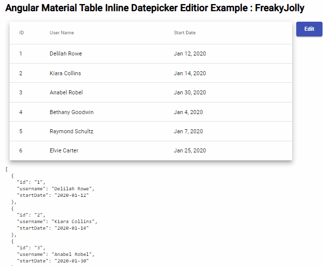
Angular 10|9|8 Edit/ Add/ Delete Rows in Material Table with using Dialogs inline Row Operation
Conclusion
In this guide, we discussed how to use the ngTemplateOutlet and ngTemplateOutletContext properties on the Mat-Cell in datatable to define a custom template for each column cell. Then we used it to implement the edit feature to inline edit the dataSource of the table that can be used to show multiple types of controls including Select, Datepicker, Timepicker, Textbox etc using NgSwitchCase.
Hope this was helpful, Thanks…