In this guide, you will learn how to easily create and Excel file with different types of charts using Python’s openpyxl library. We will create the most primary chart types including Line Chart, Bar Chart, and Pie Chart.
We will discuss each and every step to create various kinds of Charts in the XLSX file which will be connected to the data presented in it. The charts created will be easily draggable and interactive to represent the location of data as well.
Let’s get started…
How do Create Line, bar and Pie Chart in XLSX using Python Script using Openpyxl?
Follow these quick steps to create a Python script, that will download the XLSX file with various Charts including Line, bar and Pie charts:
Step 1: Install Required Libraries
Step 2: Import Necessary Libraries
Step 3: Create Dummy Data
Step 4: Create a New Workbook
Step 5: Write DataFrame to the Worksheet
Step 6: Create Chart Objects
Step 7: Set the Data and Categories for the Charts
Step 8: Add Data and Categories to the Charts
Step 9: Add the Charts to the Worksheet
Step 10: Save the Workbook to a File
Step 1: Install Required Libraries
Before we start, make sure to install the required libraries:
openpyxl: This library is used for reading and writing Excel xlsx/xlsm/xltx/xltm files.
pandas: A powerful data manipulation library, it’s used here to create a DataFrame for our dummy data.
Execute the following commands to install these libraries using pip:
pip install openpyxl
pip install pandas
Step 1: Import Necessary Libraries
Thereafter, create a new script file for example xlsx_charts.py and import the required libraries as shown below:
from openpyxl import Workbook
from openpyxl.utils.dataframe import dataframe_to_rows
from openpyxl.chart import LineChart, BarChart, PieChart, Reference
import pandas as pd
Step 2: Create Dummy Data
Now create some dummy data using pandas DataFrame:
df = pd.DataFrame({
    'Month': ['January', 'February', 'March', 'April', 'May'],
    'Temperature': [30, 25, 27, 35, 32]
})
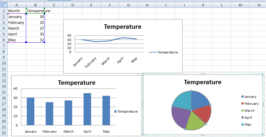
In this example, we created a data set that represents the average temperature for each month.
Step 3: Create a New Workbook
Next, create a new Workbook and add a worksheet to it:
wb = Workbook()
ws = wb.active
Step 4: Write DataFrame to the Worksheet
Write the data frame to the worksheet using the dataframe_to_rows() utility function from openpyxl.utils.dataframe:
for r in dataframe_to_rows(df, index=False, header=True):
    ws.append(r)
Step 5: Create Chart Objects
Now we will create LineChart, BarChart, and PieChart objects:
line_chart = LineChart()
bar_chart = BarChart()
pie_chart = PieChart()
Step 6: Set the Data and Categories for the Charts
Define the data and categories for all charts:
data = Reference(ws, min_col=2, min_row=1, max_row=df.shape[0] + 1, max_col=2)
cats = Reference(ws, min_col=1, min_row=2, max_row=df.shape[0] + 1)
Step 7: Add Data and Categories to the Charts
Add the data and categories to the charts we defined:
line_chart.add_data(data, titles_from_data=True)
line_chart.set_categories(cats)

bar_chart.add_data(data, titles_from_data=True)
bar_chart.set_categories(cats)

pie_chart.add_data(data, titles_from_data=True)
pie_chart.set_categories(cats)
Step 8: Add the Charts to the Worksheet
Next, add the charts to the worksheet at the specified cells which you can change as per your need:
ws.add_chart(line_chart, "D3")
ws.add_chart(bar_chart, "D15")
ws.add_chart(pie_chart, "D27")
Step 9: Save the Workbook to a File
Finally, save the Workbook to an XLSX file:
wb.save("various_charts.xlsx")
Now run this script in your Python environment, and it will create an Excel file named various_charts.xlsx with a line chart, a bar chart, and a pie chart.
Here is the complete Python script, which will generate an XLSX file with charts:
# Import necessary libraries
from openpyxl import Workbook
from openpyxl.utils.dataframe import dataframe_to_rows
from openpyxl.chart import LineChart, BarChart, PieChart, Reference
import pandas as pd

# Create a pandas DataFrame with some dummy data
df = pd.DataFrame({
    'Month': ['January', 'February', 'March', 'April', 'May'],
    'Temperature': [30, 25, 27, 35, 32]
})

# Create a new Workbook and add a worksheet to it
wb = Workbook()
ws = wb.active

# Write DataFrame to the worksheet
for r in dataframe_to_rows(df, index=False, header=True):
    ws.append(r)

# Create chart objects
line_chart = LineChart()
bar_chart = BarChart()
pie_chart = PieChart()

# Set the data and categories for the charts
data = Reference(ws, min_col=2, min_row=1, max_row=df.shape[0] + 1, max_col=2)
cats = Reference(ws, min_col=1, min_row=2, max_row=df.shape[0] + 1)

# Add data and categories to the charts
line_chart.add_data(data, titles_from_data=True)
line_chart.set_categories(cats)

bar_chart.add_data(data, titles_from_data=True)
bar_chart.set_categories(cats)

pie_chart.add_data(data, titles_from_data=True)
pie_chart.set_categories(cats)

# Add the charts to the worksheet
ws.add_chart(line_chart, "D3")
ws.add_chart(bar_chart, "D15")
ws.add_chart(pie_chart, "D27")

# Save the workbook to a file
wb.save("various_charts.xlsx")
Conclusion
We have just created a Python script that will download an XLSX file which will have the visual chart representations including Line, bar and Pie chart. We created these interactive charts using the IOpenpyxl library in Python. We also discussed how to create and work with a Workbook and Worksheet, also we added data and created different types of charts with that data.
Hope this will be helpful!