Angular range selection slider bar by dragging example tutorial; In this guide, we will discuss how to add Angular draggable range slider bar with to and from markers by using a popular npm package @angular-slider/ngx-slider.
To implement a Range Slider in the Angular application, we have the ngx-slider library. It is very popular, fully customizable and works perfectly in responsive screen sizes. Moreover, it works great with Angular 6+ version projects.
What is a Range slider Component/ Widget?
The range slider component is mainly used as an interactive widget. It enables a user to select a value on a scale or bar with provided ticks by simply dragging the markers. A user can select a single value or a range or values between minimum and maximum value provided on the slider bar.
Why the Range slider Widget is used?
This type of interactive widget is mainly used when we want to get some range preferences from a user. For example like Price Range, Salary Range, Choose temperature etc. Mainly used in scenarios where a single value or range need to be provided through user interaction.
Features of NGX Slider Component:
Let’s have a quick look at its various robust features making it a perfect choice for every use case:
- Works with both Reactive and Template Driven forms.
- Can be placed in Vertical or Horizontal Position.
- The Slider markers can be configured both functionally and with custom looks.
- Range slider can have single or double ticks.
- UI Style of Range slider is very easy to customise.
How to Implement Draggable Range Slider Example in Angular application?
We’ll follow these simple steps to add the range slider using the ngx-slider package in our application.
- Create Angular Application
- Install the NGX Slider Package
- Import NgxSliderModule in App Module
- Adding Draggable Single Range Slider in App
- Adding Double Range Slider in App
- Customise UI CSS Style of NGX Slider
- Configuration Properties and Methods
- Run the Angular Application
Create Angular Application
Before creating the Angular application, make sure you have Angular CLI installed on your system.
$ npm install -g @angular/cliAfter that, you are ready to create a new Angular project. Execute below CLI command to create a new angular application.
$ ng new angular-ngx-slider-appMove into the project directory
$ cd angular-ngx-slider-app
Install the NGX Slider Package
Next, we’ll install the ngx-slider package in our angular application. Go on and execute the below npm command to start the installation.
$ npm install @angular-slider/ngx-slider
Import NgxSliderModule in App Module
Before using the NGX Slider component, we need to import the NgxSliderModule into the app’s main module. Which will provide its service throughout the application.
Open the app.module.ts file, and update the imports array
import { BrowserModule } from '@angular/platform-browser';
import { NgModule } from '@angular/core';

import { AppRoutingModule } from './app-routing.module';
import { AppComponent } from './app.component';

import { NgxSliderModule } from '@angular-slider/ngx-slider';

@NgModule({
  declarations: [
    AppComponent
  ],
  imports: [
    BrowserModule,
    AppRoutingModule,
    NgxSliderModule
  ],
  providers: [],
  bootstrap: [AppComponent]
})

export class AppModule { }
Adding Draggable Single Range Slider in App
We’re done with configurations, lets create a simple range slider component in the application. We can easily create the Range Slider by adding the <ngx-slider> directive in the template.
Open the app.component.html file and update it with the following template.
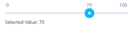
<ngx-slider [(value)]="value" [options]="options"></ngx-slider>
Selected Value: {{value}}
Now, move to the component class, import the type Options to define values in the options object. The value property binding will have a value of type number.
Open the app.component.ts file and update it with the following code.
import { Component } from '@angular/core';
import { Options } from '@angular-slider/ngx-slider';

@Component({
  selector: 'app-root',
  templateUrl: './app.component.html',
  styleUrls: ['./app.component.scss']
})

export class AppComponent {

  value: number = 70;
  options: Options = {
    floor: 0,
    ceil: 100
  };

  constructor() { }
}
Above, we have floor and ceil properties in the options object, that will mark the minimum and maximum value on the slider bar.
We’re done with a simple range slider. By default, it will show only one draggable marker as shown below.
Adding Double Range Slider in App
To show double markers in the range slider, we need to update the <ngx-slider> directive with [(highValue)]. It will add another marker in the slider bar, allowing a user to select the upper range or selection by dragging it.
update the app.component.html with this template HTML
<ngx-slider [(value)]="value" [(highValue)]="highValue" [options]="options"></ngx-slider>
 <div>Lower Range Value: {{value}}</div>
 <div>High Range Value: {{highValue}}</div>
In the component class, you only need to define the highValue property.
import { Component } from '@angular/core';
import { Options } from '@angular-slider/ngx-slider';

@Component({
  selector: 'app-root',
  templateUrl: './app.component.html',
  styleUrls: ['./app.component.scss']
})

export class AppComponent {

  value: number = 70;
  highValue: number = 90;
  options: Options = {
    floor: 0,
    ceil: 100
  };
  constructor() { }
}
This will create two markers in the Slider bar as shown below.

Customise UI CSS Style of NGX Slider
Now we’ll discuss how to easily and quickly modify the UI style of ngx-slider directive component. First, just wrap the <ngx-slider> directive with a class. Here we have custom-ngx-slider as a wrapper class.
<div class="custom-ngx-slider">
  <ngx-slider [(value)]="value" [(highValue)]="highValue" [options]="options"></ngx-slider>
</div>
Also update the options object in the component class, to add step and showTicks properties.
import { Component } from '@angular/core';
import { Options } from '@angular-slider/ngx-slider';

@Component({
  selector: 'app-root',
  templateUrl: './app.component.html',
  styleUrls: ['./app.component.scss']
})

export class AppComponent {

  value: number = 40;
  highValue: number = 60;
  options: Options = {
    floor: 0,
    ceil: 100,
    step: 5,
    showTicks: true
  };

  constructor() { }
}
Now, open the app.component.scss file then add the following CSS style to it
// We need to use ::ng-deep to overcome view encapsulation
::ng-deep {
    .custom-ngx-slider .ngx-slider .ngx-slider-bar {
      background: #ffe4d1;
      height: 5px;
    }
    .custom-ngx-slider .ngx-slider .ngx-slider-selection {
      background: red;
    }

    .custom-ngx-slider .ngx-slider .ngx-slider-pointer {
      width: 10px;
      height: 15px;
      top: auto; /* to remove the default positioning */
      bottom: 0;
      background-color: #22c70a;
    }

    .custom-ngx-slider .ngx-slider .ngx-slider-pointer:after {
      display: none;
    }

    .custom-ngx-slider .ngx-slider .ngx-slider-bubble {
      bottom: 14px;
    }

    .custom-ngx-slider .ngx-slider .ngx-slider-limit {
      font-weight: bold;
      color: red;
    }

    .custom-ngx-slider .ngx-slider .ngx-slider-tick {
      width: 3px;
      height: 15px;
      margin-left: 4px;
      border-radius: 0;
      background: #ccc;
      top: -1px;
    }

    .custom-ngx-slider .ngx-slider .ngx-slider-tick.ngx-slider-selected {
      background: rgb(0, 110, 255);
    }
  }
Configuration Properties and Methods
Range Slider directive provides various Properties and Methods to configure and handle a wide range of events triggered from the Range Slider component.
<ngx-slider
    [(value)]="value"
    [(highValue)]="highValue"
    [options]="options"
    (userChangeStart)="onUserChangeStart($event)"
    (userChange)="onUserChange($event)"
    (userChangeEnd)="onUserChangeEnd($event)"
    (valueChange)="onValueChange($event)"
   (highValueChange)="onHighValueChange($event)">
</ngx-slider>
You can check more details and demo on official documentation.
Run the Angular Application
You can now run the application by executing the ng serve command below.
$ ng serve –open
This will open the application in the localhost:4200 URL in your default browser.

Conclusion
We have completed our draggable range slider implementation tutorial in the Angular application. To summarise we discussed how to create a range slider with single and double markers. Moreover, we customised the UI of the marker using custom styled CSS. And also discussed various important configuration properties and events.
Hope you enjoyed this guide. Do share your thoughts… Thanks