In this Angular tutorial, you will learn how to open a full-screen dialog in an angular application. In Angular, we usually use the Material Library to quickly add UI components like DataTables, Form Controls, Dialog modals etc. So In this guide, we will use the Material Dialogs to convert them into full-screen modals using simple CSS customizations.
Full-screen modals are used to allow a user to perform actions on a full UI layout with a number of visible controls. Modal helps to popup a screen in front of the user to perform various actions like filling up important and required form details.
A full-screen dialog layout helps in restricting a user to fill in details before performing any further actions, which may include getting some required data that is required before proceeding with the next steps.
You can check this detailed tutorial on Material modals including how to open a dialog from a static template or component, passing data, close and open event handling and much more. Here we will concentrate on full-screen modals only.
How to add full-screen dialog in Angular application?
You can add a fullscreen Material dialog by following these quick steps:
Step 1 – Create Angular App
Step 2 – Install Material Library
Step 3 – Import Dialog Module
Step 4 – Open Material Modal
Step 5 – Customize to Full-Screen Modal
Step 1 – Create Angular App
To enable the ng command in the terminal window, make sure to instal the Angular CLI tool. If you already have, you can update it as well.
# Install NG CLI
npm install -g @angular/cli

#Update NG CLI
ng update
Afterwards, you can hit the following command to create a new angular project with the name provided:
ng new angular-material-dialog-appMove inside the application folder
cd angular-material-dialog-appStep 2 – Install Material Library
Thereafter creating and moving the terminal to the application folder, we will install the Material library by executing the ng add command. This makes the installation of the material library very easy, you can choose options while installation as shown below:
ng add @angular/material

# ? Choose a prebuilt theme name, or "custom" for a custom theme: Indigo/Pink
# ? Set up global Angular Material typography styles? No
# ? Set up browser animations for Angular Material? Yes
This will update the "styles" property array inside the angular.json file, which you can change anytime.
Step 3 – Import Dialog Module
The Material Library provides a huge set of usable API’s for its various modules and components. So we need to import only those modules, that we’re going to use in our application. This keeps our app more optimized and size-efficient.
Open the app.module.ts file to import the MatDialogModule under the imports array:
import { NgModule } from '@angular/core';
import { BrowserModule } from '@angular/platform-browser';

import { AppRoutingModule } from './app-routing.module';
import { AppComponent } from './app.component';
import { BrowserAnimationsModule } from '@angular/platform-browser/animations';

import { MatDialogModule } from '@angular/material/dialog';


@NgModule({
  declarations: [
    AppComponent
  ],
  imports: [
    BrowserModule,
    AppRoutingModule,
    BrowserAnimationsModule,
    MatDialogModule // < - Add here
  ],
  providers: [],
  bootstrap: [AppComponent]
})
export class AppModule { }
Step 4 – Open Material Modal
Now, we will create a new component that will open as a modal content.
Creating a new component named MyDialogComponent by executing the below command:
ng generate component comps/my-dialogIt will create a new component, and update the my-dialog.component.ts file:
import { Component, Inject, OnInit, Optional } from '@angular/core';
import { MatDialogRef, MAT_DIALOG_DATA } from '@angular/material/dialog';

@Component({
  selector: 'app-my-dialog',
  templateUrl: './my-dialog.component.html',
  styleUrls: ['./my-dialog.component.css']
})
export class MyDialogComponent implements OnInit {

  constructor(
    public dialogRef: MatDialogRef<MyDialogComponent>
  ) { }

  closeDialog() {
     this.dialogRef.close();
   }
}
Update the my-dialog.component.html file:
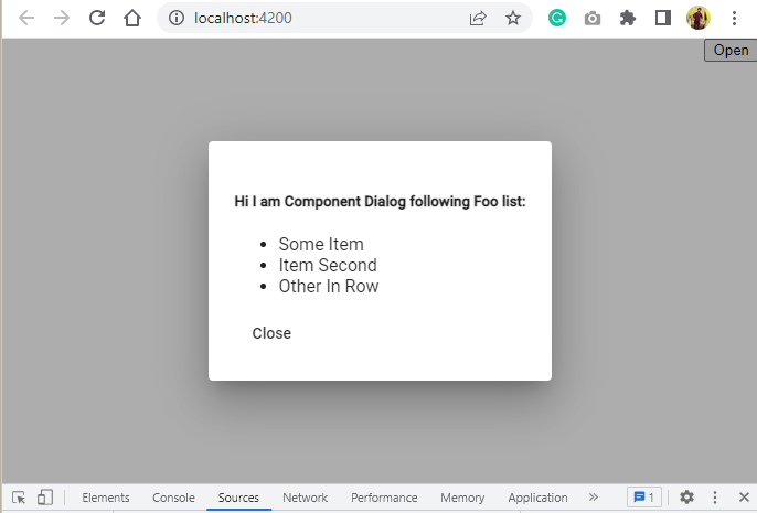
<h5>Hi I am Component Dialog following Foo list:</h5>
<ul>
<li>Some Item</li>
<li>Item Second</li>
<li>Other In Row</li>
</ul>
<button mat-button (click)="closeDialog()">Close</button>
Finally, update the App Component HTML to have a button and its method in the class:
constructor(
public dialog: MatDialog
) {
}

openCompDialog() {
    const myCompDialog = this.dialog.open(MyDialogComponent, { data: this.myFooList });
    myCompDialog.afterClosed().subscribe((res) => {
      // Data back from dialog
      console.log({ res });
    });
  }
We’re passing the component itself to open in the dialog, instead of template ref.
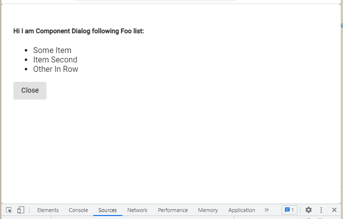
Step 5 – Customize to Full-Screen Modal
By default, the dialogs are displayed at the centre of the screen with max-width of 80%. But here you will learn how to make them full screen by adding a few configuration settings with modified width, height and custom CSS class.
this.dialog.open(MyDialogComponent,
      {
        panelClass: 'fullscreen-dialog'
      }
    );
The .fullscreen-dialog class you can add in the styles.css/scss file at the project root or remove view encapsulation and directly add in the my-dialog.component.css/scss file.
.fullscreen-dialog {
max-width: 100% !important;
max-height: 100% !important;
width: 100%;
height: 100%;
}
Conclusion
This is how you can easily and quickly convert a small sized centered modal dialog into a full screen dialog by simply adding a CSS style using a custom class.