In this Angular material tutorial, you will learn how to implement Dialog modal with an extensively used scenario tutorial with easy to go tutorial.
You will get to know how to position a Dialog or display a fullscreen modal popup. Explore various events and popup hooks including after opened or closed callbacks. Passing data dynamically to the modal and getting back the data to the parent component.
You will start with a new Angular 13 project, afterwords we will add the Material library to use its Dialog API module. Consequently, we will explore various use0cased with elaborated examples and demos to put you more to work instead of looking anywhere else.
Why Dialog or Modal UI Component?
We know Dialog AKA Modal got its popularity from the Bootstrap component, which floats over your content to catch all user attention at once. it can be used for any purpose from filling out important details using an intensive form to show a simple confirm Yes, No dialogue box.
With Material, you can have customized Modal with Header, Body, Footer panes or simply a paneless diolog. It can have an in-view template based or fully component-based Dialog modal. You can easily customize styles and control how data with go through it.
Let’s get our hands dirty!
How to Add Material Dialog in Angular App?
This is how you can open the Angular Material dialog.
Following are quick steps, including various types of Dialog and details about event hook handling to control data follow by passing in/ out of Dialog or Modal popup container:
Step 1 – Create Angular App
Step 2 – Install Material Library
Step 3 – Import Dialog Module
Step 4 – Dialog using Template
Step 5 – Dialog using Component
Step 7 – AfterOpened and AfterClosed Dialog Events
Step 8 – Full Screen Dialog Modal
Step 9 – Confirm Dialog with YES, NO Buttons
Step 10 – Dialog with Header, Body and Footer Panel
Step 1 – Create Angular App
To enable the ng command in the terminal window, make sure to instal the angular cli tool. If you already have, you can update it as well.
# Install NG CLI
npm install -g @angular/cli

#Update NG CLI
ng update
Afterwards, you can hit the following command to create a new angular project with the name provided:
ng new angular-material-dialog-appMove inside the application folder
cd angular-material-dialog-appStep 2 – Install Material Library
Thereafter creating and moving the terminal to the application folder, we will install the Material library by executing the ng add command. This makes the installation of the material library very easy, you can choose options while installation as shown below:
ng add @angular/material

# ? Choose a prebuilt theme name, or "custom" for a custom theme: Indigo/Pink
# ? Set up global Angular Material typography styles? No
# ? Set up browser animations for Angular Material? Yes
This will update the "styles" property array inside the angular.json file, which you can change anytime.
Step 3 – Import Dialog Module
The Material library provides huge set of usable API’s for its various modules and components. So we need to import only those modules, that we’re going to use in our application. This keeps out app more optimized and size-efficient.
Open the app.module.ts file to import the MatDialogModule under the imports array:
import { NgModule } from '@angular/core';
import { BrowserModule } from '@angular/platform-browser';

import { AppRoutingModule } from './app-routing.module';
import { AppComponent } from './app.component';
import { BrowserAnimationsModule } from '@angular/platform-browser/animations';

import { MatDialogModule } from '@angular/material/dialog';


@NgModule({
  declarations: [
    AppComponent
  ],
  imports: [
    BrowserModule,
    AppRoutingModule,
    BrowserAnimationsModule,
    MatDialogModule // < - Add here
  ],
  providers: [],
  bootstrap: [AppComponent]
})
export class AppModule { }
Step 4 – Dialog using Template, Pass and Get Data
Now we are all set to start using the simplest implementation of our Dialog popup using a template. We’ll also pass dynamic data into the Template of dialog to create a list out of it.
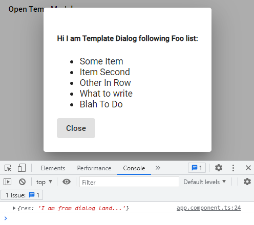
In the app.component.html add folloiwng template HTML
<button mat-button (click)="openTempDialog()">Open Temp Modal</button>

<ng-template #dialogRef let-mydata>
  <h5>Hi I am Template Dialog following Foo list:</h5>
  <ul *ngIf="mydata">
    <li *ngFor="let item of mydata">{{item}}</li>
  </ul>
  <button mat-button mat-dialog-close="I am from dialog land...">Close</button>
</ng-template>
The ng-template with ref variable #dialogRef will contain the template HTMl to show inside the Dialog we’re going to generate. The let-mydata (or any name you like) directive will contain the data we will pass into the open method.
Next, open the app.component.ts file and add the following content in it:
import { Component, TemplateRef, ViewChild } from '@angular/core';
import { MatDialog } from '@angular/material/dialog';

@Component({
  selector: 'app-root',
  templateUrl: './app.component.html',
  styleUrls: ['./app.component.css']
})
export class AppComponent {
  title = 'angular-material-dialog-app';

  @ViewChild('dialogRef')
  dialogRef!: TemplateRef<any>;

  myFooList = ['Some Item', 'Item Second', 'Other In Row', 'What to write', 'Blah To Do']

  constructor(public dialog: MatDialog) { }

  openTempDialog() {
    const myTempDialog = this.dialog.open(this.dialogRef, { data: this.myFooList });
    myTempDialog.afterClosed().subscribe((res) => {

      // Data back from dialog
      console.log({ res });
    });
  }
}
The @ViewChild with TemplateRef helps to get template context that we are passing into the open method. On top, we are passing the data property with any data set you wan to pass into the modal dynamically. This is how to send data to a TemplateRef MatDialog.
Step 5 – Dialog using Component
Templates can be used for quick implementation of less complex modals, but for keeping things cool, we need to have a separate components which will take care of our Dialog content and its data communication. let’s check how to pass data to and forth between parent and component popup modal.
Creating a new component named MyDialogComponent by executing below command:
ng generate component comps/my-dialogIt will create a new component, update the my-dialog.component.ts file:
import { Component, Inject, OnInit, Optional } from '@angular/core';
import { MatDialogRef, MAT_DIALOG_DATA } from '@angular/material/dialog';

@Component({
  selector: 'app-my-dialog',
  templateUrl: './my-dialog.component.html',
  styleUrls: ['./my-dialog.component.css']
})
export class MyDialogComponent implements OnInit {

  fromPage!: string;
  fromDialog!: string;

  constructor(
    public dialogRef: MatDialogRef<MyDialogComponent>,
    @Optional() @Inject(MAT_DIALOG_DATA) public mydata: any
  ) { }

  ngOnInit(): void {
    this.fromDialog = "I am from dialog land...";
  }

  closeDialog() { this.dialogRef.close({ event: 'close', data: this.fromDialog }); }
}
The fromPage and fromDialog variables are handling data to pass inside the Modal and sending back to parent using close() method.
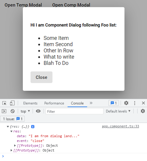
Update the my-dialog.component.html file to show the list of item passed dynamically:
<h5>Hi I am Component Dialog following Foo list:</h5>
<ul *ngIf="mydata">
  <li *ngFor="let item of mydata">{{item}}</li>
</ul>
<button mat-button (click)="closeDialog()">Close</button>
Finally update the App Component HTML to have a button and its method in the class:
openCompDialog() {
    const myCompDialog = this.dialog.open(MyDialogComponent, { data: this.myFooList });
    myCompDialog.afterClosed().subscribe((res) => {
      // Data back from dialog
      console.log({ res });
    });
  }
We’re passing the component it self to open in the dialog, instead of template ref.
Step 7 – AfterOpened and AfterClosed Dialog Events
The Dialog provides three useful Hooks that can be used to manage dialog data render.
- afterOpened(): Triggered After Dialog is Opened.
- beforeClosed(): Triggered Before Dialog is Opened.
- afterClosed(): Triggered After Dialog is Closed.
These can be subscribed to the dialog open instance as shown below
openCompDialog() {
    const myCompDialog = this.dialog.open(MyDialogComponent, { data: this.myFooList });
    myCompDialog.afterOpened().subscribe((res) => {
      // Trigger After Dialog Opened
      console.log('After Opened', { res });
    });
    myCompDialog.beforeClosed().subscribe((res) => {
      // Trigger Before Dialog Closed
      console.log('Before Closed', { res });
    });
    myCompDialog.afterClosed().subscribe((res) => {
      // Trigger After Dialog Closed
      console.log('After Closed', { res });
    });
  }
Step 8 – Full Screen Dialog Modal
By default, the dialogs are displayed at the centre of the screen with max-width of 80%. But here you will learn how to make them full screen by adding few configuration settings with modified width, height and custom CSS class.
this.dialog.open(MyDialogComponent,
      {
        data: this.myFooList,
        panelClass: 'fullscreen-dialog',
        height: '100vh',
        width: '100%'
      }
    );
The .fullscreen-dialog class you can add in the styles.css/scss file at project root or remove view encapsulation and directly add in the my-dialog.component.css/scss file.
.fullscreen-dialog {
  max-width: 100% !important;
}
Step 9 – Confirm Dialog with YES, NO Buttons
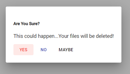
Here’s a quick look at how to modify a dialogue to show Yes, No or any custom button with their respective callback methods to trigger any required action. You can do it using a template or dedicated component.
HTML Template in my-dialog.component.html for dialogue modal will have the following”
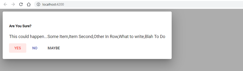
<h5>Are You Sure?</h5>
<p>This could happen...{{fromPage}}</p>
<button mat-button color="warn" (click)="yesDialog()">YES</button>
<button mat-button color="primary" (click)="noDialog()">NO</button>
<button mat-button (click)="maybeDialog()">MAYBE</button>
Add the following methods in my-dialog.component.ts file:
export class MyDialogComponent implements OnInit {

  fromPage!: string;
  fromDialog!: string;

  constructor(
    public dialogRef: MatDialogRef<MyDialogComponent>,
    @Optional() @Inject(MAT_DIALOG_DATA) public mydata: any
  ) { }

  ngOnInit(): void {
    this.fromPage = this.mydata;
    this.fromDialog = "I am from dialog land...";
  }

  yesDialog() {
    this.dialogRef.close({ event: 'yes-option', data: this.fromDialog });
  }
  noDialog() {
    this.dialogRef.close({ event: 'no-option', data: this.fromDialog });
  }
  maybeDialog() {
    this.dialogRef.close({ event: 'maybe-option', data: this.fromDialog });
  }
}
The AppModule class will have the following open method:
openConfirmDialog() {
    const myCompDialog = this.dialog.open(MyDialogComponent,
      {
        data: 'Your files will be deleted!'
      }
    );
    myCompDialog.afterClosed().subscribe((res) => {
      // Trigger After Dialog Closed

      switch (res.event) {
        case "yes-option":
          console.log('Yes Clicked');
          break;
        case "no-option":
          console.log('No Clicked');
          break;
        case "maybe-option":
          console.log('May Be Clicked');
          break;

        default:
          break;
      }
    });
  }
The MatDialogModule provides other mat tag directives to create Header, Body and Footer components for the Dialog modal.
<h2 mat-dialog-title>Install Angular</h2>
<mat-dialog-content class="mat-typography">
  <h3>Develop across all platforms</h3>
  <p>Learn one way to build applications with Angular and reuse your code and abilities to build
    apps for any deployment target. For web, mobile web, native mobile and native desktop.</p>
</mat-dialog-content>
<mat-dialog-actions align="end">
  <button mat-button mat-dialog-close>Cancel</button>
  <button mat-button [mat-dialog-close]="true" cdkFocusInitial>Install</button>
</mat-dialog-actions>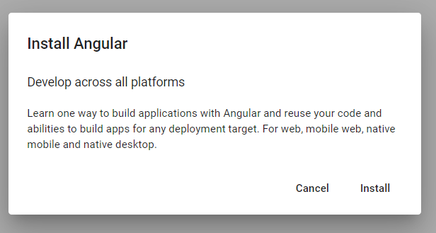
Step 11 – Positioning Material Dialog on Page
The position property can be used to place the dialog at top, bottom, left or right location of the page.
const myCompDialog = this.dialog.open(MyDialogComponent,
      {
        data: this.myFooList,
        position: {
          left: '10px',
          top: '10px',
        }
      }
    );
Conclusion
We have completed the Material Dialog tutorial, with various useful use-cases and examples. We discussed how to use a template or component and pass dynamic data in the dialog modal popup. Also, we looked into various callback hooks to control various custom actions.
Using the custom CSS style and class we modified the dialog width to display in the fullscreen mode. Hope you like the tutorial and it was helpful and handy for quick development suggestions.