Tree View component in Angular app with checkboxes example; In this Angular tutorial, we’re going to discuss how to create a dynamic Tree View list with parent-child relation having the expand/ collapse feature where each list can have checkboxes to check to uncheck its child items. Moreover, we can also have a filter search filter in this tree view list.
A list of dynamic information lists can have lots of parent-child items that can be easily represented in the form of tree view lists.
A Tree view list can show the hierarchy of items with a spacial indented parent-child UI design. Today we’ll discuss how to easily create a Tree view structure list by using a cool package named ngx-treeview.
The ngx-treeview package not only creates a Tree view lists but also adds some required features:
- Filter search on tree view items having parent-child relation.
- Master and checkbox selection for all and each item in the tree view.
- The tree view list can also be shown as a drop-down with checkboxes to enable selection.
- Expand/ Collapse all control
Required Dependencies
The ngx-treeview package uses Lodash helper functions to optimize the logical operations on the tree view and Bootstrap to style the elements. So Lodash and Bootstraps are the required dependencies for using the ngx-treeview.
Let’s start implementation with an example application.
How to add Tree View with Checkboxes in Angular App?
Create a New Angular Application
Run the following ng command to create a new Angular project
$ ng new angular-ngx-treeview-app
# ? Would you like to add Angular routing? No
# ? Which stylesheet format would you like to use? SCSS
Enter the project directory
$ cd angular-ngx-treeview-appRun the application
$ ng serve --open
Install ngx-treeview Package
Next, install the ngx-treeview package by executing below npm command at the project root.
$ npm install ngx-treeview --save
Install Bootstrap
As a dependency for adding style, we need to import the bootstrap style files. We can do it following ways:
Method 1#
Include bootstrap.css in the index.html file’s <head> section
<link rel="stylesheet" href="https://stackpath.bootstrapcdn.com/bootstrap/4.5.2/css/bootstrap.min.css">
Method 2#
Install the bootstrap package by hitting below the npm command.
$ npm install bootstrapThen update the styles.scss file with bootstrap.scss file import
@import "~bootstrap/scss/bootstrap.scss";
Update App Module
Now import the TreeviewModule to use its components across the Angular application.
Open the app.module.ts file and update its content as shown below:
// app.module.ts
import { BrowserModule } from '@angular/platform-browser';
import { NgModule } from '@angular/core';

import { AppComponent } from './app.component';

import { TreeviewModule } from 'ngx-treeview';

@NgModule({
  declarations: [
    AppComponent
  ],
  imports: [
    BrowserModule,
    TreeviewModule.forRoot()
  ],
  providers: [],
  bootstrap: [AppComponent]
})
export class AppModule { }
Creating an Inline Tree View list
The ngx-treeview component can be added in the template HTML with some property bindings to create an inline page embedded Tree View list element.
<ngx-treeview [items]="items"></ngx-treeview>The [items] property takes a collection of an iterable array of objects having a defined set of literals as shown below:
// app.component.ts

import { Component } from '@angular/core';
import { TreeviewItem } from 'ngx-treeview';

@Component({
  selector: 'app-root',
  templateUrl: './app.component.html',
  styleUrls: ['./app.component.scss']
})
export class AppComponent {
  title = 'angular-ngx-treeview-app';

  items: any;

  simpleItems = {
    text: 'parent-1',
    value: 'p1',
    children: [
      {
        text: 'child-1',
        value: 'c1'
      }, {
        text: 'child-2',
        value: 'c2',
        children: [
          {
            text: 'child-1-2',
            value: 'c12'
          },
          {
            text: 'child-1-2',
            value: 'c12',
            disabled: true,
            collapsed: true,
            checked: true,
            children: [
              {
                text: 'child-1-2',
                value: 'c12'
              },
              {
                text: 'child-1-2',
                value: 'c12'
              }
            ]
          }
        ]
      },
    ]
  };

  simpleItems2 = {
    text: 'parent-2',
    value: 'p2',
    collapsed: true,
    children: [
      {
        text: 'child-1',
        value: 'c1'
      }, {
        text: 'child-2',
        value: 'c2',
        children: [
          {
            text: 'child-1-2',
            value: 'c12'
          },
          {
            text: 'child-1-2',
            value: 'c12',
            disabled: true,
            collapsed: true,
            checked: true,
            children: [
              {
                text: 'child-1-2',
                value: 'c12'
              },
              {
                text: 'child-1-2',
                value: 'c12'
              }
            ]
          }
        ]
      },
    ]
  };

  ngOnInit(): void {
    this.items = this.getItems([this.simpleItems, this.simpleItems2]);
  }

  getItems(parentChildObj) {
    let itemsArray = [];
    parentChildObj.forEach(set => {
      itemsArray.push(new TreeviewItem(set))
    });
    return itemsArray;
  }

}
The getItems method takes array then convert them into Objects of type TreeviewItem. The Object properties can have the following keys:
text: Label value for an item.value: The value for item checkbox.children: Define the items for items children.disabled: Boolean value to control the disabled state.checked: Boolean value to control the checkbox state.collapsed: Boolean value to control collapsed or expanded state.

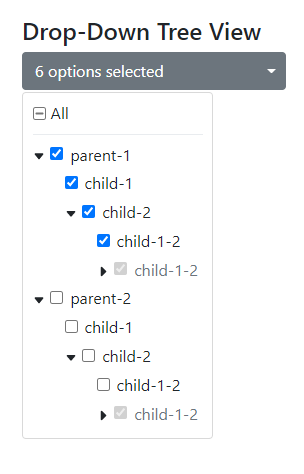
Creating the Tree View in Drop-Down Overlay
The ngx-dropdown-treeview component can be used to create a tree view in the Bootstrap’s drop-down component styled element.
<ngx-dropdown-treeview [items]="items">
  </ngx-dropdown-treeview>
This will create a drop-down with options having a tree view structure for selection using similar items collection object.
Configurations for Tree View
The ngx-treeview and ngx-dropdown-treeview components can have configurations passed into the [config] property.
<ngx-treeview
  [config]="config"
  [items]="items">
</ngx-treeview>
The TreeviewConfig class can be used to assign a type to the config object.
// app.component.ts

import { Component } from '@angular/core';
import { TreeviewItem, TreeviewConfig } from 'ngx-treeview';

@Component({
  selector: 'app-root',
  templateUrl: './app.component.html',
  styleUrls: ['./app.component.scss']
})
export class AppComponent {
  title = 'angular-ngx-treeview-app';

  config: TreeviewConfig = {
    hasAllCheckBox: true,
    hasFilter: true,
    hasCollapseExpand: true,
    decoupleChildFromParent: true,
    maxHeight: 500,
    hasDivider: true
  };

  ...
}
Properties to configure
The following properties can be configured to change representational and functional behavior:
hasAllCheckBox: Adds a master checkbox on top with the “All” label to control the checkbox selection state.hasFilter: Show/ Hide Search filter tree view list.hasCollapseExpand: A double-side arrow icon to expand or collapse all list items at once.decoupleChildFromParent: It decouples the parents from the child during filter search results.maxHeight: A max-height property can be added after which a scroll-bar will appear.hasDivider: Add a divider between “All” master checkbox and tree item list.
Event Handling During Selection and Filter Search
The (selectedChange) and (filterChange) events can be added to trigger events during any selection is changed or filter control is used to search items.
<ngx-treeview
    [config]="config"
    [items]="items"
    (selectedChange)="onSelectedChange($event)"
    (filterChange)="onFilterChange($event)"
  >
  </ngx-treeview>
Conclusion
The ngx-treeview component is easy to use and build a tree view structure with the object provided. There are many features available like Checkboxes, Expand Collapse, Select all, etc. We can also use a custom pipe ngxTreeview to configure how a custom Object will behave.
You can check the official documentation and demo here.