Colour picker component to select color code in React js application; In this React tutorial, you will learn how to add a color selection or picker component in React application.
In the web applications, which includes online tools to generate dynamic and creative layouts deploy color-picker widget. Using such interactive tools, users can choose colors and adjust the shade for multiple DOM elements for example cards, greetings or image editor tools.
We will create react application and install the react-color package to adding a color picker widget in the React application. Using a colour picker widget, a user can open a floating popup color selector layout and select any color shade. It allows users to choose color codes in any format including HEX, HSLA or RGBA.
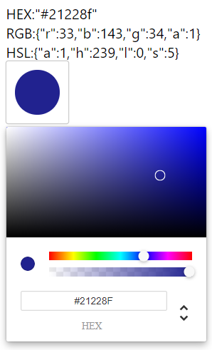
In this React color picker, we will create a Chrome styled color-picker, that will allow users to easily switch between multiple color code formats.
How to Add Color Selector or Picker Widget in React App?
- Step 1 – Setup React Application
- Step 2 – Install Color Picker Library
- Step 3 – Create Color Picker Component
- Step 4 – Import Color Picker Component in App.js
- Step 5 – Run React Application
Step 1 – Setup React Application
To start with, create a new react application by executing the npx command in the terminal window:
npx create-react-app react-color-picker-appMove into the react app directory:
cd react-color-picker-appStep 3 – Install Color Picker Library
Next, install the react-color package in your application. Execute the following npm command to install the library:
npm install react-color --saveStep 4 – Create Color Picker Component
To have a reusable color-picker component, head towards the src folder and create a new file colorpicker.component.js to have a separate ColorPickerComponent.
Update the colorpicker.component.js file with the following code:
import React from "react";
import { ChromePicker } from "react-color";
import reactCSS from "reactcss";

class ColorPickerComponent extends React.Component {
  state = {
    viewPicker: false,
    color: {
        rgb:{
            r: 33,
            b: 143,
            g: 34,
            a: 1,
        },
        hex:'#21228f',
        hsl:{
            a: 1,
            h: 239,
            l: 0,
            s: 5,
        }
    },
  };

  handleOnClick = () => {
    this.setState({
      viewPicker: !this.state.viewPicker,
    });
  };

  handleOnClose = () => {
    this.setState({
      viewPicker: false,
    });
  };

  handleOnChange = (color) => {
    this.setState({
      color: {
        rgb:color.rgb,
        hex:color.hex,
        hsl:color.hsl
    },
    });
    // Passing the selected color to parent component
    setTimeout(() => {
      // SetTimeout added to update color correctly
      this.props.onColorSelect(this.state.color);
    });

  };

  render() {
    const styles = reactCSS({
      default: {
        color: {
          width: "50px",
          height: "50px",
          borderRadius: "50px",
          background: `rgba(${this.state.color.rgb.r}, ${this.state.color.rgb.g}, ${this.state.color.rgb.b}, ${this.state.color.rgb.a})`,
        },
        swatch: {
          padding: "10px",
          background: "white",
          borderRadius: "2px",
          boxShadow: "0 0 0 1px rgba(0,0,0,.2)",
          cursor: "pointer",
          display: "inline-block",
        },
        cover: {
          position: "fixed",
          top: "0px",
          right: "0px",
          bottom: "0px",
          left: "0px",
        },
        popover: {
          position: "absolute",
          zIndex: "4",
        },
      },
    });

    return (
      <div>
        <div style={styles.swatch} onClick={this.handleOnClick}>
          <div style={styles.color} />
        </div>
        {this.state.viewPicker ? (
          <div style={styles.popover}>
            <div style={styles.cover} onClick={this.handleOnClose} />
            <ChromePicker
              color={this.state.color.rgb}
              onChange={this.handleOnChange}
            />
          </div>
        ) : null}
      </div>
    );
  }
}

export default ColorPickerComponent;
You will notice that we used the <ChromePicker/> component which allows users to switch between RBGA, HEX or RSLA formats. The <SketchPicker/> component can also be used by it shows only the RBGA format selection to the user.
The event handlers are getting used to update the selected color to pass back to the parent component as well as update the color picker component.
Step 5 – Import Color Picker Component in App.js
Now, import the ColorPickerComponent and render it inside the App component. The ColorPickerComponent will also pass the onChange event handler to get the selected color back in the parent ie the App component.
In the App.js file, we will define a state variable to show the selected color from the picker.
Update the App.js file as shown below:
import React, { Component } from "react";
import ColorPickerComponent from "./components/colorpicker.component";

class App extends Component {
  state = {
    color: {
        rgb:{
            r: 33,
            b: 143,
            g: 34,
            a: 1,
        },
        hex:'#21228f',
        hsl:{
            a: 1,
            h: 239,
            l: 0,
            s: 5,
        }
    },
  };

  onChange = (event) => {
    console.log(event);
    this.setState({ color: event });
  };
  render() {
    return (
      <div className="App" style={{backgroundColor:`rgba(${this.state.color.rgb.r},${this.state.color.rgb.g},${this.state.color.rgb.b},${this.state.color.rgb.a})`}}>
        <code>{JSON.stringify(this.state.color)}</code>

        <ColorPickerComponent onColorSelect={this.onChange} />
      </div>
    );
  }
}
export default App;
Step 6 – Run React Application
Finally, you can see the amazing color picker widget in action. Execute the following npm command to serve the application webserver.
npm startit will open the react application at the following URL:
http://localhost:3000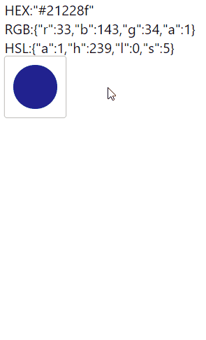
Conclusion
We have completed the implementation of color-picker widget component in react application. The implementation of Chrome styles colour picker allows selecting color code in multiple formats. We manage to get the select colour value in a parent component which is the App component in our case, this makes out colour picker compoennt reusable at multiple places in extensive applications.