In this comprehensive tutorial, you will learn how to create a robust and reusable date & time picker component in the Vue application. The DateTimepicker popup will be compatible with bootstrap 4 stylings. We will deploy the vue-bootstrap-datetimepicker library package to create a date-time picker.
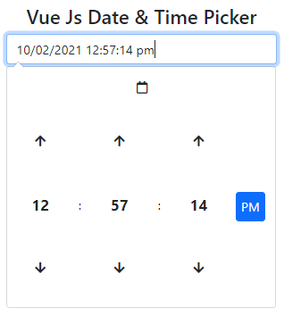
The Vue Bootstrap DateTimepicker package allows the creation of a popup calendar component on the Input control fields, using which a user can select date as well as time in any format. The calendar popup appears with various user-friendly options to jump any year or month using navigation arrows.
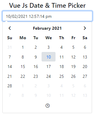
Similarly, the up and down arrows for time selection are very placed to provide elite convenience.
The date & time picker component can be used in commonly used forms and event management systems. There are a number of configuration options available to make it more flexible according to the use-case of the application. We will discuss most of them in detail with examples.
How to Create Date & Time Picker in Vue App?
Step 1 – Create Vue App
Before indulging in Vue project development, you need to install the Vue CLI tool on your system. Just execute the below command perform installation globally. This is a one-time installation process unless you want to upgrade the CLI version.
npm install -g @vue/cliAfterwards, you are ready to create new Vue applications by executing the below command. it will download a new Vue project boilerplate with the provided name.
vue create my-vue-appSoon after, enter into the application directory by hitting the change directory command below:
cd my-vue-appConveniently, you can execute the code . command provided by Visual Studio Code(VS Code) IDE to open the project in VS Code.
Step 2 – Installation of Bootstrap and Vue Date Time Picker Packages
Thereafter, perform installation of the bootstrap package to add-up style dependency and vue-bootstrap-datetimepicker by executing the below command at once:
npm install bootstrap vue-bootstrap-datetimepickerTo use font-awesome icons in the picker, you can install the following package as well:
npm i @fortawesome/fontawesome-freeStep 3 – Using Datepicker Module
To provide access to external modules in Vue, we need to import them into the ~src/main.js file by injecting them into the use() function as shown below:
import Vue from 'vue'
import App from './App.vue'

import datePicker from 'vue-bootstrap-datetimepicker';
Vue.use(datePicker); // Register datePicker

Vue.config.productionTip = false

new Vue({
  render: h => h(App),
}).$mount('#app')
Step 4 – Create DateTimePicker Reusable Component
The date-time picker widget will be kept in a separate component, this will allow you to use it anywhere across multiple areas of your application.
Head towards the ~src/components folder and create a new file names custom-date-time-picker.component.vue with the following code:
<template>
  <div class="container mt-5">
    <div class="row text-center">
      <div>
        <h2 class="">Vue Js Date & Time Picker</h2>
        <date-picker v-model="date" :config="options"></date-picker>
        <b>Selected Date & Time : {{ date }}</b>
      </div>
    </div>
  </div>
</template>

<script>
import datePicker from "vue-bootstrap-datetimepicker";
import "bootstrap/dist/css/bootstrap.css";
import "@fortawesome/fontawesome-free/css/all.css";
import "pc-bootstrap4-datetimepicker/build/css/bootstrap-datetimepicker.css";

export default {
  data() {
    return {
      date: new Date(),
      options: {
        format: "DD/MM/YYYY h:m:s a",
        useCurrent: false,
        icons: {
          time: "far fa-clock",
          date: "far fa-calendar",
          up: "fas fa-arrow-up",
          down: "fas fa-arrow-down",
          previous: "fas fa-chevron-left",
          next: "fas fa-chevron-right",
          today: "fas fa-calendar-check",
          clear: "far fa-trash-alt",
          close: "far fa-times-circle",
        },
      },
    };
  },
  components: {
    datePicker,
  },
};
</script>
Step 5 – Adding Date Time Picker
Now, we will import the custom date time picker component then use it in App.vue file as shown below:
<template>
  <div>
    <CustomDateTimePicker />
  </div>
</template>

<script>
  import CustomDateTimePicker from './components/custom-date-time-picker.component.vue'

  export default {
    name: 'App',
    components: {
      CustomDateTimePicker
    }
  }
</script>

<style scoped>
 .container {
     max-width: 600px;
 }
</style>
Step 6 – Running Vue App
In the package.json file, there are already existing node scripts. You can execute the following script to start the development server and run the application.
npm run serveIt will start the application server at the following location
http://localhost:8080/
Conclusion
We have completed the implementation of the Date Time picker component using Vue bootstrap datetimepicker packages. It provides a flexible set of configurations using which you can add validation for min and max dates, change the date format, show the only month and year for selection, configuring tooltip labels etc. You can have a look at a wide variety of options on this official documentation.