The way we do CSS styling in Reactive Native apps is mostly the same as we do in Web applications but only a few minor differences. We will create simple UI components like a page with Header, Content and Footer, Table and form with Checkbox, Radio buttons and Textarea.
In React Native, instead of using classes or IDs, we directly style the component using JavaScript objects. React Native also uses Flexbox for layout, which works in a similar to the web with a few exceptions.
Let’s have a look on sample UI components and how we can style them using Javascript Objects:
Basic Styling
Here’s a simple example of how to style a component in React Native:
import React from 'react';
import { View, Text, StyleSheet } from 'react-native';

const MyComponent = () => (
  <View style={styles.container}>
    <Text style={styles.text}>Hello, world!</Text>
  </View>
);

const styles = StyleSheet.create({
  container: {
    flex: 1,
    justifyContent: 'center',
    alignItems: 'center',
    backgroundColor: '#F5FCFF',
  },
  text: {
    fontSize: 20,
    textAlign: 'center',
    margin: 10,
  },
});

export default MyComponent;
In this example, we’re using the StyleSheet.create method to create a styles object. This object contains two properties, container and text, each of which is an object that defines style rules. We then use these style rules in our component by passing them to the style prop.

Flexbox
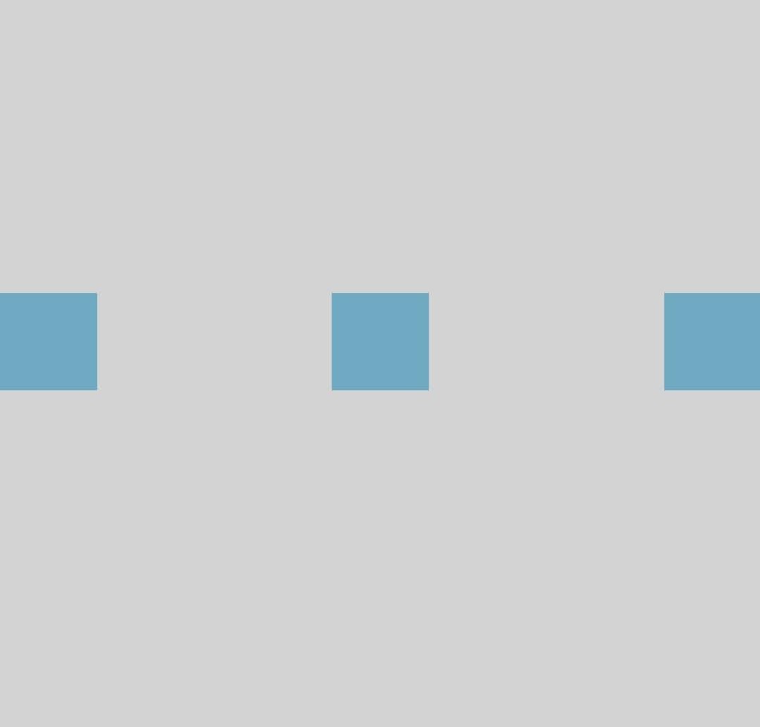
Flexbox is a powerful layout tool. It allows us to specify how your components need to be laid out on the screen. Here’s an example of how to use Flexbox in React Native:
import React from 'react';
import { View, StyleSheet } from 'react-native';

const MyComponent = () => (
  <View style={styles.container}>
    <View style={styles.box} />
    <View style={styles.box} />
    <View style={styles.box} />
  </View>
);

const styles = StyleSheet.create({
  container: {
    flex: 1,
    flexDirection: 'row',
    justifyContent: 'space-between',
    alignItems: 'center',
  },
  box: {
    width: 50,
    height: 50,
    backgroundColor: 'skyblue',
  },
});

export default MyComponent;
In this example, we’re using the flexDirection, justifyContent, and alignItems properties to control the layout of our boxes.
Handling Different Screen Sizes
React Native provides a Dimensions API which you can use to get the width and height of the screen:
import { Dimensions } from 'react-native';

const windowWidth = Dimensions.get('window').width;
const windowHeight = Dimensions.get('window').height;
You can use these values to create responsive designs. For example, you might want to use a different layout for larger screens:
const styles = StyleSheet.create({
  container: {
    flex: 1,
    flexDirection: windowWidth > 500 ? 'row' : 'column',
  },
});
import React from 'react';
import { View, Text, StyleSheet, Dimensions } from 'react-native';

const App = () => {
  return (
    <View style={styles.container}>
      <View style={styles.header}>
        <Text style={styles.headerText}>Header</Text>
      </View>
      <View style={styles.content}>
        <Text style={styles.contentText}>Content goes here</Text>
      </View>
      <View style={styles.footer}>
        <Text style={styles.footerText}>Footer</Text>
      </View>
    </View>
  );
};

const windowWidth = Dimensions.get('window').width;
const windowHeight = Dimensions.get('window').height;

const styles = StyleSheet.create({
  container: {
    flex: 1,
    flexDirection: 'column',
  },
  header: {
    height: windowHeight * 0.1,
    backgroundColor: '#f8d7da',
    justifyContent: 'center',
    alignItems: 'center',
  },
  headerText: {
    fontSize: 20,
    color: '#721c24',
  },
  content: {
    flex: 1,
    backgroundColor: '#d1ecf1',
    justifyContent: 'center',
    alignItems: 'center',
  },
  contentText: {
    fontSize: 18,
    color: '#0c5460',
  },
  footer: {
    height: windowHeight * 0.1,
    backgroundColor: '#c3e6cb',
    justifyContent: 'center',
    alignItems: 'center',
  },
  footerText: {
    fontSize: 16,
    color: '#155724',
  },
});

export default App;
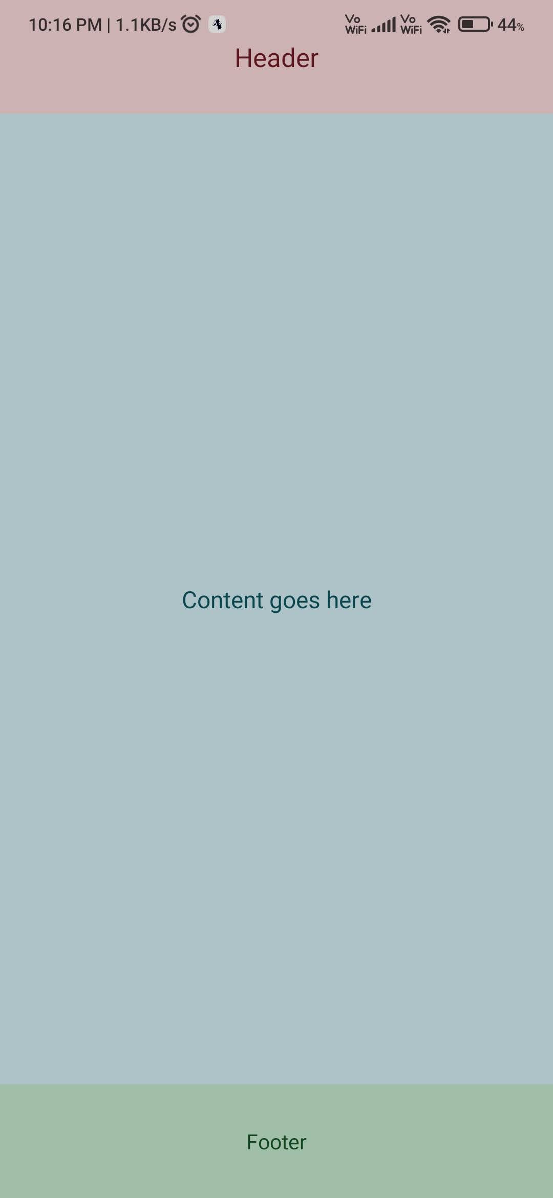
We have a header, content, and footer section. Each section is a View component with its own styles. The header and footer have a fixed height, while the content the section takes up the remaining space thanks to the flex: 1 style.
Form with Select Box, Check Box, Radio Input, and Textarea
React Native doesn’t have built-in components for form elements like select boxes, checkboxes, radio buttons, and textareas. However, there are many libraries available that provide these components, such as react-native-elements and react-native-paper.
npm install react-native-paper
Here’s an example using react-native-paper:
import React from 'react';
import { View, StyleSheet } from 'react-native';
import { RadioButton, Checkbox, TextInput, Button } from 'react-native-paper';

const MyForm = () => {
  const [checked, setChecked] = React.useState(false);
  const [value, setValue] = React.useState('first');

  return (
    <View style={styles.container}>
      <RadioButton.Group onValueChange={newValue => setValue(newValue)} value={value}>
        <View>
          <Text>First</Text>
          <RadioButton value="first" />
        </View>
        <View>
          <Text>Second</Text>
          <RadioButton value="second" />
        </View>
      </RadioButton.Group>

      <Checkbox
        status={checked ? 'checked' : 'unchecked'}
        onPress={() => {
          setChecked(!checked);
        }}
      />

      <TextInput
        label="Textarea"
        multiline
        numberOfLines={4}
        style={styles.textarea}
      />

      <Button mode="contained" onPress={() => console.log('Submitted')}>
        Submit
      </Button>
    </View>
  );
};

const styles = StyleSheet.create({
  container: {
    flex: 1,
    justifyContent: 'center',
    padding: 8,
  },
  textarea: {
    height: 100,
    marginBottom: 12,
  },
});

export default MyForm;
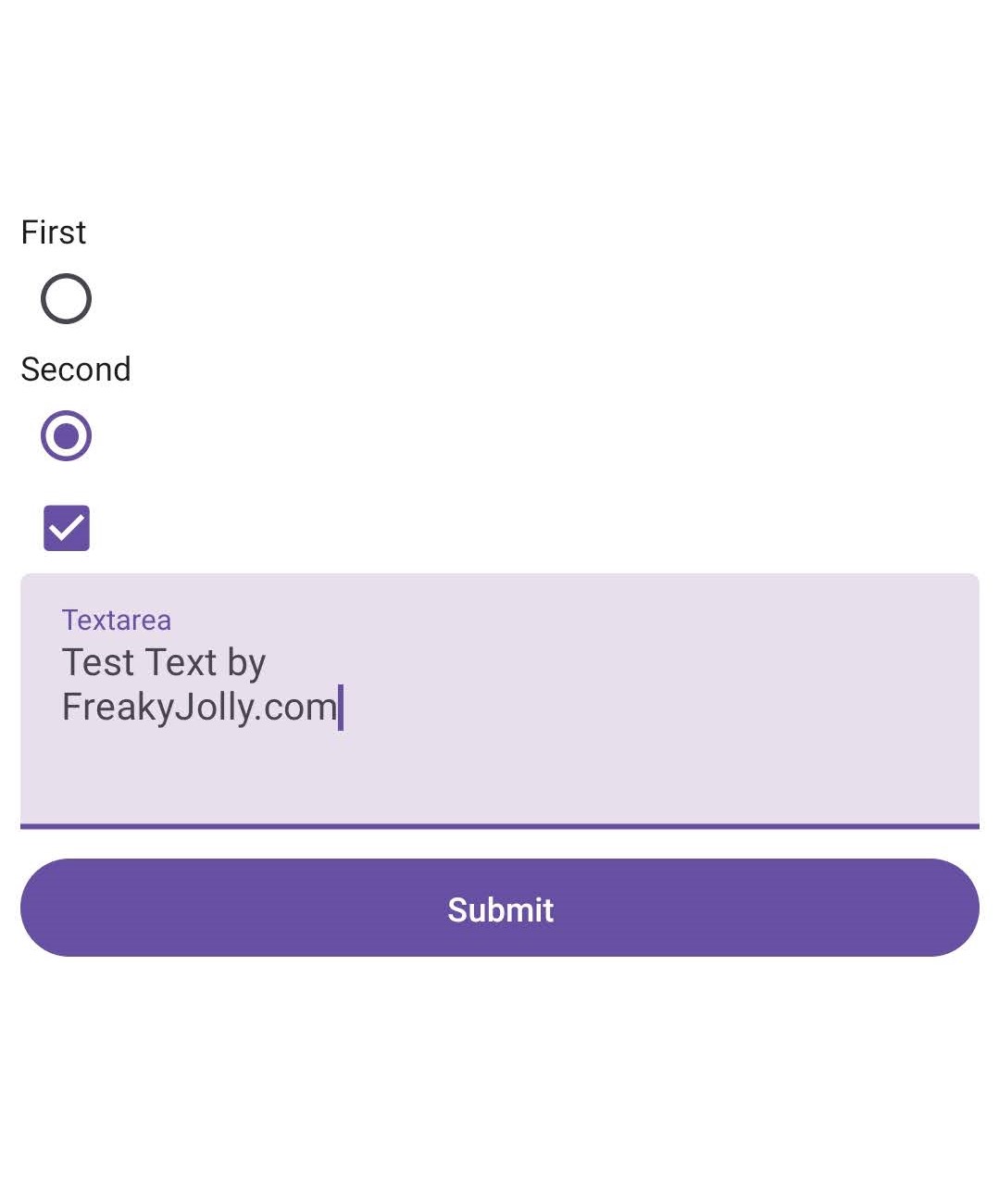
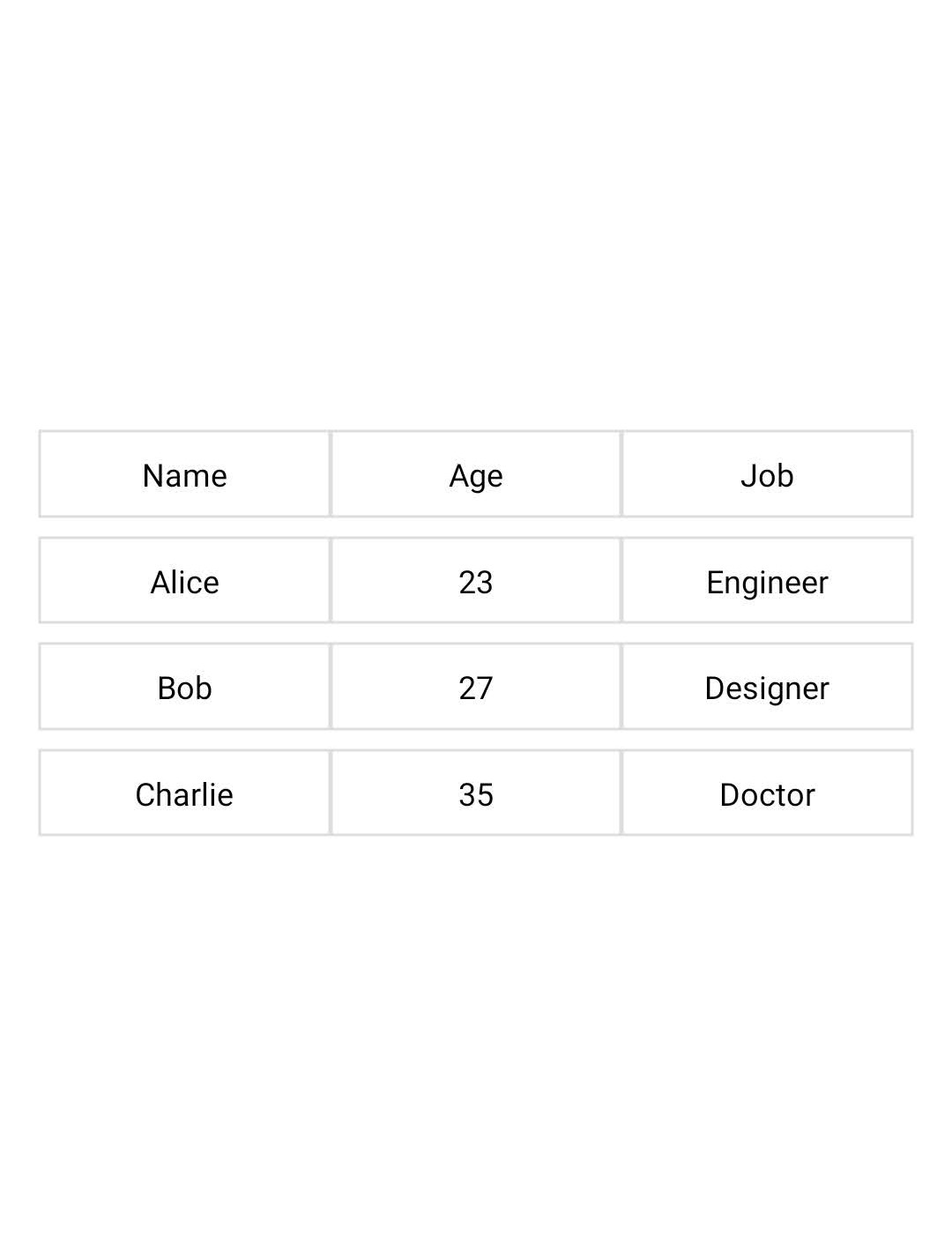
Table Grid
React Native doesn’t have a built-in table component, but you can easily create a grid layout using the View and Text components:
import React from 'react';
import { View, Text, StyleSheet } from 'react-native';

const MyTable = () => {
  const data = [
    ['Name', 'Age', 'Job'],
    ['Alice', '23', 'Engineer'],
    ['Bob', '27', 'Designer'],
    ['Charlie', '35', 'Doctor'],
  ];

  return (
    <View style={styles.container}>
      {data.map((row, i) => (
        <View key={i} style={styles.row}>
          {row.map((cell, j) => (
            <View key={j} style={styles.cell}>
              <Text>{cell}</Text>
            </View>
          ))}
        </View>
      ))}
    </View>
  );
};

const styles = StyleSheet.create({
  container: {
    flex: 1,
    justifyContent: 'center',
    padding: 16,
  },
  row: {
    flexDirection: 'row',
    marginBottom: 8,
  },
  cell: {
    flex: 1,
    justifyContent: 'center',
    alignItems: 'center',
    padding: 8,
    borderWidth: 1,
    borderColor: '#ddd',
  },
});

export default MyTable;
Conclusion
We discussed simple UI components and ways to style them using CSS styles. we created a simple hello word example that is kept in the centre of the screen. Then we create a simple grid example with a more detailed layout having header, content and footer sections. The most common data representation is done via tables and given CSS style to to create in the center of the screen.