React-select is a popular library for creating custom select elements in React applications. It offers a wide range of features and customization options, making it a great choice for building advanced select elements. With React-select, developers can easily create and customize select elements with a simple and intuitive API. In this tutorial, we will go over how to use React-select in a React application, including examples of how to customize the library to fit your specific use case.
Getting Started:
To get started, you will need to install the React-select library using npm. You can do this by running the command npm install react-select. Once the library is installed, you can import it into your React component and use it to create a select element. For example:
import React from 'react';
import Select from 'react-select';
function App() {
const options = [
{ value: 'option1', label: 'Option 1' },
{ value: 'option2', label: 'Option 2' },
{ value: 'option3', label: 'Option 3' },
];
return (
<div>
<Select options={options} />
</div>
);
}
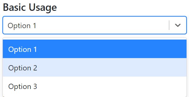
export default App;This example shows a basic usage of the React-select library, where the component is being passed an options array that will be used to populate the select element.
Customizing the Select Element:
React-select offers a wide range of customization options, which allows you to tailor the select element to fit your specific use case. For example, you can use the value prop to set the currently selected option, and the onChange prop to handle changes to the selected option. Additionally, you can use the components prop to customize the look and feel of the select element.
import React, { useState } from "react";
import Select from "react-select";
import "./App.css";

const customStyles = {
  option: (provided, state) => ({
    ...provided,
    backgroundColor: state.isSelected ? "#ff00ff" : "#ffd1dc",
    color: state.isSelected ? "#ffff00" : "#800080",
    padding: 20,
    border: state.isSelected ? "2px solid #32CD32" : "1px solid #0000ff",
    "&:hover": {
      backgroundColor: "#7fffd4",
      color: "#0000ff",
    },
  }),
  control: (provided) => ({
    ...provided,
    minHeight: 50,
    backgroundColor: "#ffc0cb",
    borderRadius: 25,
    border: "2px solid #ff00ff",
    fontSize: 20,
    "&:hover": {
      borderColor: "#7fffd4",
    },
  }),
  singleValue: (provided) => ({
    ...provided,
    color: "#ff00ff",
    fontSize: 20,
  }),
  placeholder: (provided) => ({
    ...provided,
    color: "#ff00ff",
    fontSize: 20,
  }),
};

function App() {
  const options = [
    { value: "option1", label: "Option 1" },
    { value: "option2", label: "Option 2" },
    { value: "option3", label: "Option 3" },
  ];

  const [selectedOption, setSelectedOption] = useState(null);

  const handleChange = (selectedOption) => {
    setSelectedOption(selectedOption);
  };

  return (
    <div className="wrapper">
      <h1>React Select Examples</h1>
      <h4>Basic Usage</h4>
      <Select options={options} />

      <h4>Customizing the Select Element</h4>
      <Select
        options={options}
        value={selectedOption}
        onChange={handleChange}
        styles={customStyles}
      />
    </div>
  );
}

export default App;
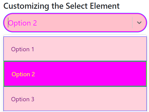
In this example, I have used different high-contrast colors like pink, purple, yellow, sea green and blue for different parts of the select element. The option key is used to customize the appearance of each option in the dropdown, control key is used to customize the select box itself, singleValue is used to customize the selected item, placeholder is used to customize the placeholder text.
And also used &:hover css selector to change color when hover on options and control.
You can use this customStyle in the same way as I have shown above in the code snippet.
You can adjust the colors and styles as per your requirement to make it in your desired design.
Server-Side example:
React-select also offers an async prop that can handle server-side filtering and loading of options. The async prop expects a function that takes in an input value and returns a promise that resolves to an array of options. This is particularly useful when you have a large number of options that need to be loaded from a server.
In this tutorial we will also take a look at an example of how you can use the React-select library with a JSON server:
import React, { useState } from 'react';
import Select from 'react-select';

function App() {
  const [selectedOption, setSelectedOption] = useState(null);

  return (
    <div>
      <Select
        value={selectedOption}
        onChange={setSelectedOption}
        loadOptions={loadOptions}
        async
      />
    </div>
  );
}

async function loadOptions(inputValue) {
  const response = await fetch(`http://localhost:3000/options?q=${inputValue}`);
  const data = await response.json();
  return data.options;
}

export default App;
Multiple Select Example:
React-select also allows you to create a multiple select element by setting the isMulti prop to true. This allows users to select multiple options from the select element. For example:
import React, { useState } from 'react';
import Select from 'react-select';

function App() {
  const [selectedOptions, setSelectedOptions] = useState([]);
  const options = [
    { value: 'option1', label: 'Option 1' },
    { value: 'option2', label: 'Option 2' },
    { value: 'option3', label: 'Option 3' },
  ];

  return (
    <div>
      <Select
        options={options}
        value={selectedOptions}
        onChange={setSelectedOptions}
        isMulti
      />
    </div>
  );
}

export default App;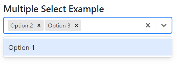
Setting and getting values from React-select
When creating the select element, you can set the value prop to a value or an array of values that will be selected by default. For example:
import React, { useState } from 'react';
import Select from 'react-select';

function App() {
  const options = [
    { value: 'option1', label: 'Option 1' },
    { value: 'option2', label: 'Option 2' },
    { value: 'option3', label: 'Option 3' },
  ];

  return (
    <div>
      <Select
        options={options}
        value={options[1]}
      />
    </div>
  );
}

export default App;
In this example, the value prop is set to options[1], which will select “Option 2” by default.
To get the selected value or values, you can use the onChange prop and pass it a callback function that updates a state variable or calls a function that processes the selected value(s). For example:
import React, { useState } from 'react';
import Select from 'react-select';

function App() {
  const [selectedOption, setSelectedOption] = useState(null);
  const options = [
    { value: 'option1', label: 'Option 1' },
    { value: 'option2', label: 'Option 2' },
    { value: 'option3', label: 'Option 3' },
  ];

  const handleChange = (selectedOption) => {
    setSelectedOption(selectedOption);
  }

  return (
    <div>
      <Select
        options={options}
        value={selectedOption}
        onChange={handleChange}
      />
      <p>Selected option: {selectedOption?.label}</p>
    </div>
  );
}

export default App;
In above example, the onChange prop is set to the handleChange function, which updates the selectedOption state variable when the user makes a selection. The selected option label is then displayed in the component.
In case of multi select, you can use setSelectedOptions and selectedOptions in place of setSelectedOption and selectedOption.
Note: The value prop should match the shape of the options array, so if the options array contains objects with value and label properties, then the value prop should also be an object with value and label properties.
Conclusion:
React-select is a powerful library for creating custom select elements in React applications. With its wide range of features and customization options, it offers a lot of flexibility for building advanced select elements. This tutorial provided an overview of how to use the React-select library, as well as examples of some of the ways you