In this React tutorial, we’ll discuss how to add Datepickers and Timepicker in the ReactJS application by using the Material UI library.
Material UI library is exclusively created for React application. Material provides a wide variety of ready to use component APIs like Tables, Dialog modals, Inputs, Buttons, Grids, etc.
The components created by using Material UI are compatible with mobile interfaces as well. So we can easily implement Material UI components supporting multi-dimension screens.
We’ll be using Material UI to add Datepicker and Timepicker components and explore its various configuration options.
Create a React Application
First, we’ll create a new React application using npx create-react-app command
$ npx create-react-app react-materialui-date-timepicker-appMove inside the react app
$ cd react-materialui-date-timepicker-appRun application
$ npm start
Install Material UI and Other Packages
After creating the React application, install the Material UI package by executing the below NPM command
$ npm install @material-ui/coreFor using the Datepicker component, we also need to install the Material UI Pickers package
$ npm install @material-ui/pickersInstall the date-io package to perform various basic date operations
$ npm install date-fns @date-io/date-fns@1Note: For material-ui-pickers v3 use v1.x version of @date-io adapters.
Using Datepicker Material UI Components
There are a number of UI components provided by Material UI package modules. To use a component we first import it in the React Component. It can be a functional or class component.
Import MuiPickersUtilsProvider and KeyboardDatePicker from @material-ui/pickers
import {
  MuiPickersUtilsProvider,
  KeyboardDatePicker
} from '@material-ui/pickers';
Also, we need to import the DateFnsUtils used by MuiPickersUtilsProvider component as a utility method provider.
import 'date-fns';
import DateFnsUtils from '@date-io/date-fns';
To get an updated date, define a state using useState() hook
const [selectedDate, setSelectedDate] = useState(new Date());
Now open the App.js file and update as shown below:
// App.js
import 'date-fns';
import React, { useState } from 'react';
import './App.css';
import DateFnsUtils from '@date-io/date-fns';
import {
MuiPickersUtilsProvider,
KeyboardDatePicker
} from '@material-ui/pickers';
function App() {
const [selectedDate, setSelectedDate] = useState(new Date());
const handleDateChange = (date) => {
console.log(date);
setSelectedDate(date);
};
return (
<div className="App">
<MuiPickersUtilsProvider utils={DateFnsUtils}>
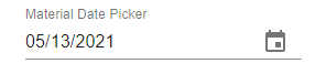
<KeyboardDatePicker
label="Material Date Picker"
value={selectedDate}
onChange={handleDateChange}
/>
</MuiPickersUtilsProvider>
</div>
);
}
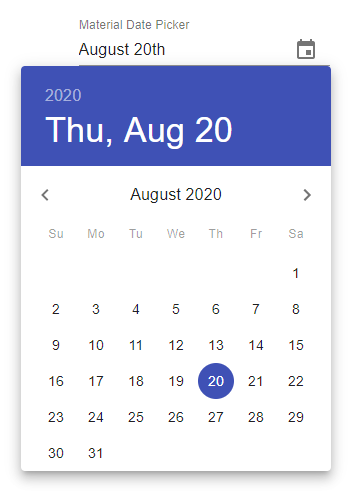
export default App;Run the application by hitting $ npm start to see a default MaterialUI Datepicker. By default, it creates a popover varient type
Types of Variants of Material Datepickers
The variant property is used to change the style of the Datepicker. There are three types of variants available <span class="token string">"dialog"(default),</span> <span class="token string">"inline"</span> <span class="token operator">&</span> <span class="token string">"static"</span>
# Inline Datepicker Variant
<KeyboardDatePicker
          label="Material Date Picker"
          variant="inline"
          value={selectedDate}
          onChange={handleDateChange}
/>
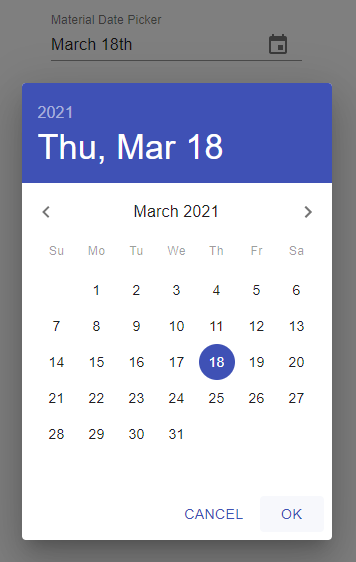
# Static Datepicker Variant
The static date picker is placed as an element and copies space.
<div style={{ width: '100px', height: '200px'   }}>
    <KeyboardDatePicker
      label="Material Date Picker"
      variant="static"
      value={selectedDate}
      onChange={handleDateChange}
    />
  </div>
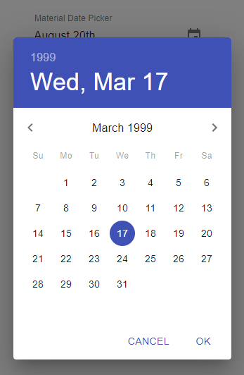
# Dialog Datepicker Variant
The Dialog variant is displayed in the center of the page, useful for mobile or small interfaces.
<KeyboardDatePicker
  label="Material Date Picker"
  variant="dialog"
  value={selectedDate}
  onChange={handleDateChange}
/>
Change Format of Date
The format property is used to change the format of the date
<KeyboardDatePicker
    label="Material Date Picker"
    format="MM/dd/yyyy"
    value={selectedDate}
    onChange={handleDateChange}
  />
How to Disable Specific Days in Material UI Datepicker?
Sometimes we may need to disable some days from the calendar Datepicker for example weekends like Saturdays or Sunday.
In that case, we need to use the shouldDisableDate property event to return boolean for each day rendered in the current month displayed.
Define a function returning true/ false based on expression defined.
function filterWeekends(date) {
  // Return false if Saturday or Sunday
  return date.getDay() === 0 || date.getDay() === 6;
}
Then use it in the shouldDisableDate property.
// App.js
import 'date-fns';
import React, { useState } from 'react';
import './App.css';

import DateFnsUtils from '@date-io/date-fns';
import {
  MuiPickersUtilsProvider,
  KeyboardDatePicker
} from '@material-ui/pickers';

function filterWeekends(date) {
  // Return false if Saturday or Sunday
  return date.getDay() === 0 || date.getDay() === 6;
}

function App() {

  const [selectedDate, setSelectedDate] = useState(new Date());

  const handleDateChange = (date) => {
    console.log(date);
    setSelectedDate(date);
  };


  return (
    <div className="App">

      <MuiPickersUtilsProvider utils={DateFnsUtils}>

        <KeyboardDatePicker
          label="Material Date Picker"
          format="MM/dd/yyyy"
          value={selectedDate}
          onChange={handleDateChange}
          shouldDisableDate={filterWeekends}
        />

      </MuiPickersUtilsProvider>

    </div >
  );
}

export default App;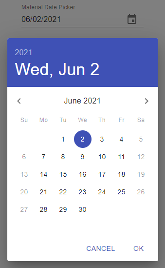
Material UI Timepickers
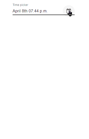
The time picker is created by adding the KeyboardTimePicker component.
<KeyboardTimePicker
          id="time-picker"
          label="Time picker"
          value={selectedDate}
          onChange={handleDateChange}
/>
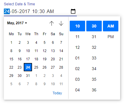
Date and Timepicker using Material UI
Selection for both Date and Time can be fetched by using the KeyboardDateTimePicker component.
<KeyboardDateTimePicker
          id="time-picker"
          label="Time picker"
          value={selectedDate}
          onChange={handleDateChange}
 />
Other Datepicker Properties
disabled: Takes boolean to set the disabled state of Datepicker.disableFuture: Set to true to disable all future dates.disablePast: Disable previous/past dates from today.disableToolbar: Hide toolbar and show only date/time views.format: Format of the date string egDD/MM/YYYYmaxDate: Max selectable date.minDate: Min selectable date.open: Controlled picker open state.openTo: The first view to show in DatePicker;"date" | "year" | "month".orientation: Force rendering in particular orientation;”portrait“(default) | “landscape“.readOnly: Make picker read-only
Methods
onAccept:(date: DateIOType) => void; Callback fired when date is acceptedonClose:() => void;On close callbackonError:(error: ReactNode, value: DateIOType) => void; Callback fired when a new error should be displayedonMonthChange:(date: DateIOType) => void | Promise<void>; Callback firing on month change.onOpen:() => void; On open callback.onYearChange:(date: DateIOType) => void; Callback firing on year change.renderDay:(day: DateIOType, selectedDate: DateIOType, dayInCurrentMonth: boolean, dayComponent: Element) => Element; Custom renderer for the day.
Native Date and Time Pickers
Instead of fancy date-time pickers, we can also opt for native Input controls using type="date" inside the MaterialUI component. For that we use <TextField /> component but with type property.
# Date Picker using Native Element
// App.js
import 'date-fns';
import React, { useState } from 'react';
import './App.css';

import { TextField } from '@material-ui/core';


function App() {

  const [selectedDate, setSelectedDate] = useState('2017-05-24');

  const handleDateChange = (event) => {
    console.log(event.target.value);
    setSelectedDate(event.target.value);
  };


  return (
    <div className="App">

      <form noValidate>
        <TextField
          id="date"
          label="Select Date"
          type="date"
          defaultValue="2017-05-24"
          value={selectedDate}
          onChange={handleDateChange}
          InputLabelProps={{
            shrink: true,
          }}
        />
      </form>

    </div >
  );
}

export default App;
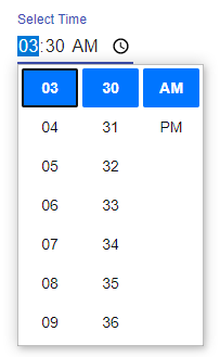
# Time Picker using Native Element
<TextField
          id="time"
          label="Select Time"
          type="time"
          defaultValue="03:30"
          value={selectedDate}
          onChange={handleDateChange}
          InputLabelProps={{
            shrink: true,
          }}
        />
# Date and Time Picker Selection using Native Element
<TextField
  id="datetime-local"
  label="Select Date & Time"
  type="datetime-local"
  defaultValue="2017-05-24T03:30"
  value={selectedDate}
  onChange={handleDateChange}
  InputLabelProps={{
    shrink: true,
  }}
/>
Conclusion
Material-UI provides a number component and options to choose from. In this tutorial, we discussed how to implement Date and Time picker using the material Ui’s pickers package as well as the Native <TextField /> component.
You can get more importation about official docs here.