Material Datatables in React application with features including Pagination, Sorting, Filter, Binding with Remote Dynamic data, Checkboxes with nested child rows and many more.
In this React tutorial, you will learn how to implement a robust Datagrid with Material design. We are going to discuss how to integrate databases using the Material-Table plugin. This package is exclusively built for React applications using Material Core at heart.
Material-Table provides a remarkable set of superb features like exporting the list into CSV and PDF formats, nesting tables into rows, and customising table rows with event handling support.
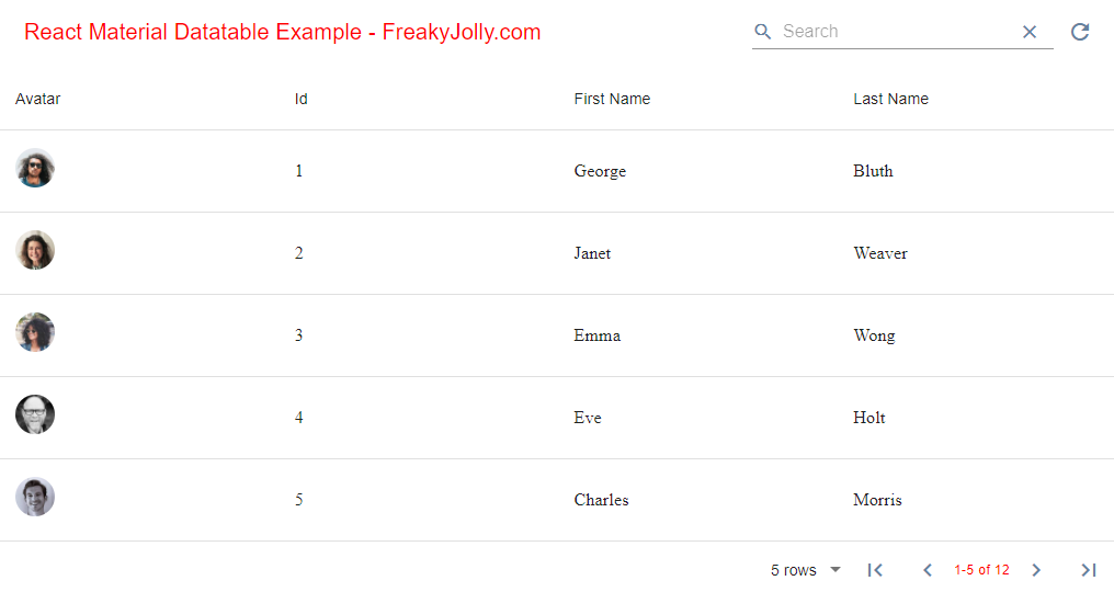
This is how the Material Datatable grid looks like using the material-table react plugin:
This tutorial will teach you how to integrate the material-table plugin in an application graciously and quickly. We will walk through some important features with easy to follow step by step tutorial.
So, let’s get started…
How to Add Material Datatable in React Application?
- Step 1 – Create React Application
- Step 2 – Install Material Table and Core Packages
- Step 3.1 – Adding Material Datatable in React App
- Step 3.2 – Loading Remote Dynamic Data in Updating Rows in Material Table
- Step 3.3 – How to Add Custom Actions on Material Table
- Step 3.4 – Export Material Table as PDF and CSV
- Step 3.5 – Column Level Filter in Material Table
Step 1 – Create React App
To start, let’s create a new React Js application. Execute the following command in the terminal window:
npx create-react-app react-material-datatable-appThen, move inside the application directory:
cd react-material-datatable-appStep 2 – Install Material Table and Core Packages
To use the Material Datatable in our react js application, we need to install few packages including the Material-Table with Material-UI Core. To use the Material icons in Datagrid, we will install Material icons as well.
- material-table: React material table adapter package.
- @material-ui/core: The Material-UI core plugin as a dependency.
- @material-ui/icons: The Material icons package to icons in Datagrid.
Run the following command to install three packages one by one:
npm install material-table --save
npm install @material-ui/core --save
npm install @material-ui/icons --save
Or at once by hitting the below command:
npm install material-table @material-ui/core @material-ui/icons --saveStep 3.1 – Adding Material Datatable in React App
Let’s have a look at how to create Material Datatables in React application. You need to import the MaterialTable component, which will take three required props, icons, columns, and data.
The Material Data grid used various material icons, to efficiently import the icons, individual import is required. That will help in optimising the bundle size.
Open the App.js file and update as shown below:
import { Component } from "react";
import "./App.css";
import MaterialTable from "material-table";
// Import Material Icons
import { forwardRef } from 'react';
import AddBox from '@material-ui/icons/AddBox';
import ArrowDownward from '@material-ui/icons/ArrowDownward';
import Check from '@material-ui/icons/Check';
import ChevronLeft from '@material-ui/icons/ChevronLeft';
import ChevronRight from '@material-ui/icons/ChevronRight';
import Clear from '@material-ui/icons/Clear';
import DeleteOutline from '@material-ui/icons/DeleteOutline';
import Edit from '@material-ui/icons/Edit';
import FilterList from '@material-ui/icons/FilterList';
import FirstPage from '@material-ui/icons/FirstPage';
import LastPage from '@material-ui/icons/LastPage';
import Remove from '@material-ui/icons/Remove';
import SaveAlt from '@material-ui/icons/SaveAlt';
import Search from '@material-ui/icons/Search';
import ViewColumn from '@material-ui/icons/ViewColumn';
const tableIcons = {
Add: forwardRef((props, ref) => <AddBox {...props} ref={ref} />),
Check: forwardRef((props, ref) => <Check {...props} ref={ref} />),
Clear: forwardRef((props, ref) => <Clear {...props} ref={ref} />),
Delete: forwardRef((props, ref) => <DeleteOutline {...props} ref={ref} />),
DetailPanel: forwardRef((props, ref) => <ChevronRight {...props} ref={ref} />),
Edit: forwardRef((props, ref) => <Edit {...props} ref={ref} />),
Export: forwardRef((props, ref) => <SaveAlt {...props} ref={ref} />),
Filter: forwardRef((props, ref) => <FilterList {...props} ref={ref} />),
FirstPage: forwardRef((props, ref) => <FirstPage {...props} ref={ref} />),
LastPage: forwardRef((props, ref) => <LastPage {...props} ref={ref} />),
NextPage: forwardRef((props, ref) => <ChevronRight {...props} ref={ref} />),
PreviousPage: forwardRef((props, ref) => <ChevronLeft {...props} ref={ref} />),
ResetSearch: forwardRef((props, ref) => <Clear {...props} ref={ref} />),
Search: forwardRef((props, ref) => <Search {...props} ref={ref} />),
SortArrow: forwardRef((props, ref) => <ArrowDownward {...props} ref={ref} />),
ThirdStateCheck: forwardRef((props, ref) => <Remove {...props} ref={ref} />),
ViewColumn: forwardRef((props, ref) => <ViewColumn {...props} ref={ref} />)
};
class App extends Component {
render() {
// Material Table Columns
const columns = [
{
title: 'Avatar',
field: 'avatar',
render: rowData => (
<img
style={{ height: 36, borderRadius: '50%' }}
src={rowData.avatar}
/>
),
},
{ title: 'Id', field: 'id' },
{ title: 'First Name', field: 'first_name' },
{ title: 'Last Name', field: 'last_name' },
];
// Material Table Columns Rows
const data = [
{
"id":1,
"email":"george.bluth@reqres.in",
"first_name":"George",
"last_name":"Bluth",
"avatar":"https://reqres.in/img/faces/1-image.jpg"
},
{
"id":2,
"email":"janet.weaver@reqres.in",
"first_name":"Janet",
"last_name":"Weaver",
"avatar":"https://reqres.in/img/faces/2-image.jpg"
},
{
"id":3,
"email":"emma.wong@reqres.in",
"first_name":"Emma",
"last_name":"Wong",
"avatar":"https://reqres.in/img/faces/3-image.jpg"
}
];
return (
<div className="App wrapper">
<h2>React Material Datatable Example - FreakyJolly.com</h2>
<MaterialTable
title="Static Data Example"
icons={tableIcons}
columns={columns}
data={data}
/>
</div>
);
}
}
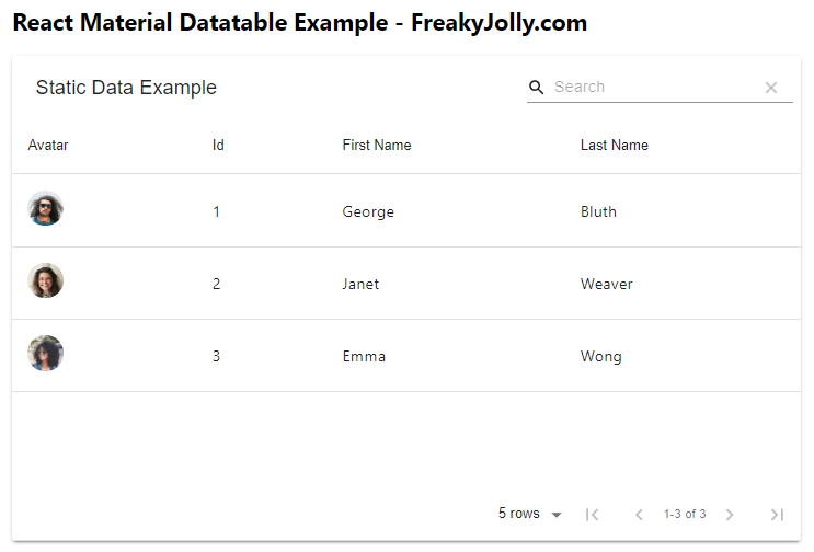
export default App;This is the simplest form of Material table implementation. You can check it by running the react application. Execute the npm start command.
Step 3.2 – Loading Remote Dynamic Data in Updating Rows in Material Table
We will now learn how to get data from a remote server using a GET API call from a web server and render the material table with updated data.
To render the remote data of re-render by updating the dataset, we need to return a promise for the data prop in form of a query. The query will take the page offset and total item per page and total rows count.
For refreshing or rerender the data, we are adding an action icon on the top right corner.
...
...
class App extends Component {
  render() {
    // Material Table Columns
    const columns = [
      {
        title: "Avatar",
        field: "avatar",
        render: (rowData) => (
          <img
            style={{ height: 36, borderRadius: "50%" }}
            src={rowData.avatar}
          />
        ),
      },
      { title: "Id", field: "id" },
      { title: "First Name", field: "first_name" },
      { title: "Last Name", field: "last_name" },
    ];

    // Material Table Columns Rows
    const data = (query) =>(
      new Promise((resolve, reject) => {
        let url = "https://reqres.in/api/users?";
        url += "per_page=" + query.pageSize;
        url += "&page=" + (query.page + 1);
        fetch(url)
          .then((response) => response.json())
          .then((result) => {
            resolve({
              data: result.data,
              page: result.page - 1,
              totalCount: result.total,
            });
          });
      }));

    const tableRef = React.createRef();

    return (
      <div className="App wrapper">
        <h2>React Material Datatable Example - FreakyJolly.com</h2>

        <MaterialTable
          title="Remote Server Data Example"
          tableRef={tableRef}
          icons={tableIcons}
          columns={columns}
          data={data}
        />
      </div>
    );
  }
}
export default App;
It will be featuring the response data from server API, whenever the search, pagination or sorting events are triggered.
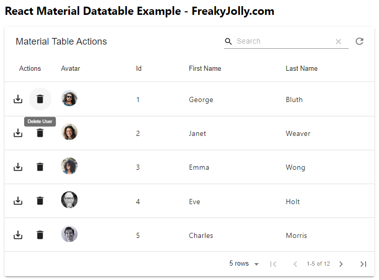
Step 3.3 – How to Add Custom Actions on Material Table
You can easily add actions, by defining the actions prop on <MaterialTable> component. Each action can have the following properties to configure:
- icon: Takes the name of the Material icon.
- tooltip: Text to show on the tooltip.
- isFreeAction: If set to true, the action icon will be shown with filter search on the top right corner. Otherwise in actions column of each row.
- onClick: Define the click trigger action.
- disabled: To disable the icon, have a boolean value.
- hidden: To hide the action icon.
- position: To position the icon “auto”,”toolbar”,”toolbarOnSelect” or “row”.
Example of adding Save, Refresh and Delete refresh action icons:
import SaveAlt from '@material-ui/icons/SaveAlt';
import Refresh from '@material-ui/icons/Refresh';
import Delete from '@material-ui/icons/Delete';

...

    return (
      <div className="App wrapper">
        <h2>React Material Datatable Example - FreakyJolly.com</h2>

        <MaterialTable
          title="Actions Example"
          icons={tableIcons}
          ...
          actions={[
            {
              icon: Refresh,
              tooltip: 'Refresh Data',
              isFreeAction: true,
              onClick: () => tableRef.current && tableRef.current.onQueryChange(),
              position:
            },{
              icon: SaveAlt,
              tooltip: 'Save User',
              onClick: (event, rowData) => console.log("You saved ",rowData)
            },
            {
              icon: Delete,
              tooltip: 'Delete User',
              onClick: (event, rowData) => console.log("You want to delete ",rowData)
            }
          ]}
        />
      </div>
    );
  }
}
export default App;
We also discover how to use icons in Material tables by importing them directly from icons packages. These can be used directly on icons property for each action.
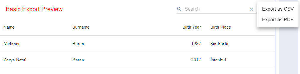
Step 3.4 – Export Material Table as PDF and CSV
The export feature can be easily enabled by adding the options prop with exportButton:true as shown below:
<MaterialTable
      title="Basic Export Preview"
      columns={[
        { title: 'Name', field: 'name' },
        { title: 'Surname', field: 'surname' },
        { title: 'Birth Year', field: 'birthYear', type: 'numeric' },
        {
          title: 'Birth Place',
          field: 'birthCity',
          lookup: { 34: 'İstanbul', 63: 'Şanlıurfa' },
        },
      ]}
      data={[
        { name: 'Mehmet', surname: 'Baran', birthYear: 1987, birthCity: 63 },
        { name: 'Zerya Betül', surname: 'Baran', birthYear: 2017, birthCity: 34 },
      ]}
      options={{
        exportButton: true
      }}
    />
You can remove a particular column from export, by adding the export:false to a specific column. Below the “Name” column is set to export:false.
columns={[
        { title: 'Name', field: 'name', export: false },
        { title: 'Surname', field: 'surname' },
        { title: 'Birth Year', field: 'birthYear', type: 'numeric' },
        {
          title: 'Birth Place',
          field: 'birthCity',
          lookup: { 34: 'İstanbul', 63: 'Şanlıurfa' },
        },
      ]}
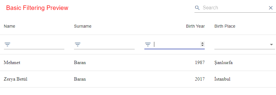
Step 3.5 – Column Level Filter in Material Table
The common search is already present on the top right corner of the table grid. On top of that, you can enable filter at column level by setting the filtering: true inside the options prop as shown below:
<MaterialTable
      title="Basic Filtering Preview"
      columns={[
        { title: 'Name', field: 'name' },
        { title: 'Surname', field: 'surname' },
        { title: 'Birth Year', field: 'birthYear', type: 'numeric' },
        {
          title: 'Birth Place',
          field: 'birthCity',
          lookup: { 34: 'İstanbul', 63: 'Şanlıurfa' },
        },
      ]}
      data={[
        { name: 'Mehmet', surname: 'Baran', birthYear: 1987, birthCity: 63 },
        { name: 'Zerya Betül', surname: 'Baran', birthYear: 2017, birthCity: 34 },
      ]}
      options={{
        filtering: true
      }}
    />
Conclusion
We have completed our quick walkthrough on adding the Material UI datatable in React application. We discussed how to add the datatable very quickly and easily in react application with static and dynamic data fetching from a remote server. In the next posts, we will look into the checkbox, nesting of rows, export and filter examples of Material datatable in react app.