In this React 15+ tutorial, we are going to discuss how to build robust and advanced forms with validation in the ReactJs and Native applications using Formik.
Creating forms in an application is always a painful and time-consuming process spacially in a composite application like React.
A Form not only takes input from the user and throw in the database but also includes various events and validation process which must be handled with care to consume only useful information.
Formik is a powerful tool which makes it very handy to construct simple to advanced level of forms with component support for multiple input control types, validation errors, and event handling.
Let’s get into it…
Create a React Application
First, we’ll create a new React application using npx create-react-app command
$ npx create-react-app react-formik-tutorial-appMove inside the react app
$ cd react-formik-tutorial-appRun application
$ npm start
Install formik Package
After creating the React application ready, install the formik package by running below npm command
$ npm install formik --save
Create Contact Us Form Component
To understand the implementation of Formik forms, let’s create a new component with a Contact Us form. Create a new file ~src/components/contactus-form.component.js
For creating a Formik form, import Formik, Form and Field components from 'formik'
Formik: It is used as a hook to initialize form values, add form Submit even handler, and Validation logic.
Form: It acts as an HTML form tag to wrap form controls.
Field: It is used to create form controls inside the form like input text, select box, textarea, checkboxes, etc.
Add CSS Style for Form Controls
As a quick trick, we’ll install the bootstrap package and use the bootstrap.css and its classes to style our Formik form.
Run following npm command to install bootstrap package.
$ npm install bootstrapNow we just need to import the bootstrap CSS file in our component.
...
import 'bootstrap/dist/css/bootstrap.min.css';
...
Build Contact Us Form
In our Contact Us form, we’ll have Name, Email, Subject and Content fields to get data from the user.
Update the ‘~src/components/contactus-form.component.js‘ file
// components/contactus-form.component.js

import React from 'react';
import { Formik, Field, Form } from 'formik';
import 'bootstrap/dist/css/bootstrap.min.css';

const ContactUsForm = () => {
    return (
        <Formik
            initialValues={{ name: '', email: '', subject: '', content: '' }}
            onSubmit={(values, { setSubmitting }) => {
                setTimeout(() => {
                    alert(JSON.stringify(values, null, 2));
                    setSubmitting(false);
                }, 1000);
            }}
        >
            {({ isSubmitting }) => (
                <Form>
                    <div className="form-group">
                        <label htmlFor="name">Name</label>
                        <Field name="name" className="form-control" type="text" />
                    </div>

                    <div className="form-group">
                        <label htmlFor="email">Email Address</label>
                        <Field name="email" className="form-control" type="email" />
                    </div>

                    <div className="form-group">
                        <label htmlFor="subject">Subject</label>
                        <Field name="subject" className="form-control" type="text" />
                    </div>

                    <div className="form-group">
                        <label htmlFor="content">Content</label>
                        <Field name="content" className="form-control" as="textarea" />
                    </div>
                    <div className="form-group">
                        <button type="submit" className="btn btn-primary" disabled={isSubmitting}>{isSubmitting ? "Please wait..." : "Submit"}</button>
                    </div>

                </Form>
            )}
        </Formik>
    );
};

export default ContactUsForm;
The <Formik> component is having the initialValues prop to set form controls with initial values by their name.
The OnSubmit() function is triggered when the form is submitted. This can be used to POST form data on the server using HTTP calls.
The setSubmitting() controls the state to check if the form is in processing state. We can use the isSubmitting boolean flag on the submit button.
We have used bootstrap classes like form-group and form-control to style the input form controls.
Adding Form in App
Now open the App.js file with function component and import ContactUsForm to render in App function.
// App.js
import React from 'react';
import './App.css';
import ContactUsForm from './components/contactus-form.component';

function App() {
  return (
    <div className="container">
      <div className="form-wrapper">

        <h4>Contact Us</h4>

        <ContactUsForm />

      </div>
    </div>
  );
}

export default App;
Run React app by hitting $ npm start to see it working:
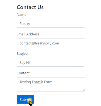
In the form, we used text inputs and textarea input. Other types of form controls can also be added discussed in the next section.
Different Types of Formik Form Controls
Using the <Field /> component we can create multiple types of form controls. By default, it renders to create a text field.
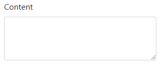
Textarea Form Control
The text area is created by adding the as="textarea" property
<Field name="content" className="form-control" as="textarea" rows={3} cols={10} />Rows and Cols can be defined as rows={3} cols={10}
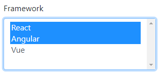
Select Form Control
The select box is created by adding the as="select" property
<Field name="framework" as="select" multiple={true} className="form-control">
    <option value="react">React</option>
    <option value="ng">Angular</option>
    <option value="vue">Vue</option>
</Field>
The multiple property can be set to true or false for multiple file selection.
Checkbox Form Control
The <Field /> component will create a checkbox when type="checkbox" is added. In bootstrap we can create as shown below:
<div class="form-check">
     <Field name="terms" className="form-check-input" type="checkbox" id="gridCheck" />
     <label className="form-check-label" htmlFor="gridCheck">Accept Terms & Conditions</label>
</div>
Radio Form Control
The <Field /> component will create a checkbox when type="radio" is added with name and value. In bootstrap we can create as shown below:
<div className="form-group">
         <label>Gender</label>
         <div class="form-check">
                  <Field className="form-check-input" type="radio" name="gridRadios" id="gridRadios1" value="male" />
                  <label className="form-check-label" htmlFor="gridRadios1">Male</label>
          </div>
         <div class="form-check">
                   <Field className="form-check-input" type="radio" name="gridRadios" id="gridRadios2" value="female" />
                    <label className="form-check-label" htmlFor="gridRadios2">Female</label>
           </div>
</div>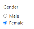
File Browse Form Control
The File Browser controls are used to upload single or multiple files. The <Field/> component with bootstrap classes can be created as shown below
<div className="form-group">
    <label>Upload File</label>
    <div className="custom-file">
        <Field type="file" name="uploadedfile" className="custom-file-input" id="customFile" />
        <label className="custom-file-label" htmlFor="customFile">Choose file</label>
    </div>
</div>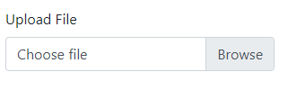
Validation in Formik Form
Now we’ll add validation on Formik form we just created. The Formik component takes two properties validate and validationSchema. Any of these can be used to add validation on the form. Let’s discuss one by one.
Formik’s validate property
In the validate property we define an Object with validation rules for each form control. For making the Name, Email, Subject mandatory add following
// components/contactus-form.component.js

import React from 'react';
import { Formik, Field, Form } from 'formik';
import 'bootstrap/dist/css/bootstrap.min.css';

const ContactUsForm = () => {

    const validateForm = values => {
        const errors = {};
        if (!values.name) {
            errors.name = 'Name is required';
        } else if (values.name.length > 15) {
            errors.name = 'Must be 15 characters or less';
        }


        if (!values.email) {
            errors.email = 'Email is required';
        } else if (!/^[A-Z0-9._%+-]+@[A-Z0-9.-]+\.[A-Z]{2,4}$/i.test(values.email)) {
            errors.email = 'Invalid email address';
        }


        if (!values.subject) {
            errors.subject = 'Subject is required';
        }

        return errors;
    };


    return (
        <Formik
            initialValues={{ name: '', email: '', subject: '', content: '' }}
            onSubmit={(values, { setSubmitting }) => {
                setTimeout(() => {
                    alert(JSON.stringify(values, null, 2));
                    setSubmitting(false);
                }, 1000);
            }}
            validate={validateForm}
        >
            {(formik, isSubmitting) => (
                <Form>
                    <div className="form-group">
                        <label htmlFor="name">Name</label>
                        <Field name="name" className={(formik.touched.name && formik.errors.name) ? 'form-control is-invalid' : 'form-control'} type="text" />

                        {formik.touched.name && formik.errors.name ? (
                            <div className="invalid-feedback">{formik.errors.name}</div>
                        ) : null}
                    </div>

                    <div className="form-group">
                        <label htmlFor="email">Email Address</label>
                        <Field name="email" className={(formik.touched.email && formik.errors.email) ? 'form-control is-invalid' : 'form-control'} type="email" />

                        {formik.touched.email && formik.errors.email ? (
                            <div className="invalid-feedback">{formik.errors.email}</div>
                        ) : null}
                    </div>

                    <div className="form-group">
                        <label htmlFor="subject">Subject</label>
                        <Field name="subject" className={(formik.touched.subject && formik.errors.subject) ? 'form-control is-invalid' : 'form-control'} type="text" />

                        {formik.touched.subject && formik.errors.subject ? (
                            <div className="invalid-feedback">{formik.errors.subject}</div>
                        ) : null}
                    </div>

                    <div className="form-group">
                        <label htmlFor="content">Content</label>
                        <Field name="content" className="form-control" as="textarea" rows={3} cols={10} />
                    </div>

                    <div className="form-group">
                        <button type="submit" className="btn btn-primary" disabled={isSubmitting}>{isSubmitting ? "Please wait..." : "Submit"}</button>
                    </div>

                </Form>
            )
            }
        </Formik >
    );
};

export default ContactUsForm;
The validateForm object keeps the rules for each control validation. Then the formik object is used to errors for each control and display messages. Errors will only be shown it form is touched.
We used Bootstrap error messages with is-invalid class.

Formik’s validationSchema property
Formik loves Yup, it is ready to use library for validation purposes. It lets you define inbuilt validation rules instead of writing them all.
Let’s apply validation using Yup. Install it by running below command
$ npm install yup --saveThen define the validationSchema property as shown
// components/contactus-form.component.js

import React from 'react';
import { Formik, Field, Form } from 'formik';
import 'bootstrap/dist/css/bootstrap.min.css';

import * as Yup from 'yup';

const ContactUsForm = () => {

    return (
        <Formik
            initialValues={{ name: '', email: '', subject: '', content: '' }}
            onSubmit={(values, { setSubmitting }) => {
                setTimeout(() => {
                    alert(JSON.stringify(values, null, 2));
                    setSubmitting(false);
                }, 1000);
            }}
            validationSchema={Yup.object({
                name: Yup.string()
                    .max(15, 'Must be 15 characters or less')
                    .required('Name is required'),
                subject: Yup.string()
                    .required('Subject is required'),
                email: Yup.string()
                    .email('Invalid email address')
                    .required('Email is required'),
            })}
        >
            {(formik, isSubmitting) => (
                <Form>
                    <div className="form-group">
                        <label htmlFor="name">Name</label>
                        <Field name="name" className={(formik.touched.name && formik.errors.name) ? 'form-control is-invalid' : 'form-control'} type="text" />
                        {formik.touched.name && formik.errors.name ? (
                            <div className="invalid-feedback">{formik.errors.name}</div>
                        ) : null}
                    </div>

                    <div className="form-group">
                        <label htmlFor="email">Email Address</label>
                        <Field name="email" className={(formik.touched.email && formik.errors.email) ? 'form-control is-invalid' : 'form-control'} type="email" />
                        {formik.touched.email && formik.errors.email ? (
                            <div className="invalid-feedback">{formik.errors.email}</div>
                        ) : null}
                    </div>

                    <div className="form-group">
                        <label htmlFor="subject">Subject</label>
                        <Field name="subject" className={(formik.touched.subject && formik.errors.subject) ? 'form-control is-invalid' : 'form-control'} type="text" />
                        {formik.touched.subject && formik.errors.subject ? (
                            <div className="invalid-feedback">{formik.errors.subject}</div>
                        ) : null}
                    </div>

                    <div className="form-group">
                        <label htmlFor="content">Content</label>
                        <Field name="content" className="form-control" as="textarea" rows={3} cols={10} />
                    </div>

                    <div className="form-group">
                        <button type="submit" className="btn btn-primary" disabled={isSubmitting}>{isSubmitting ? "Please wait..." : "Submit"}</button>
                    </div>

                </Form>
            )
            }
        </Formik >
    );
};

export default ContactUsForm;
Conclusion
Using Formik makes it easy to create complex forms. We can add any type of Form controls and add validation with customized login or use Yup with the special supporting property.
Here we used Bootstrap to create React form with validation messages. Using Bootstrap classes make development even faster with a responsive approach.
You can check more UI Bootstrap components tutorial here using the react-bootstrap package.
Do share your comments and suggestions below.
Stay Safe!