In this tutorial, you will learn how to create a DateRangePicker component in React application. This DataRange Picker will allow users to select To-From Dates from the calendar and will also display the selected date range after the to-date is selected.
To create the Date Range Picker component for dates, we will use the react-date-range package module. Moreover, to easily style it, we will deploy the Bootstrap CSS library. We will walk through this detailed guide on React date range picker and include various use-cases with simple examples like selecting a default date To From dates and showing the selected dates in readable formats.
To create the React Date Range picker, we will create a separate DateRange reusable component, which can be easily used at multiple places in your application.
In addition to this, we will also discuss how to pass the selected date range values from the component to the parent App component and show it, as in some situations, we may need to pass on the selected values from the child component to the parent.
We will implement two types of Date Range Pickers in our demo app, Fixed calendars components, which will always be there and visible to allow users to select a date range with various options like Today, Yesterday, This Week, Last Week, This Month etc.
Other will be of Overlay type of Date Range which will only show up when a user focuses on a To or From date input field in the form.
How to Create Date Range Picker in React Application?
Follow these quick steps to create a Date Range Picker with an embedded calender and Overlay selection picker:
Step 1: Setting up the project
Step 2: Installing necessary packages
Step 3: Importing Bootstrap
Step 4: Embedded Date Range Picker component
Step 5: Overlay Date Range Picker component
Step 6: Using the Date Range Picker component
Step 7: Changing the date format
Step 8: Start the Application
Step 1: Setting up the project
First, you need to set up a new React project. If you have Node.js and npm installed, you can do this by running the following command in your terminal:
npx create-react-app react-bootstrap-daterangepicker
Then, navigate into your new project:
cd react-bootstrap-daterangepickerStep 2: Installing necessary packages
Next, you need to install Bootstrap, React-Bootstrap, and the React Date Range Picker. You can do this with the following commands:
npm install bootstrap react-bootstrap
npm install react-date-range
Step 3: Importing Bootstrap
In your src/index.js file, import the Bootstrap CSS:
import 'bootstrap/dist/css/bootstrap.min.css';
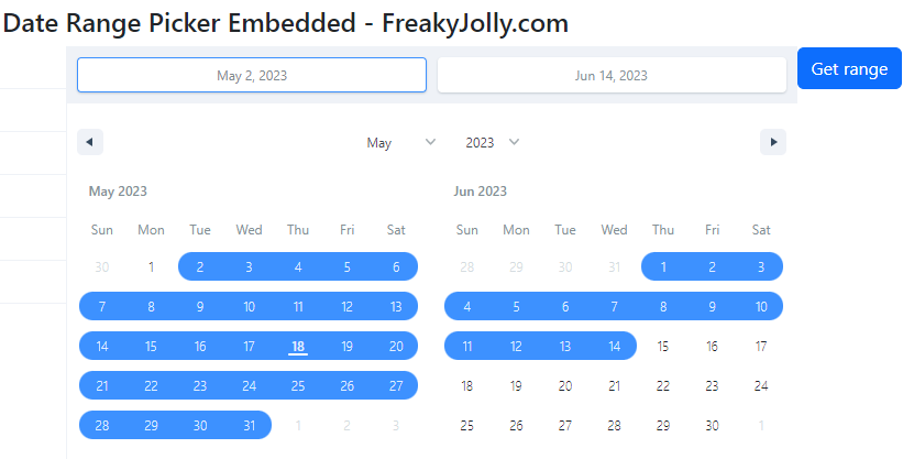
Step 4: Embedded Date Range Picker
Now, you can create a new Date Range Picker component. In your src directory, create a new file called DateRangePickerEmbedded.js and add the following code:
import React, { useState } from "react";
import { DateRangePicker } from "react-date-range";
import "react-date-range/dist/styles.css"; // main css file
import "react-date-range/dist/theme/default.css"; // theme css file
import { Button, Container } from "react-bootstrap";

const MyDateRangePickerEmbedded = ({ onSelect }) => {
  const [state, setState] = useState([
    {
      startDate: new Date(),
      endDate: null,
      key: "selection",
    },
  ]);

  const handleSelect = () => {
    onSelect(state[0]);
  };

  return (
    <Container>
      <DateRangePicker
        onChange={(item) => setState([item.selection])}
        showSelectionPreview={true}
        moveRangeOnFirstSelection={false}
        months={2}
        ranges={state}
        direction="horizontal"
      />
      <Button onClick={handleSelect}>Get range</Button>
      {state[0].startDate && state[0].endDate && (
        <p>
          Selected range: {state[0].startDate.toLocaleDateString()} -{" "}
          {state[0].endDate.toLocaleDateString()}
        </p>
      )}
    </Container>
  );
};

export default MyDateRangePickerEmbedded;
This component uses the useState hook to manage the selected date range. The DateRangePicker component from the react-date-range library is used to render the date range picker. The selected range is displayed below the picker.
We are also passing the onSelect prop from parent to pass back the selected date range to parent on button click
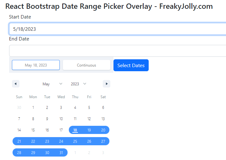
Step 5: Overlay Date Range Picker
Create a new Date Range Picker component for overlay selection of Date Range using the Form Input controls. In your src directory, create a new file called DateRangePickerOverlay.js and add the following code:
import React, { useState } from "react";
import { DateRange } from "react-date-range";
import "react-date-range/dist/styles.css"; // main css file
import "react-date-range/dist/theme/default.css"; // theme css file
import { Button, Container, Form } from "react-bootstrap";

const MyDateRangePickerOverlay = () => {
  const [state, setState] = useState([
    {
      startDate: new Date(),
      endDate: null,
      key: "selection",
    },
  ]);

  const [show, setShow] = useState(false);

  const handleFocus = () => {
    setShow(true);
  };

  const handleSelect = () => {
    setShow(false);
  };

  const handleRangeChange = (item) => {
    setState([item.selection]);
    handleSelect();
  };

  return (
    <Container>
      <Form>
        <Form.Group>
          <Form.Label>Start Date</Form.Label>
          <Form.Control
            type="text"
            onFocus={handleFocus}
            value={
              state[0].startDate ? state[0].startDate.toLocaleDateString() : ""
            }
            readOnly
          />
        </Form.Group>
        <Form.Group>
          <Form.Label>End Date</Form.Label>
          <Form.Control
            type="text"
            onFocus={handleFocus}
            value={
              state[0].endDate ? state[0].endDate.toLocaleDateString() : ""
            }
            readOnly
          />
        </Form.Group>
      </Form>
      {show && (
        <DateRange
          editableDateInputs={true}
          onChange={handleRangeChange}
          moveRangeOnFirstSelection={false}
          ranges={state}
        />
      )}
      <Button onClick={handleSelect}>Select Dates</Button>
      {state[0].startDate && state[0].endDate && (
        <p>
          Selected range: {state[0].startDate.toLocaleDateString()} -{" "}
          {state[0].endDate.toLocaleDateString()}
        </p>
      )}
    </Container>
  );
};

export default MyDateRangePickerOverlay;
In the above component, we have created Form Input Fields to select a date range. When a user focuses the input, it will open the Date Range selection popup with one month. After the selection popup will close up and date will be updated into the input controls.
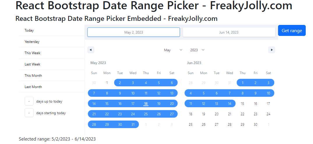
Step 6: Using the Date Range Picker
In your src/App.js file, import and use both of our components DateRangePickerEmbedded and DateRangePickerOverlay into the App component:
import React from "react";
import { Container } from "react-bootstrap";
import MyDateRangePickerEmbedded from "./DateRangePickerEmbedded";
import MyDateRangePickerOverlay from "./DateRangePickerOverlay";

function App() {
  const handleSelect = (range) => {
    console.log("Date Range value in App", range);
  };
  return (
    <Container>
      <h1>React Bootstrap Date Range Picker - FreakyJolly.com</h1>
      <h4>React Bootstrap Date Range Picker Embedded - FreakyJolly.com</h4>
      <MyDateRangePickerEmbedded onSelect={handleSelect} />
      <h4>React Bootstrap Date Range Picker Overlay - FreakyJolly.com</h4>
      <MyDateRangePickerOverlay />
    </Container>
  );
}

export default App;
Step 7: Changing the date format
To change the date format, you can use the toLocaleDateString method with a locales and options argument. For example, to display the date in the format “day-month-year”, you can do the following:
<p>
  Selected range: {state[0].startDate.toLocaleDateString('en-GB')} - {state[0].endDate.toLocaleDateString('en-GB')}
</p>
Step 8: Start the Application
We are ready to finally see our application up and running. Execute the npm start command to start the web server and render the app at http://localhost:3000/
Conclusion
In this tutorial, we have discussed the process of creating a React application with a Bootstrap Date Range Picker. We covered the following features and customizations:
Setting up a new React project: Created a new React application and installed the necessary packages.
Creating a Date Range Picker component: Created new components by using the react-date-range library to render a date range picker.
Customizing the Date Range Picker: We customized the date range picker to show only the current month and removed the predefined ranges like “Today”, “Yesterday”, etc.
Handling date range selection: We implemented functionality to handle the selection of a date range, updating the state of the component and displaying the selected range.
Formatting the selected dates: We discussed how to change the format of the selected dates and how to add time to the date range.
Creating an overlay for date selection: We did modifications to the component to display the date picker as a popup when an input field is focused.
Closing the overlay after selection: We also added functionality to close the date picker overlay after a date range is selected or when clicking outside of it.
Passing the selected date range to the parent component: We implemented a callback function to pass the selected date range to the parent component.
We discussed how to use the react-date-range library in a React application and how to customize the date range picker for various use cases. Hope this was helpful!