React Dropdown Select Component Tutorial by Example; In this guide, we will discuss how to add a Select box or Dropdown in React application by using the react-select library.
Select Box or Dropdown is very common and mostly used HTML form control, But we can’t simply use the use of a native select control in modern applications. To provide a good user experience we need to customise the Select component and add more features to it.
In this tutorial, we will learn how to add custom and immaculate fully-features select box or dropdown component in react application. We will use the profound React-Select package and discuss its immaculate implementation in a React app.
Features of React-Select Control
Let’s have a look at some cool features it provides:
- Customisable and Clean UI of Select Box or Dropdown Component.
- Users can select single or multiple values.
- Search or filter results for both local and remote responses.
- Built-in animates components.
- Customisable options in the select box.
How to add React Selecbox or Dropdown Component in React App
Going to follow these steps to implement the React-Select component in react js application.
- Create a React App
- Install the React-Select and Bootstrap packages
- Create Select Box Dropdown Component
- Adding Select Component
- Properties and Configurations in React-Select
- How to Customise UI Style of React-Select Component
- Run React Application
Create React Application
To begin with, let’s create a new React application executing the below npx command in the CLI terminal.
$ npx create-react-app react-bootstrap-modalMove into the application directory
$ cd react-bootstrap-modal
Install the React-Select and Bootstrap packages
After the application is created, next we will install the profound react-selectlibrary package. We also need to install the bootstrap as a dependency package.
Execute the following command in the CLI terminal to install the library.
$ npm install react-select bootstrap --save
Create Select Box Dropdown Component
Next, we will create a new Component in our React app; The component will have events and methods to handle data; render Select template.
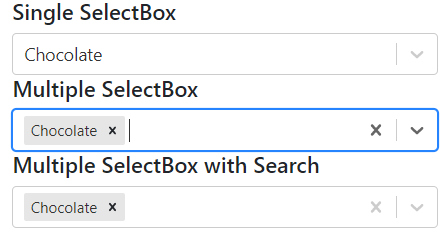
Our component we have single and multi-select components. A react-select component is created by adding the <Select/> with options props to it.
Three types of Select components we have; Single selection select box; Multiple selection with tags; Filter or search option in the select box.
Under the src folder create selectDropdownComponent.js file and update with the following code.
import React from "react";

import Select from "react-select";

const icecreams = [
    { value: 'chocolate', label: 'Chocolate' },
    { value: 'strawberry', label: 'Strawberry' },
    { value: 'vanilla', label: 'Vanilla' },
  ];;

class SelectDropDownComponent extends React.Component {
  state = {
    selectedOption: null,
  };
  handleChange = (selectedOption) => {
    this.setState({ selectedOption });
    console.log(`Option selected:`, selectedOption);
  };

  render() {
    const { selectedOption } = this.state;

    return (
      <div className="container">
        <div className="row">
          <div className="col-md-12">

            <h5>Single SelectBox</h5>
            <Select
              value={selectedOption}
              onChange={this.handleChange}
              options={icecreams}
            />

          </div>
        </div>
        <div className="row">
          <div className="col-md-12">

            <h5>Multiple SelectBox</h5>
            <Select
              value={selectedOption}
              isMulti="true"
              onChange={this.handleChange}
              options={icecreams}
            />

          </div>
        </div>
        <div className="row">
          <div className="col-md-12">

            <h5>Multiple SelectBox with Search</h5>
            <Select
              value={selectedOption}
              isMulti="true"
              isSearchable="true"
              onChange={this.handleChange}
              options={icecreams}
            />

          </div>
        </div>
      </div>
    );
  }
}

export default SelectDropDownComponent;
Adding Select Component
To use the SelectDropDownComponent in our react app, open the App.js main component then update with the following code.
import './App.css';
import '../node_modules/bootstrap/dist/css/bootstrap.min.css';
import SelectDropDownComponent from './selectDropdownComponent'

function App() {
  return (
    <div className="App">
       <SelectDropDownComponent />
    </div>
  );
}

export default App;
Above, we have also imported the bootstrap.css file from the bootstrap package we installed.
Properties and Configurations in React-Select
We already used the event handlers and few other important properties to enable Multiselect and enable search filter option. Let’s have a look at other useful properties available for the React-Select component.
autoFocus– focus the control when it mountsclassName– apply a className to the controlclassNamePrefix– apply classNames to inner elements with the given prefixisDisabled– disable the controlisMulti– allow the user to select multiple valuesisSearchable– allow the user to search for matching optionsname– generate an HTML input with this name, containing the current valueonChange– subscribe to change eventsoptions– specify the options the user can select fromplaceholder– change the text displayed when no option is selectedvalue– control the current value
How to Customise UI Style of React-Select Component?
Customization of UI style of React-Select is fairly easy, it gives more flexibility in enhancing the user experience of the application.
The styles prop can be used to provide custom styling to the component as shown below.
import React from "react";

import Select from "react-select";

const icecreams = [
    { value: 'chocolate', label: 'Chocolate' },
    { value: 'strawberry', label: 'Strawberry' },
    { value: 'vanilla', label: 'Vanilla' },
  ];

  const colourStyles = {
    control: styles => ({ ...styles, backgroundColor: 'white' }),
    option: (styles, { data, isDisabled, isFocused, isSelected }) => {
      return {
        ...styles,
        backgroundColor: isDisabled
          ? null
          : isSelected
          ? data.color
          : isFocused
          ? 'red'
          : null,
        color: isDisabled
          ? '#ccc'
          : isSelected
          ? 'white'
            ? 'white'
            : 'black'
          : data.color,
        cursor: isDisabled ? 'not-allowed' : 'default',

        ':active': {
          ...styles[':active'],
          backgroundColor:
            !isDisabled && (isSelected ? data.color : 'green'),
        },
      };
    }
};

class SelectDropDownComponent extends React.Component {
  state = {
    selectedOption: null,
  };
  handleChange = (selectedOption) => {
    this.setState({ selectedOption });
    console.log(`Option selected:`, selectedOption);
  };

  render() {
    const { selectedOption } = this.state;

    return (
      <div className="container">
        <div className="row">
          <div className="col-md-12">

            <h5>Single SelectBox</h5>
            <Select
              value={selectedOption}
              onChange={this.handleChange}
              options={icecreams}
            />

          </div>
        </div>
        <div className="row">
          <div className="col-md-12">

            <h5>Multiple SelectBox</h5>
            <Select
              value={selectedOption}
              isMulti="true"
              onChange={this.handleChange}
              options={icecreams}
              styles={colourStyles}
            />

          </div>
        </div>
        <div className="row">
          <div className="col-md-12">

            <h5>Multiple SelectBox with Search</h5>
            <Select
              value={selectedOption}
              isMulti="true"
              isSearchable="true"
              onChange={this.handleChange}
              options={icecreams}
            />

          </div>
        </div>
      </div>
    );
  }
}

export default SelectDropDownComponent;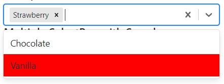
Run React Application
Finally, you see the React-Select component working by executing the below command at the terminal
$ npm startIt will open the application in the browser at the following URL
http://localhost:3000/
Conclusion
We are completed with React Select tutorial; we discussed how to quickly and easily add the Selectbox Dropdown component in the React app using the React-Select library package.
There is a number of other impressive features which this library provides, you can check the official documentation.