React js Datepicker using the React-Bootstrap package is going to be discussed in this tutorial. We are going to learn how to integrate Datepicker in react app using the bootstrap component provided by the react-bootstrap package.
Datepicker components are used to immaculate the user experience while selecting a date from a popup overlay. In this guide, we will implement Bootstrap Datepicker in react application.
We will create the dynamic datepicker component, which can be practically used anywhere without repeating the code. The DatepickerCompoennt will accept the default value and also the onChange handler as props. The selected value will be passed back to the parent component to modify the parent internal state.
How to add Bootstrap Datepicker in React Js App?
Step 1 – Create React Application
Step 2 – Install React-Bootstrap Package
Step 3 – Create Bootstrap Datepicker Component
Step 4 – Adding Bootstrap Component in React App
Step 5 – Run React Application
Step 1 – Create React Application
Head towards the CLI terminal, and execute the following command to create a new React app. If you already having React application, you can skip this step.
$ npx create-react-app react-bootstrap-datepicker-appMove inside the application directory
$ cd react-bootstrap-datepicker-app
Step 2 – Install React-Bootstrap Package
Next, install the react-bootstrap and bootstrap package by hitting the below npm command into the react application
$ npm install bootstrap react-bootstrap --save
Step 3 – Create Bootstrap Datepicker Component
Now, inside the src folder, create a new file named datepicker.component.js. This will be the Datepicker Component which will be having the below code.
import React from 'react'
import { Form } from 'react-bootstrap';

class DatepickerComponent extends React.Component{

    render(){

        return(
            <div>
                <div className="row">
                    <div className="col-md-4">
                        <Form.Group controlId="doj">
                            <Form.Label>Select Date</Form.Label>
                            <Form.Control
                                 type="date"
                                 name="doj"
                                 defaultValue={this.props.selectedValue}
                                 placeholder="Date of Joining"
                                 onChange={(e) => this.props.onChange(e)} />
                        </Form.Group>
                    </div>
                </div>
            </div>
        )
    }

}

export default DatepickerComponent;
The defaultValue we will pass from the parent component, which is App.js for our application. The onChange event handler also, we’re passing from App.js, which will send back or emit the selected value to the parent component.
The DatepickerCompoennt is only responsible to show Datepicker and emit selected Value. This makes the component reusable at any place inside the application.
Step 4 – Adding Bootstrap Component in React App
To use our DatepickerComponent, head inside the App.js file, then import the component to render it.
Also, import the bootstrap.min.css file to add Bootstrap stylings.
Update the App.js file as shown below.
import { Component } from "react";
import "./App.css";
import "../node_modules/bootstrap/dist/css/bootstrap.min.css";
import DatepickerComponent from "./datepicker.component";

class App extends Component {
  constructor() {
    super();
    this.handleOnChange = this.handleOnChange.bind(this);
    this.state = {
      selectedDate:"2015-04-14"
    };
  }

  handleOnChange(event) {
    this.setState({
      selectedDate: event.target.value
    })
  }
  render() {
    return (
      <div className="App container">
        <div>
          <div className="row">
            <div className="col-md-12 offset-md-3">
              <h3>React Bootstrap Datepicker</h3>
              <DatepickerComponent selectedValue={this.state.selectedDate} onChange={this.handleOnChange}/>
              <br/>
              <h5>Selected Date: {this.state.selectedDate}</h5>
            </div>
          </div>
        </div>
      </div>
    );
  }
}
export default App;
In-App class component, we have handleOnChange event handler which will fetch values passed from DatepickerComponent. There are two props we’re passing to DatepickerComponent; the selectedValue and onChange handler.
The selectedValue state can be used to show a default selected value.
Step 5 – Run React Application
Now, you can you React app to see the Datepicker in action. Execute below command
$ npm startIt will open the React application in the default browser at this URl
http://localhost:3000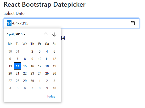
Conclusion
We discussed how to create a dynamic datepicker component using Bootstrap in react application. we passed the selectedValue and onChange event handler as props inside the component. The change event is emitted by the child component to the parent and set the state using setState method. After that, the selected date is shown in the parent component.
Hope this tutorial was helpful, do share your thought and suggestions. Thanks…