Multiselect dropdowns allow users to choose more than one value at a time. In this tutorial, you will learn how to add a multi-select drop-down selection in Angular using the Material library. Multiselect dropdown with checkboxes and select all that can be easily created using this awesome library.
While using the material library in the Angular project, you may have missed the Select box which allows multiple value selections. Using the Material drop-down you can only select a single value.
In this guide, we will discuss how to enable multiple selections of value in material styles drop-down control using the ngx-mat-select-search library package.
The NGX Mat Select Search library, not only allows the user to select more than one value but also provides a number of other useful features like:
- Clear selection control
- Options grouping
- Server-side results
- Select/ Unselecte All option
- Infinite Scroll with huge options
How to Add Material Multi-Select Drop-Down in Angular app?
Follow these quick steps to create a multi-select drop down with checkboxes and filter search using Material library:
Step 1 – Create Angular App
Step 2 – Install Material and ngx-mat-select-search Libraries
Step 3 – Update App Module with Required Modules
Step 4 – Add HTML Template
Step 5 – Update Component TS Class
Step 6 – See In Action
Step 1 – Create an Angular App
Before creating a new Angular app, make sure you have installed the latest version on Angular CLI tool:
npm install -g @angular/cli
Create a new Angular project of the name provided by executing the below command:
ng new angular-multi-select-app
Move into the application directory:
cd angular-multi-select-app
Step 2 – Install Material and ngx-mat-select-search Libraries
next, we will be installing the Material UI library and NGX Mat select search library by executing below npm commands:
Install Material Library
ng add @angular/material

? Choose a prebuilt theme name, or "custom" for a custom theme: Indigo/Pink
? Set up global Angular Material typography styles? No
? Include the Angular animations module? Include and enable animations
Install NGX Mat Select Search library
npm install ngx-mat-select-search
Step 3 – Update App Module with Required Modules
After installing the required npm libraries, we need to import the modules in the App Module of the application. This will enable us to use various API components on our pages.
We will import the following modules to set up multiple selection dropdowns:
Forms module including FormsModule and ReactiveFormsModule (If using reactive forms approach)
Material modules including MatSelectModule and MatFormFieldModule
Last but not least the NgxMatSelectSearchModule which will help to create multiple selections with filter and checkbox selection support.
Open the app.module.ts file and update it as shown below:
import { NgModule } from '@angular/core';
import { BrowserModule } from '@angular/platform-browser';
import { AppComponent } from './app.component';

import { FormsModule, ReactiveFormsModule } from '@angular/forms';

// NGX Multi Select
import { NgxMatSelectSearchModule } from 'ngx-mat-select-search';

// Material modules
import { BrowserAnimationsModule } from '@angular/platform-browser/animations';

import { MatFormFieldModule } from '@angular/material/form-field';
import { MatSelectModule } from '@angular/material/select';

@NgModule({
  declarations: [AppComponent],
  imports: [
    BrowserModule,
    ReactiveFormsModule,
    FormsModule,
    BrowserAnimationsModule,
    MatSelectModule,
    MatFormFieldModule,
    NgxMatSelectSearchModule,
  ],
  providers: [],
  bootstrap: [AppComponent],
})
export class AppModule {}
Step 4 – Add HTML Template
The NGX Mat select with multiple selection can be easily created by the fusion on <mat-select> provided by Material and <ngx-mat-select-search> provide by NGX library components.
Open the app.component.html file and update it with following template html:
<div class="wrapper">
<div class="inner-wrap">
<h3>Material Multi Select Dropdown with search and checkboxes</h3>
<mat-form-field>
<mat-select
[formControl]="carCtrl"
placeholder="Car"
[multiple]="true"
#singleSelect
>
<mat-option>
<ngx-mat-select-search
[formControl]="carFilterCtrl"
placeholderLabel="Find cars..."
noEntriesFoundLabel="'no matching found'"
[showToggleAllCheckbox]="true"
toggleAllCheckboxTooltipMessage="Select / Unselect All"
[toggleAllCheckboxIndeterminate]="isIndeterminate"
[toggleAllCheckboxChecked]="isChecked"
(toggleAll)="toggleSelectAll($event)"
>
<mat-icon ngxMatSelectSearchClear>delete</mat-icon>
</ngx-mat-select-search>
</mat-option>
<mat-option *ngFor="let car of filteredCars | async" [value]="car">
{{ car.name }}
</mat-option>
</mat-select>
</mat-form-field>
</div>
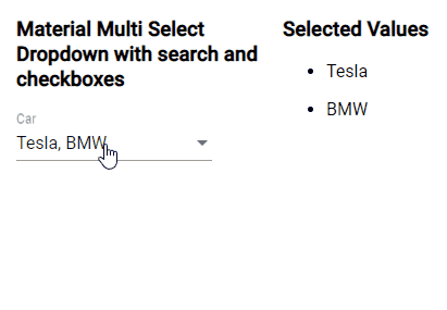
<div class="inner-wrap">
<h3>Selected Values</h3>
<ul *ngFor="let car of carCtrl?.value">
<li>{{ car.name }}</li>
</ul>
</div>
</div>On the ngx-mat-select-search, we already added the properties to configure select box with filter search, checkboxes, tooltip and custom labels. You can check more API properties here.
Step 5 – Update Component TS Class
Next. open the app.component.ts file to add filter methods, and select toggle and initiation data objects. Update the file with the following code:
import { Component, ViewChild } from '@angular/core';
import { ReplaySubject, Subject, take, takeUntil } from 'rxjs';
import { UntypedFormControl } from '@angular/forms';
import { MatSelect } from '@angular/material/select';

export interface Car {
  id: string;
  name: string;
}

/** list of cars */
export const CARS: Car[] = [
  { name: 'Mercedes-Benz', id: 'A' },
  { name: 'Tesla', id: 'B' },
  { name: 'BMW', id: 'C' },
  { name: '	Volvo', id: 'D' },
];

@Component({
  selector: 'app-root',
  templateUrl: './app.component.html',
  styleUrls: ['./app.component.css'],
})
export class AppComponent {
  /** list of cars */
  protected cars: Car[] = CARS;

  /** control for the selected car */
  public carCtrl: UntypedFormControl = new UntypedFormControl();

  /** control for the MatSelect filter keyword */
  public carFilterCtrl: UntypedFormControl = new UntypedFormControl();

  /** list of cars filtered by search keyword */
  public filteredCars: ReplaySubject<Car[]> = new ReplaySubject<Car[]>(1);

  @ViewChild('singleSelect', { static: true })
  singleSelect!: MatSelect;

  /** Subject that emits when the component has been destroyed. */
  protected _onDestroy = new Subject<void>();

  /** flags to set the toggle all checkbox state */
  isIndeterminate = false;
  isChecked = false;

  constructor() {}

  ngOnInit() {
    // set initial selection
    this.carCtrl.setValue([this.cars[1], this.cars[2]]);

    // load the initial car list
    this.filteredCars.next(this.cars.slice());

    // listen for search field value changes
    this.carFilterCtrl.valueChanges
      .pipe(takeUntil(this._onDestroy))
      .subscribe(() => {
        this.filterCars();
      });
  }

  ngAfterViewInit() {
    this.setInitialValue();
  }

  ngOnDestroy() {
    this._onDestroy.next();
    this._onDestroy.complete();
  }

  /**
   * Sets the initial value after the filteredCars are loaded initially
   */
  protected setInitialValue() {
    this.filteredCars
      .pipe(take(1), takeUntil(this._onDestroy))
      .subscribe(() => {
        this.singleSelect.compareWith = (a: Car, b: Car) =>
          a && b && a.id === b.id;
      });
  }

  protected filterCars() {
    if (!this.cars) {
      return;
    }
    // get the search keyword
    let search = this.carFilterCtrl.value;
    if (!search) {
      this.filteredCars.next(this.cars.slice());
      return;
    } else {
      search = search.toLowerCase();
    }
    // filter the cars
    this.filteredCars.next(
      this.cars.filter((car) => car.name.toLowerCase().indexOf(search) > -1)
    );
  }

  toggleSelectAll(selectAllValue: boolean) {
    this.filteredCars
      .pipe(take(1), takeUntil(this._onDestroy))
      .subscribe((val) => {
        if (selectAllValue) {
          this.carCtrl.patchValue(val);
        } else {
          this.carCtrl.patchValue([]);
        }
      });
  }
}
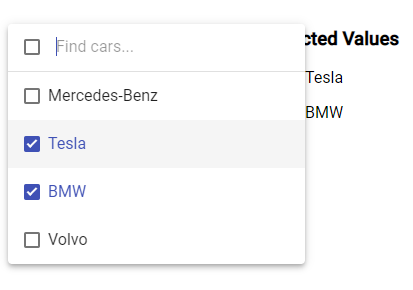
Step 6 – See In Action
We are done with implementation stuff. Now you can run your application by hitting the following command:
npm startIt will start the development web server and run the application at the following URL:
Conclusion
We discussed how to easily create Material styles multiple selection drop down using the ngx-mat-select-search library. This package supports a wide variety of features like search control, checkbox, labels, server-side population of options etc.