To put more focus on specified rows, it’s always a good idea to add a hover background colour on table rows. So that user easily moves their eyeballs horizontally on correct rows and release the finding sensation.
In this quick guide, you will learn how to add the row hover effect in Angular Material Table by adding a small snippet of CSS code. This snippet will work on Native Table as well as on Mat Table tags.
Even on the table where we have frozen or static parts like Header, Footer or Columns, this row hover CSS snippet will work like charm.
How to add row hover background highlight on Mat Table?
Following these steps to add row hover in Table or Mat table in Angular:
Step 1) Create Angular App
Step 2) Install Material and Update AppModule
Step 3) Create Material Table
Step 4) Add CSS Snippet
Step 5) See In Action
Step 1) Create Angular App
To enable the ng command in the terminal window, make sure to instal the angular cli tool. If you already have, you can update it as well.
# Install NG CLI
npm install -g @angular/cli

#Update NG CLI
ng update
Afterwards, you can hit the following command to create a new angular project with the name provided:
ng new angular-material-table-appMove inside the application folder
cd angular-material-table-appStep 2) Add Material Library and Update AppModule
Thereafter creating and moving the terminal to the application folder, we will install the Material library by executing the ng add command. This makes the installation of the material library very easy, you can choose options while installation as shown below:
ng add @angular/material

# ? Choose a prebuilt theme name, or "custom" for a custom theme: Indigo/Pink
# ? Set up global Angular Material typography styles? No
# ? Set up browser animations for Angular Material? Yes
This will update the "styles" property array inside the angular.json file, which you can change anytime.
Import Material Module
The Material Library provides a huge set of usable API’s for its various modules and components. So we need to import only those modules, that we’re going to use in our application. This keeps our app more optimized and size-efficient.
Let’s import the MatTableModulefor creating Datatable.
import { NgModule } from '@angular/core';
import { BrowserModule } from '@angular/platform-browser';

import { AppComponent } from './app.component';
import { BrowserAnimationsModule } from '@angular/platform-browser/animations';

// Material Modules
import { MatTableModule } from '@angular/material/table';

@NgModule({
  declarations: [AppComponent],
  imports: [BrowserModule, BrowserAnimationsModule, MatTableModule],
  providers: [],
  bootstrap: [AppComponent],
})
export class AppModule {}
Step 3) Create a Simple Material Table
Now head towards the HTML template to add the dynamically create table using the Mat Table components. We will be using the Material table components like mat-table, mat-row, mat-cell etc instead of Native HTML tags like table, tr, td. But you can easily replace them and use vice-versa
Open the app.component.html file and update it with the following code:
<div class="table-container" tabindex="0">
  <mat-table [dataSource]="dataSource">

    <ng-container matColumnDef="{{col}}" *ngFor="let col of displayedColumns;">
      <mat-header-cell *matHeaderCellDef> <b>{{col}}</b> </mat-header-cell>
      <mat-cell *matCellDef="let element"> {{element[col]}} </mat-cell>
    </ng-container>

    <mat-row mat-header-row *matHeaderRowDef="displayedColumns;"></mat-row>
    <mat-row *matRowDef="let row; columns: displayedColumns;"></mat-row>

  </mat-table>
</div>
Also, update the component class to add columns and dataSource for generating dynamic columns and rows.
import { Component } from '@angular/core';
@Component({
selector: 'app-root',
templateUrl: './app.component.html',
styleUrls: ['./app.component.css'],
})
export class AppComponent {
displayedColumns: any[] = [];
dataSource: any[] = [];
constructor() {
// Generate columns
for (let c = 0; c < 7; c++) {
this.displayedColumns.push('Column_' + c);
}
// Generate rows
for (let r = 0; r < 7; r++) {
const row: any = new Object();
for (let c = 0; c < 7; c++) {
row[this.displayedColumns[c]] = 'Row_' + c;
}
this.dataSource.push(row);
}
console.log(this.displayedColumns);
console.log(this.dataSource);
}
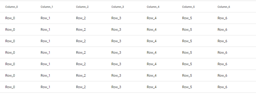
}This will create an Angular material data table without any row hover effect as shown below:
Step 4) Add CSS Snippet
Next, add the following CSS snippet in the app.component.css or scss file to add the row hover effect as shown below:
/* Row hover bakground */
.mat-row:hover .mat-cell{
    background-color: #fff5a2;
}
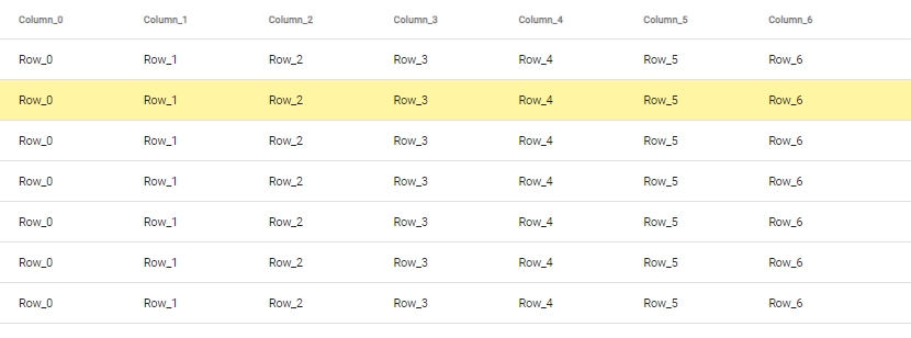
Step 5) See In Action
Now run your Angular app by hitting npm start to see the row hover effect as shown below:
