How to create typeahead in Angular? How to use Angular Material Autocomplete with dynamic remote server responses? Implement RxJS debounce in Mat Autocomplete search with dynamic server responses. In this tutorial, we will focus on efficiently implementing the Material Autocomplete in the Angular app with the RxJS function and operators.
Autocomplete or Typeahead search component is used to get user-specified small set of items which are fetch based on term entered from a huge database list data. We can easily pull data in a number of less optimised ways as well that will cause numerous unnecessary network calls, transfer of JSON data to client and resource consumption. But here we will optimize network calls and trigger functions only when the user is finished typing its term of interest.
By deploying the RxJS operators and function with material autocomplete, make your search component a more professional, efficient and user-friendly enterprise-level experience.
In our demonstration application, we will add Angular Autocomplete with the Debounce feature which will fetch results from server/API response. Here we will also use the HttpClient service of Angular to make a Get request to IMDB movies API for demonstration.
You can check my previous post to know more about adding Angular Material to the Angular project.
Autocomplete with server-side responses will also use the debounceTime method of Rxjs for optimized API calls for results.
How to Add Server-Side Mat-Autocomplete in Angular App?
Let’s get started with quick implementation steps:
- Step 1 – Create Angular App
- Step 2 – Install Material Package
- Step 3 – Configure App Module
- Step 4 – Adding Server-Side Mat Autocomplete Component
- Step 5 – Run Angular Application
Step 1 – Create Angular App
To begin, make sure you have installed the latest version of the angular CLI tool on your system. Execute the following command to install it globally:
npm install -g @angular/cliAfter that, you can execute the following ng new command to create a new Angular project with provided name and configuration setup for routing and style selection:
ng new angular-mat-autocomplete-app

? Would you like to add Angular routing? No
? Which stylesheet format would you like to use? CSS
Next, move into the application directory by executing the change directory command:
cd angular-mat-autocomplete-appStep 2 – Install Material Package
Thereafter, we will install the Material library package into our Angular application. you can install the material library by executing the ng add command and setup configuration by replying with default or custom answers:
ng add @angular/material

? Choose a prebuilt theme name, or "custom" for a custom theme: Indigo/Pink
? Set up global Angular Material typography styles? No
? Set up browser animations for Angular Material? Yes
Step 3 – Configure App Module
After the installation of the Material library, we need to import the required and supporting modules API into the App Module. You are required to import the MatAutocompleteModule , MatInputModule and FormsModule to set up Material Autocomplete. Additionally, we have MatIconModule and MatbuttonModule to show the cross icon to clear the input.
Open the app.module.ts file and update it as shown below:
// app.module.ts
import { NgModule } from '@angular/core';
import { BrowserModule } from '@angular/platform-browser';

import { AppComponent } from './app.component';
import { BrowserAnimationsModule } from '@angular/platform-browser/animations';

// Material Modules
import { MatAutocompleteModule } from '@angular/material/autocomplete';
import { MatInputModule } from '@angular/material/input';
import { MatIconModule } from '@angular/material/icon';
import { MatButtonModule } from '@angular/material/button';

import { FormsModule, ReactiveFormsModule } from '@angular/forms';
import { HttpClientModule } from '@angular/common/http';

@NgModule({
  declarations: [
    AppComponent
  ],
  imports: [
    BrowserModule,
    BrowserAnimationsModule,
    HttpClientModule,
    FormsModule,
    ReactiveFormsModule,
    MatInputModule,
    MatIconModule,
    MatButtonModule,
    MatAutocompleteModule
  ],
  providers: [],
  bootstrap: [AppComponent]
})
export class AppModule { }
Step 4 – Adding Server-Side Mat Autocomplete Component
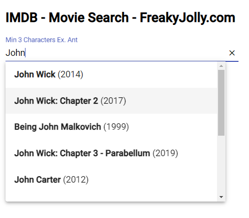
As of now, we are ready to start using the mat-autocomplete component and create a suggestion or typeahead search box. The Autocomplete will fetch results from IMDB’s remote server based on the query tern entered by a user.
Open the app.component.html template HTML and update with following code into it:
<div class="wrapper">
  <h2>
    IMDB - Movie Search - FreakyJolly.com
  </h2>
  <mat-form-field class="example-full-width">
    <input matInput placeholder="Search Movie" [(ngModel)]="selectedMovie" [matAutocomplete]="auto"
      [formControl]="searchMoviesCtrl" placeholder="Min 3 Characters Ex. Ant">
    <button *ngIf="selectedMovie" matSuffix mat-icon-button aria-label="Clear" (click)="clearSelection()">
      <mat-icon>close</mat-icon>
    </button>
    <mat-autocomplete [panelWidth]="400" #auto="matAutocomplete" (optionSelected)="onSelected()"
      [displayWith]="displayWith">
      <mat-option *ngIf="isLoading" class="is-loading">Loading...</mat-option>
      <ng-container *ngIf="!isLoading">
        <mat-option *ngFor="let movie of filteredMovies" [value]="movie">
          <span><b>{{movie.Title}}</b> ({{movie.Year}})</span>
        </mat-option>
      </ng-container>
    </mat-autocomplete>
  </mat-form-field>

  <br>

  <ng-container *ngIf="errorMsg; else elseTemplate">
    {{errorMsg}}
  </ng-container>
  <ng-template #elseTemplate>
    <div class="movie-details" *ngIf="selectedMovie?.Title">
      <div>
        <img [src]="selectedMovie?.Poster" style="height: 250px;" />
      </div>
      <div>
        <h3>Selected Value: {{selectedMovie?.Title}}</h3>
        <ul>
          <li>Year: {{selectedMovie?.Year}}</li>
        </ul>
      </div>
    </div>
  </ng-template>

</div>
In the HTML template, we have a set of input form control and mat-autocomplete component to create a typeahead component for us. There are few properties and events bound to achieve the custom behaviour and UI tweaks.
The [matAutocomplete] prop is used to bind the mat-autocomplete to the input form control. Which is also having a cross icon button beside it which is setting the model empty when clicked.
The (optionSelected) output event is triggered when a value is selected from the suggestions shown on typeahead.
The [panelWidth] is used to define the width of suggestion panel options. On mat-option component, we have ngFor directive to loop over the returned set of results.
The important thing to notice is, we have value as a complete item object, so to show only the title of the movie on input control after selection, we used the [displayWith] prop. Which can return any string to show inside the input control.
Next, head towards the App Component class and implement the valueChanges subscription and other RxJS operators and functions that add more spice to our Mat Autocomplete suggestions box.
Open the app.component.ts file and update with the following code:
//app.component.ts
import { Component, OnInit } from '@angular/core';
import { FormControl } from '@angular/forms';
import { HttpClient } from '@angular/common/http';

import { debounceTime, tap, switchMap, finalize, distinctUntilChanged, filter } from 'rxjs/operators';

const API_KEY = "e8067b53"

@Component({
  selector: 'app-root',
  templateUrl: './app.component.html',
  styleUrls: ['./app.component.css']
})
export class AppComponent implements OnInit {

  searchMoviesCtrl = new FormControl();
  filteredMovies: any;
  isLoading = false;
  errorMsg!: string;
  minLengthTerm = 3;
  selectedMovie: any = "";

  constructor(
    private http: HttpClient
  ) { }

  onSelected() {
    console.log(this.selectedMovie);
    this.selectedMovie = this.selectedMovie;
  }

  displayWith(value: any) {
    return value?.Title;
  }

  clearSelection() {
    this.selectedMovie = "";
    this.filteredMovies = [];
  }

  ngOnInit() {
    this.searchMoviesCtrl.valueChanges
      .pipe(
        filter(res => {
          return res !== null && res.length >= this.minLengthTerm
        }),
        distinctUntilChanged(),
        debounceTime(1000),
        tap(() => {
          this.errorMsg = "";
          this.filteredMovies = [];
          this.isLoading = true;
        }),
        switchMap(value => this.http.get('http://www.omdbapi.com/?apikey=' + API_KEY + '&s=' + value)
          .pipe(
            finalize(() => {
              this.isLoading = false
            }),
          )
        )
      )
      .subscribe((data: any) => {
        if (data['Search'] == undefined) {
          this.errorMsg = data['Error'];
          this.filteredMovies = [];
        } else {
          this.errorMsg = "";
          this.filteredMovies = data['Search'];
        }
        console.log(this.filteredMovies);
      });
  }
}
You can get your OMDB API key to test this app from here. We are subscribing to the valueChanges event handler of out input control. Also used below the pipe functions to handle and restrict the event triggers:
filter(): Filter is used to adding the minimum character limit, so the user needs to add min number of characters before API call is triggered.distinctUntilChanged(): The next API will trigger only if it differs from the previous value.debounceTime(): The debounceTime will reset the specified time to the initial state on every keystroke if triggered before completion.tap(): It is used as an interceptor to log or perform any action.switchMap(): The switchMap helps in cancelling any previous subscription and switches to a new observable.
In short, this set of operators and functions helps in reducing the number of API calls and arranged to work more like a human 🙂
Step 5 – Run Angular Application
Finally, run the application see your material based autocomplete in action. Execute the following command to run the development server:
ng serve --openIt will start the webserver at the following URL and open the app in your default browser:
http://localhost:4200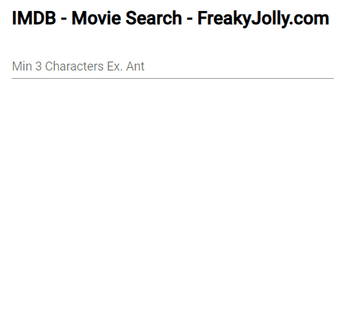
Conclusion
We discussed how to easily and quickly implement the Material Autocomplete to fetch the dynamic search results from a remote server. It triggers the HTTP call based on RxJS debounce functions and fetch the required set of records. You can easily modify the provided RxJS functional values as per the requirements.
Hope you enjoyed this tutorial, and it was helpful.. thanks!!!