In this post, we will discuss jQuery custom code to implement Image/ Thumbnail Zoom effect on hover. For a number of images, we usually place thumbnails of larger images which be selected by the user to view full-size image.
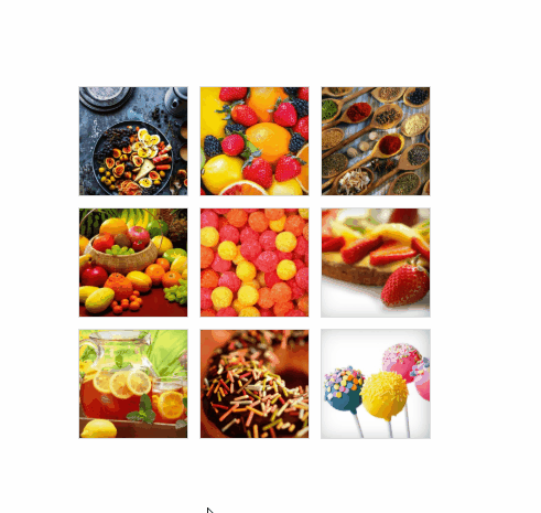
In this example, we will place images in square boxes which will show thumbnails by default but zooms to original dimensions as we over/ mouseover with the cursor. A user can also click on that image thumb to view full-size image in fullscreen.
We will use jQuery and some custom CSS code to give style to thumbnails and fullscreen zoom effect. Here we will also use jQuery’s animate function and a small login to get image’s actual dimensions and apply on hover and click.
You can check the working demo here
Let’s start with implementation.
First, add following HTML, we will have a list with thumbnails as background images. On these thumbnails, we will bind jQuery hover event to zoom the image to full dimensions.
            <ul class="thumb">
                <li>
                    <a href="javascript:void(0)">
                        <div class="thumbnail-wrap" style="background-image:url(./images/1.jpg)"></div>
                    </a>
                </li>
                <li>
                    <a href="javascript:void(0)">
                        <div class="thumbnail-wrap" style="background-image:url(./images/2.jpg)"></div>
                    </a>
                </li>
                <li>
                    <a href="javascript:void(0)">
                        <div class="thumbnail-wrap" style="background-image:url(./images/3.jpg)"></div>
                    </a>
                </li>
                <li>
                    <a href="javascript:void(0)">
                        <div class="thumbnail-wrap" style="background-image:url(./images/4.jpg)"></div>
                    </a>
                </li>
                <li>
                    <a href="javascript:void(0)">
                        <div class="thumbnail-wrap" style="background-image:url(./images/5.jpg)"></div>
                    </a>
                </li>
                <li>
                    <a href="javascript:void(0)">
                        <div class="thumbnail-wrap" style="background-image:url(./images/6.jpg)"></div>
                    </a>
                </li>
                <li>
                    <a href="javascript:void(0)">
                        <div class="thumbnail-wrap" style="background-image:url(./images/7.jpg)"></div>
                    </a>
                </li>
                <li>
                    <a href="javascript:void(0)">
                        <div class="thumbnail-wrap" style="background-image:url(./images/8.jpg)"></div>
                    </a>
                </li>
                <li>
                    <a href="javascript:void(0)">
                        <div class="thumbnail-wrap" style="background-image:url(./images/9.jpg)"></div>
                    </a>
                </li>
            </ul>
Add following CSS style for thumbnail list and the fullscreen preview of the image.
        ul.thumb {
            float: left;
            list-style: none;
            padding: 10px;
            width: 360px;
            margin: 80px;
        }

        ul.thumb li {
            margin: 0;
            padding: 5px;
            float: left;
            position: relative;
            /* Set the absolute positioning base coordinate */
            width: 110px;
            height: 110px;
        }

        ul.thumb li .thumbnail-wrap {
            width: 100px;
            height: 100px;
            /* Set the small thumbnail size */
            -ms-interpolation-mode: bicubic;
            /* IE Fix for Bicubic Scaling */
            border: 1px solid #ddd;
            padding: 5px;
            position: absolute;
            left: 0;
            top: 0;
            background-size: cover;
            background-repeat: no-repeat;

            -webkit-box-shadow: inset -3px 0px 40px -15px rgba(0, 0, 0, 1);
            -moz-box-shadow: inset -3px 0px 40px -15px rgba(0, 0, 0, 1);
            box-shadow: inset -3px 0px 40px -15px rgba(0, 0, 0, 1);

        }

        ul.thumb li .thumbnail-wrap.hover {
            -webkit-box-shadow: -2px 1px 22px -1px rgba(0, 0, 0, 0.75);
            -moz-box-shadow: -2px 1px 22px -1px rgba(0, 0, 0, 0.75);
            box-shadow: -2px 1px 22px -1px rgba(0, 0, 0, 0.75);
        }

        .thumnail-zoomed-wrapper {
            display: none;
            position: fixed;
            top: 0px;
            left: 0px;
            height: 100vh;
            width: 100%;
            background: rgba(0, 0, 0, 0.2);
            z-index: 99;
        }

        .thumbnail-zoomed-image {
            margin: auto;
            display: block;
            text-align: center;
            margin-top: 12%;
        }

        .thumbnail-zoomed-image img {
            max-width: 100%;
        }

        .close-image-zoom {
            z-index: 10;
            float: right;
            margin: 10px;
            cursor: pointer;
        }
Next, we have following jQuery custom code to add some event handlers. We will bind a hover and hover out event to give zoom effect using the animate method of jQuery.
We will fetch the image’s original dimensions to show a zoomed image with proper dimensions. Here we also have a variable named perc using which we can control zoom level of the image for example if we give 40 them image will be 40 percent smaller then original dimensions.
        $(function () {
            //Larger thumbnail preview
            var perc = 40;
            $("ul.thumb li").hover(function () {
                $("ul.thumb li").find(".thumbnail-wrap").css({
                    "z-index": "0"
                });
                $(this).find(".thumbnail-wrap").css({
                    "z-index": "10"
                });
                var imageval = $(this).find(".thumbnail-wrap").css("background-image").slice(5);
                var img;
                var thisImage = this;
                img = new Image();
                img.src = imageval.substring(0, imageval.length - 2);
                img.onload = function () {
                    var imgh = this.height * (perc / 100);
                    var imgw = this.width * (perc / 100);
                    $(thisImage).find(".thumbnail-wrap").addClass("hover").stop()
                        .animate({
                            marginTop: "-" + (imgh / 4) + "px",
                            marginLeft: "-" + (imgw / 4) + "px",
                            width: imgw + "px",
                            height: imgh + "px"
                        }, 200);
                }
            }, function () {
                var thisImage = this;
                $(this).find(".thumbnail-wrap").removeClass("hover").stop()
                    .animate({
                        marginTop: "0",
                        marginLeft: "0",
                        top: "0",
                        left: "0",
                        width: "100px",
                        height: "100px",
                        padding: "5px"
                    }, 400, function () {});
            });

            //Show thumbnail in fullscreen
            $("ul.thumb li .thumbnail-wrap").click(function () {

                var imageval = $(this).css("background-image").slice(5);
                imageval = imageval.substring(0, imageval.length - 2);
                $(".thumbnail-zoomed-image img").attr({
                    src: imageval
                });
                $(".thumnail-zoomed-wrapper").fadeIn();
                return false;
            });

            //Close fullscreen preview
            $(".thumnail-zoomed-wrapper .close-image-zoom").click(function () {
                $(".thumnail-zoomed-wrapper").hide();
                return false;
            });
        });
That’s all, now our thumbnails will look like this.
Check demo here