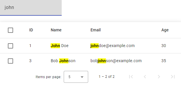
In this tutorial, we will be learning how to implement a custom directive in Angular to highlight the filter text in a Material table. When searching for a specific term in a table, it can be helpful to have the search term highlighted in the results to make it more prominent and easier to spot. By using a custom directive, we can apply this highlighting effect to any text in the table, making it a reusable solution that can be applied to multiple tables or elements.
We will be using Angular Material’s MatTableDataSource modules to create a table and filter the data. We will also be creating a custom directive, which can be used to highlight the filter text in the table.
We will be walking through each step to create this feature, from creating the table and data source, to applying the filter and custom directive. By the end of this tutorial, you will have a fully functional Material table with the ability to filter and highlight the search text.
Let’s get started and build a powerful, reusable feature for your Angular Material tables!
Steps to Add Custom Directive to Highlight Filtered Text in Angular Material Table
Create Angular App and Create Material Table
Create a new Angular project and install the required dependencies for Angular Material by running ng add @angular/material in the command line.
In your component’s class, create an instance of MatTableDataSource and pass your data to it.
import {MatTableDataSource} from '@angular/material/table';

export class AppComponent {
  dataSource = new MatTableDataSource();
  ...
}
Setup Custom Directive
Create a new directive by running ng g d highlight in the command line. This will generate a new file called highlight.directive.ts in your project’s src/app directory.
Then update the highlight.directive.ts file with following code:
import { Directive, ElementRef, Input } from '@angular/core';

@Directive({
  selector: '[appHighlight]',
})
export class HighlightDirective {
  @Input() appHighlight: any;

  constructor(private el: ElementRef) {}

  ngOnChanges() {
    if (!this.appHighlight || !this.appHighlight[0]) {
      this.el.nativeElement.innerHTML = this.appHighlight[1];
      return;
    }

    const re = new RegExp(this.appHighlight[0], 'gi');
    let value = this.appHighlight[1];
    if (typeof value !== 'string') {
      value = value + '';
    }
    this.el.nativeElement.innerHTML = value.replace(
      re,
      "<b style='background-color: yellow;'>$&</b>"
    );
  }
}
The above code snippet is a custom directive that is used to highlight the filtered text in the Angular Material table.
The directive is decorated with the @Directive decorator, which is used to mark a class as an Angular directive. It takes an object that has a single property selector, which is used to define the directive’s name. In this case, the selector is appHighlight, which means that this directive can be used as an attribute with this name in any HTML element.
The directive has a single input property, appHighlight, which is decorated with the @Input decorator. This property will be used to pass the filter text and the text that needs to be highlighted from the component’s template.
The directive also has a constructor that accepts an ElementRef as an argument. The ElementRef is used to access the element on which the directive is applied.
The directive also has an ngOnChanges lifecycle hook, which is called whenever the input properties of the directive are updated. In this hook, the code checks if the appHighlight input property is present and if the filter text is not empty. If either of these conditions is not met, the innerHTML of the element is set to the original text.
Otherwise, the code creates a new regular expression (re) with the filter text, and replaces all occurrences of the filter text in the original text with the highlighted text. The replace function is used to replace the matched text with the highlighted text.
It then sets the innerHTML of the element to the modified text, which results in the filtered text being highlighted in the table.
This is how the HighlightDirective works, and it helps to highlight the filtered text in the Material Table.
Declare Directive in App Module
In order to use the custom directive in your application, you need to import it in the app.module.ts file.
In the app.module.ts file, import the HighlightDirective from the highlight.directive.ts file:
import { HighlightDirective } from './highlight.directive';Then, add it to the declarations array in the @NgModule decorator.
@NgModule({
  declarations: [
    ...,
    HighlightDirective
  ],
  ...
})
export class AppModule { }
Using the Directive in Mat-Cell of Material Table
To update the mat-cell tags in the Angular Material table to use the custom directive, you can use the directive selector appHighlight in the mat-cell element.
Here is an example of how to use the directive in the table’s template:
<table mat-table [dataSource]="dataSource" matSort class="mat-elevation-z8">
        <ng-container matColumnDef="id">
            <th mat-header-cell *matHeaderCellDef mat-sort-header> ID </th>
            <td mat-cell *matCellDef="let element" [appHighlight]="[filterValue,element.id]"></td>
        </ng-container>
        <ng-container matColumnDef="name">
            <th mat-header-cell *matHeaderCellDef mat-sort-header> Name </th>
            <td mat-cell *matCellDef="let element" [appHighlight]="[filterValue,element.name]"></td>
        </ng-container>
        <ng-container matColumnDef="email">
            <th mat-header-cell *matHeaderCellDef mat-sort-header> Email </th>
            <td mat-cell *matCellDef="let element" [appHighlight]="[filterValue,element.email]"></td>
        </ng-container>
        <ng-container matColumnDef="age">
            <th mat-header-cell *matHeaderCellDef mat-sort-header> Age </th>
            <td mat-cell *matCellDef="let element" [appHighlight]="[filterValue,element.age]"></td>
        </ng-container>
        <tr mat-header-row *matHeaderRowDef="displayedColumns"></tr>
        <tr mat-row *matRowDef="let row; columns: displayedColumns;"></tr>
    </table>
Conclusion
Highlighting the filtered text in a Material table can enhance the user experience by making it easier to locate the matched results. The custom directive we created in this tutorial provides an easy way to achieve this feature by using Angular’s built-in directives and the power of regular expressions.
By following the steps outlined in this tutorial, you can add this feature to your own Material table and improve the usability of your application. The code snippets provided in this tutorial can be used as a starting point and can be customized to fit the specific requirements of your project.
Overall, this feature is easy to implement and can make a big difference in the usability of your application. It can be a valuable addition to any project that utilizes Material tables.