In this React tutorial, we’ll learn how to detect click event listeners when the user clicks outside a component using the react-onclickoutside package. This package converts a simple component into a high order component to return click listeners with it.
In an application, we may sometime need to create overlay and floating elements like menu item drop-down, etc. which needs to be closed whenever the user clicks not only the close icon but also anywhere outside the container.
This is not so easy to achieve without creating a high order component. By installing the react-onclickoutside the package we can easily implement this feature to any component.
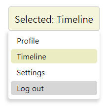
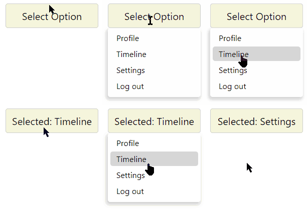
To demonstrate the working example and its use, here we’ll create a custom drop-down select box. It will show values to select from so that it will be closed if the user clicks anywhere outside to close the options.
Create a React Application
First, we’ll create a new React application using npx create-react-app command
$ npx create-react-app react-custom-dropdown-appMove inside the react app
$ cd react-custom-dropdown-appRun application
$ npm start
Install react-onclickoutside Package
After creating the React application ready, install the react-onclickoutside package by running below npm command
$ npm install react-onclickoutside --save
Create Drop Down Component
To demonstrate how to hide a component container on clicking outside it, we’ll create a Drop Down function component that will have a list of items to select from.
The container displaying options can also be closed by the user by simply clicking anywhere on the screen.
The react-onclickoutside provides a HOC function onClickOutside which enables any component to bind a click event that can be triggered by clicking outside it anywhere on the page.
Create a new find at this location ‘~src/components/dropdown.component.js’ and update it with following
// components/dropdown.component.js
import React, { useState } from "react";
import onClickOutside from "react-onclickoutside";

function DropDown(){
    const [isOpen, setIsOpen] = useState(false);
    const [selectedValue, setSelectedValue] = useState('');
    const toggle = () => setIsOpen(!isOpen);

    DropDown.handleClickOutside = () => setIsOpen(false);

    const selectOption = (value) => {
        setSelectedValue(value);
        setIsOpen(false);
    }

    const optionData = [{
        id: 1,
        text: 'Profile'
    }, {
        id: 2,
        text: 'Timeline'
    }, {
        id: 3,
        text: 'Settings'
    }, {
        id: 4,
        text: 'Log out'
    }]


    return (
        <div className="dd-wrapper">
            <div onClick={toggle} className="dd-selected">
                {selectedValue ? 'Selected: ' + selectedValue : 'Select Option'}
            </div>
            {
                isOpen ?
                    <ul className="dd-items-wrapper">
                        {optionData.map((option) =>
                            <li className={option.text === selectedValue ? 'dd-item active' : 'dd-item'} key={option.id} onClick={() => selectOption(option.text)}>
                                <div>{option.text}</div>
                            </li>
                        )}
                    </ul>
                    : null
            }

        </div>
    );
};

const clickOutsideConfig = {
    handleClickOutside: () => DropDown.handleClickOutside,

};

export default onClickOutside(DropDown, clickOutsideConfig);
In the above code, we have defined a function event handleClickOutside which will be triggered on clicking outside the component. We are passing the DropDown component inside the onClickOutside function with clickOutsideConfig to convert it into a Hight Order Component.
A High Order Component is a component that returns another component with extended or enhanced functionalities attached. Like here we attached the handleClickOutside event listener.
We have provided an optionData to populate the options and controlling selection with useState() method.
There are also few classes attached to style out the custom select drop-down boxes.
Add CSS Style
Update the App.css file with following CSS style code:
.dd-wrapper {
  width: 185px;
  margin: 30px auto;
}

.dd-selected {
  padding: 10px;
  background: beige;
  border: 1px solid #ccc;
  border-radius: 5px;
  font-size: 20px;
}
.dd-items-wrapper {
  box-shadow: -2px 4px 6px 2px #cccc;
  padding: 5px;
  border-radius: 5px;
  margin: 0px;
}

.dd-item.active {
  background: #ececc2;
}

.dd-item {
  list-style: none;
  text-align: left;
  padding: 4px 12px;
  margin-bottom: 3px;
  cursor: pointer;
  border-radius: 5px;
}
.dd-item:hover {
  background: #cccc;
}
Using in App Component
Now import the DropDown compoennt and append inside the App to render.
import React from 'react';
import './App.css';
import DropDown from "./components/dropdown.component";

function App() {
  return (
    <div className="App">
      <DropDown />
    </div>
  );
}

export default App;
now run the application by hitting $ npm start to see it working.
Issue Faced using Implementation
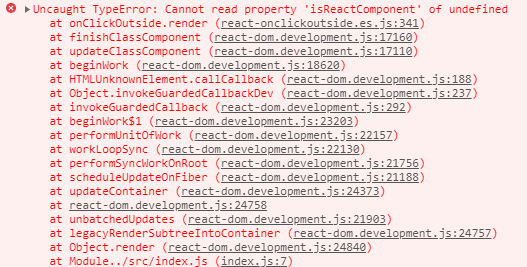
While using the react-onclickoutside provided function onClickOutside, you may see an error in the console:
Which reads: “Cannot read property ‘isReactComponent’ of undefined”
You can check this issue here
Why this issue is caused?
This issue is encountered when we pass arrow functions to the onClickOutside() which is not rendered correctly as a component.
If you change this in the above code
function DropDown() {
 ...
}
to this
const DropDown = () => {
    ...
}
The application will break and display errors.
How to resolve this issue?
This issue can be resolved with two methods:
Method 1
You can simply use function component with function keyword instead of arrow notation. Like we used above.
Method 2
Or you can change in the ‘~node_modules/react-onclickoutside/dist/react-onclickoutside.es.js’ file itself.
Find this ‘WrappedComponent.prototype.isReactComponent‘ and replace with this ‘Object.getPrototypeOf(WrappedComponent).isReactComponent‘. After change rerun the application.
This method is a bit dirty 🙂
Conclusion
Using the react-onclickoutside package is an easy way to implement the event listeners for components outside them. This can be proved a great help to control overlays and containers which need to be closed by detecting the click events outside their scopes on the page.
In the above example application, we create a custom DropDown component to demonstrate its working and also how to resolve the issue faced during implementation.


