In this guide, you will learn how to create different types of charts in XLSX files using a Python script. Moreover, we will be creating three types of charts including Line Charts, Bar Charts and Pie Charts. We will have a dummy set of data values to generate an XLSX file with draggable Charts in it.
In this Data driven era, one of the most common and efficient ways to share data is in the form of XLSX or Excel sheets. On top of that data can be represented beautifully using the visualisation in formal charts. In this article, we will learn how to create an XLSX file with different types of charts in it from that data.
For creating the XLSX file from Python script and generating data respective charts, we will be using powerful Python libraries such as Pandas, matplotlib, and openpyxl.
Pandas is a Python library that provides flexible data structures, which are designed to make working with “relational” or “labeled” data easy and intuitive.
XlsxWriter is a Python module for writing files in the XLSX file format which can be used to write text, numbers, formulas, and hyperlinks to multiple worksheets. Also helpful for our purpose to add charts to the Excel files.
Matplotlib is a versatile plotting library for Python which enables us to generate a wide array of static, animated, and interactive plots. It offers a high level of customization for all aspects of a plot to create professional-quality visualizations. Matplotlib is widely used in the data science and machine learning communities for data visualization and analysis.
How to Create XLSX with Charts in Python?
Follow these quick steps to download XLSX files with dynamic data having visual representation using Charts:
Step 1: Set Up the Environment
Step 2: Import Necessary Modules
Step 3: Create Dummy Data
Step 4: Write Data to XLSX File
Step 4: Create Charts in XLSX
Step 5: Add Charts to XLSX File
Step 6: Run Python Script
Step 1: Set Up the Environment
Before we start, make sure you have installed all the required libraries needed to accomplish our task. The libraries that we will be using are:
pandas: For creating a DataFrame with our dummy data.matplotlib: For creating our charts.openpyxl: For writing data and charts to an XLSX file.
You can install them at once by executing below pip command:
pip install openpyxl matplotlib pandas
Step 2: Import Necessary Modules
After the above libs are installed, we need to import them into our script.
import openpyxl
from openpyxl.chart import LineChart, Reference
import pandas as pd
import matplotlib.pyplot as plt
Step 3: Create Dummy Data
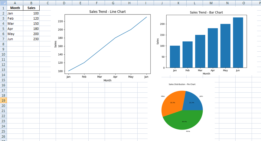
For demonstration purposes, we will add some dummy Sales data to represent them into XLSX and Charts format. Here’s how you can create a pandas DataFrame for the same:
data = {
    'Month': ['Jan', 'Feb', 'Mar', 'Apr', 'May', 'Jun'],
    'Sales': [100, 120, 150, 180, 200, 230]
}

df = pd.DataFrame(data)
Step 4: Write Data to XLSX File
After creating our data, we will write it to an XLSX file using openpyxl.
xlsx_writer = pd.ExcelWriter('sales_data.xlsx', engine='openpyxl')
df.to_excel(xlsx_writer, index=False, sheet_name='Report')
xlsx_writer.save()
Step 4: Create Charts in XLSX
Thereafter we will be using matplotlib to create our line chart, pie chart, and bar chart. We will then save these charts as images.
Line Chart
import matplotlib.pyplot as plt
from io import BytesIO

plt.figure(figsize=[6,4])
plt.plot(df['Month'], df['Sales'])
plt.title('Sales Trend - Line Chart')
plt.xlabel('Month')
plt.ylabel('Sales')

# Save the line chart to a BytesIO object
image_stream = BytesIO()
plt.savefig(image_stream, format='png')
plt.close()
Pie Chart
We will setup a different dataset for the pie chart:
data_pie = {
    'Sales Person': ['John', 'Mike', 'Anna'],
    'Sales': [100, 150, 200]
}
df_pie = pd.DataFrame(data_pie)

plt.figure(figsize=[6,6])
plt.pie(df_pie['Sales'], labels=df_pie['Sales Person'], autopct='%1.1f%%')
plt.title('Sales Distribution - Pie Chart')

# Save the pie chart to a BytesIO object
image_stream = BytesIO()
plt.savefig(image_stream, format='png')
plt.close()
Bar Chart
Using our original data for the bar chart:
plt.figure(figsize=[6,4])
plt.bar(df['Month'], df['Sales'])
plt.title('Sales Trend - Bar Chart')
plt.xlabel('Month')
plt.ylabel('Sales')

# Save the bar chart to a BytesIO object
image_stream = BytesIO()
plt.savefig(image_stream, format='png')
plt.close()
Step 5: Add Charts to XLSX File
Lastly, we will add the charts that we created to our XLSX file:
import openpyxl
from openpyxl.drawing.image import Image

# Load the workbook and get the sheet
wb = openpyxl.load_workbook('sales_data.xlsx')
ws = wb['Report']

# Create an image from the BytesIO stream and add it to the sheet
image = Image(image_stream)
ws.add_image(image, 'D4')

# Repeat for pie chart and bar chart
image = Image(image_stream)
ws.add_image(image, 'D12')

image = Image(image_stream)
ws.add_image(image, 'D20')

# Save the workbook
wb.save('sales_data.xlsx')
Let’s have a look at the completed script after putting everything we discussed above:
import pandas as pd
import matplotlib.pyplot as plt
import openpyxl
from openpyxl.drawing.image import Image
from io import BytesIO

# Create dummy data
data = {
    'Month': ['Jan', 'Feb', 'Mar', 'Apr', 'May', 'Jun'],
    'Sales': [100, 120, 150, 180, 200, 230]
}
df = pd.DataFrame(data)

# Write data to an XLSX file
xlsx_writer = pd.ExcelWriter('sales_data.xlsx', engine='openpyxl')
df.to_excel(xlsx_writer, index=False, sheet_name='Report')
xlsx_writer.close()

# Create a line chart
plt.figure(figsize=[6,4])
plt.plot(df['Month'], df['Sales'])
plt.title('Sales Trend - Line Chart')
plt.xlabel('Month')
plt.ylabel('Sales')

# Save the line chart to a BytesIO object
image_stream = BytesIO()
plt.savefig(image_stream, format='png')
plt.close()

# Load the workbook and get the sheet
wb = openpyxl.load_workbook('sales_data.xlsx')
ws = wb['Report']

# Create an image from the BytesIO stream and add it to the sheet
image = Image(image_stream)
ws.add_image(image, 'D4')

# Create a pie chart with another dataset
data_pie = {
    'Sales Person': ['John', 'Mike', 'Anna'],
    'Sales': [100, 150, 200]
}
df_pie = pd.DataFrame(data_pie)

plt.figure(figsize=[6,6])
plt.pie(df_pie['Sales'], labels=df_pie['Sales Person'], autopct='%1.1f%%')
plt.title('Sales Distribution - Pie Chart')

# Save the pie chart to a BytesIO object
image_stream = BytesIO()
plt.savefig(image_stream, format='png')
plt.close()

# Create an image from the BytesIO stream and add it to the sheet
image = Image(image_stream)
ws.add_image(image, 'D12')

# Create a bar chart
plt.figure(figsize=[6,4])
plt.bar(df['Month'], df['Sales'])
plt.title('Sales Trend - Bar Chart')
plt.xlabel('Month')
plt.ylabel('Sales')

# Save the bar chart to a BytesIO object
image_stream = BytesIO()
plt.savefig(image_stream, format='png')
plt.close()

# Create an image from the BytesIO stream and add it to the sheet
image = Image(image_stream)
ws.add_image(image, 'D20')

# Save the workbook
wb.save('sales_data.xlsx')
Step 6: Run Python Script
After putting all the above script content into a .py file we need to execute it. Navigate to the directory where you have saved our script, open a terminal window there and execute the following command:
python your_script_name.py
After running this command, your script will execute, and it will create an XLSX file in the same directory. Open this file to see your beautiful data and charts!
Conclusion
We create the XLSX file with dummy data and also created Charts like Line Chart, Bar Chart and Pie Chart using the matplotlib, and also added these charts to an XLSX file using pandas and openpyxl. This kind of automation is extremely useful in many fields, especially those involving data analysis and visualization.