Tree view with expand collapse having parent-child in Angular example; In this Angular tutorial, we’ll learn how to create a Tree structure with a parent-child hierarchy. With expanding collapse arrow and checkbox feature in Angular 10/9/8/7/6/5/4 application by using the @circlon/angular-tree-component package module.
Tree Structure are used to represent a dense hierarchy of items having a parent-child relation. A tree display makes the information very easy to understand more manageable.
To create a tree structure using Object data we are going to use the @circlon/angular-tree-component package which has many cool features.
The child items can be expanded and collapse with Arrow icons and can be loaded using Async server data operation. The tree structure can also have checkbox selection to select all child items when the parent is checked.
This all we are going to develop in this tutorial application. So let’s get started!
Setup Angular CLI
First, install or update the Angular CLI tool to the latest version by running the below NPM command
$ npm install -g @angular/cliYou can check the version of Angular currently installed
$ ng --version
Create a New Angular Application
Run following ng command to create a new Angular project
$ ng new angular-tree-component-tutorial-app
# ? Would you like to add Angular routing? No
# ? Which stylesheet format would you like to use? CSS
Enter the project directory
$ cd angular-tree-component-tutorial-appRun the application
$ ng serve --open
Install the @circlon/angular-tree-component Package
Run following NPM command to install the @circlon/angular-tree-component package in Angular project
$ npm install @circlon/angular-tree-component
Update App Module
After installing the package, import TreeModule module and add inside the imports array.
Now update the app.module.ts file to import the required modules.
// app.module.ts
import { BrowserModule } from '@angular/platform-browser';
import { NgModule } from '@angular/core';

import { AppComponent } from './app.component';

import { TreeModule } from '@circlon/angular-tree-component';

@NgModule({
  declarations: [
    AppComponent
  ],
  imports: [
    BrowserModule,
    TreeModule
  ],
  providers: [],
  bootstrap: [AppComponent]
})
export class AppModule { }
Add Tree Style CSS
By default, the package component provides the tree styling in the angular-tree-component.css file.
To add the style, open the angular.json file and update the styles property array as shown below:
...
"styles": [
              "src/styles.css",
              "./node_modules/@circlon/angular-tree-component/css/angular-tree-component.css"
 ],
...
Creating Basic Tree Structure in Component
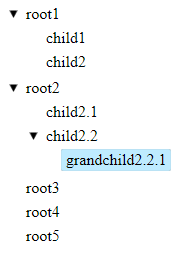
The Tree structure is created by rendering the <tree-root/> component in the HTML template. It takes the required [nodes] property which accepts the Object of item collection with a spacial structure.
<tree-root [nodes]="nodeItems"></tree-root>The nodeItems object will have the hierarchy of items with name and children properties. Where each children property further takes a new object to define its child nodes.
nodeItems = [
    {
      name: 'root1',
      children: [
        { name: 'child1' },
        { name: 'child2' }
      ]
    },
    {
      name: 'root2',
      children: [
        { name: 'child2.1', children: [] },
        {
          name: 'child2.2', children: [
            { name: 'grandchild2.2.1' }
          ]
        }
      ]
    },
    { name: 'root3' },
    { name: 'root4', children: [] },
    { name: 'root5', children: null }
  ];
This will create a very basic Tree structure with expand-collapse functionality
Using Tree Options
There are number of configuration options available to customize the Tree structure layout and its functionalities. The ITreeOptions interface needs to be imported into the component to add options.
import { ITreeOptions } from '@circlon/angular-tree-component';
The [options] property on <tree-root/> component.
<tree-root [nodes]="nodeItems" [options]="treeOptions"></tree-root>
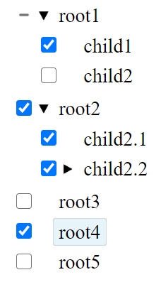
Adding Checkboxes on Tree Items
The useCheckbox property is set to true to add checkboxes on tree items for parent and child nodes.
treeOptions: ITreeOptions = {
    useCheckbox: true
  };
Filter Search on Tree Nodes
The filter can be added on the Tree nodes by adding an Input form control with (keyup) event handler to control the tree modal defined by template variable #tree on tree-root.
Also, update the <tree-root/> with #tree template variable. The complete template with the reset button will have the following in the app.component.html file.
<h2>Filter on Tree Nodes</h2>

<input #filter (keyup)="tree.treeModel.filterNodes(filter.value)" placeholder="filter nodes" />

<button (click)="tree.treeModel.clearFilter(); filter.value = ''">Clear Filter</button>

<tree-root #tree [options]="treeOptions" [nodes]="treeNodes"></tree-root>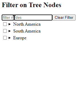
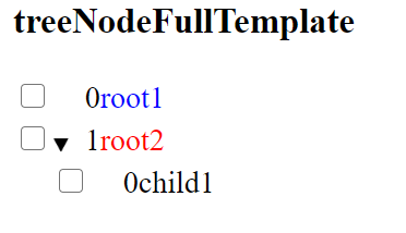
Custom Templates for Tree Nodes
The <tree-node/> can have ng-template components to create custom HTML for nodes in the tree.
<h3>treeNodeFullTemplate</h3>

<tree-root [nodes]="treeNodes">

  <ng-template #treeNodeFullTemplate let-node let-index="index" let-templates="templates">
    <div class="tree-node">

      <input type="checkbox" [checked]="node.isActive" (change)="node.toggleActivated(true)" />

      <tree-node-expander [node]="node"></tree-node-expander>

      <div class="node-content-wrapper" [class.node-content-wrapper-active]="node.isActive"
        [class.node-content-wrapper-focused]="node.isFocused" (click)="node.toggleActivated(true)">

        <span [class]="node.data.className + 'Index'">{{ index }}</span>
        <span [class]="node.data.className" [class.title]="true">{{ node.data.title }}</span>

      </div>

      <tree-node-children [node]="node" [templates]="templates"></tree-node-children>
    </div>
  </ng-template>

</tree-root>
Update Class
export class AppComponent {

  treeNodes = [
    {
      title: 'root1',
      className: 'root1Class'
    },
    {
      title: 'root2',
      className: 'root2Class',
      children: [
        { title: 'child1', className: 'child1Class' }
      ]
    }
  ];


  treeOptions: ITreeOptions = {
    displayField: 'title',
    nodeClass: (node) => `${node.data.title}Class`
  };
}
Other Properties for Tree Nodes
Following are some other useful and interesting properties:
hasChildrenField: A string representing the attribute of the node that indicates whether there are child nodes.childrenField: A string representing the attribute of the node that contains the array of children.displayField: A string representing the attribute of the node to display.idField: A string representing the attribute of the node that contains the unique ID.isExpandedField: A string representing the attribute of the node that contains whether the node starts as expanded.getChildren: Function for loading a node’s children.actionMapping: Rewire which trigger causes which action using this attribute, or create custom actions / event bindings.allowDrag: Specify if dragging tree nodes is allowed.allowDrop: Specify whether dropping inside the tree is allowed.allowDragoverStyling: Boolean flag to allow adding and removing is-dragging-over and is-dragging-over-disabled classes.levelPadding: Specify padding per node (integer).nodeClass: Specify a function that returns a class per node.useVirtualScroll: Boolean flag to use the virtual scroll option.nodeHeight: For use with`useVirtualScroll`option.dropSlotHeight: For use with`useVirtualScroll`option.animateExpand: Boolean whether or not to animate expand / collapse of nodes.animateSpeed:Speedof expand animation (described in pixels per 17 ms).animateAcceleration: Increase of expand animation speed (described in multiply per 17 ms).scrollOnActivate: Whether to scroll to the node to make it visible when it is activated.getNodeClone: Function to clone a node.rtl: Makes the tree right-to-left.rootId: Specifies id of root node (virtualRoot)useCheckbox: Whether to display a checkbox next to the node or notuseTriState: Whether to use master checkboxes mechanism if theuseCheckboxis set to truescrollContainer: The HTML element that is the scroll container for the tree.
Conclusion
In this tutorial, we discussed how to easily create a tree structure component with many useful features. There are number options available like Filter Search, Custom templates, Checkboxes, Drag and Drop, Loading indicator etc.
You can check more examples on official documnetation here.