Toastr is a popular, lightweight JavaScript notification library to displays non-blocking messages to users. We can easily implement various types of feedback to notify users of errors, success alerts, warning messages, or provide other feedback by adding just a few lines of code.
For the Angular applications, we will use the Nxg-Toastr package which is exclusively adapted for Angular applications where we can easily configure and use its various features without any problems.
In this guide, will learn how to quickly install and configure the Ngx-Toastr package and see examples of how to display various types of Toastr messages like success, info, warnings, and errors.
We will also dive deep into advanced topics like customizing the appearance and behaviour of Toastr, and using it in services and components. Also, we will create a Util service that will have all the Toastr methods to show/hide notifications which can be called from anywhere in the application.
Why Use Toastr in Angular
Before we get into the implementation details, let’s discuss why Toastr is a great choice for displaying notifications in Angular apps. Here are some of the key benefits of using it:
- Lightweight – Toastr is very lightweight coming in at just under 3kb. This makes it fast and easy to integrate without bloating your application.
- Customizable – Toastr provides numerous options for customizing the look and feel of notifications. We can control the position, animation style, colors, icons and more.
- Flexible – We can display any type of message including success, info, warnings, and errors. Toastr makes it simple to show any notification.
- Non-Blocking – The notifications display without disrupting the user experience. Users can continue interacting with the app.
- Popular – Toastr is used by many popular frameworks and sites. It’s a trusted library with a strong community behind it.
- Easy to Use – It only takes a few lines of code to get Toastr working in your app. The API is straightforward and simple.
So in summary, Toastr combines an easy API with extensive customization options making it a great choice for adding notifications in Angular. It integrates seamlessly without bloat and can be tailored to match your desired user experience.
How to Add NGX-Toastr in Angular?
Now we will move ahead and start with integrating Ngx-Toastr in our Angular application:
Installing Toastr
First, execute the following command to install the ngx-toastr package in your Angular application:
npm install ngx-toastr --saveThis will install the ngx-toastr package and save it to the package.json.
Update App Module
For using Toastr, we need to import the ToastrModule and also the BrowserAnimationsModule as Toastr use animations. So update the app.module.ts file as shown below:
import { NgModule } from '@angular/core';
import { BrowserModule } from '@angular/platform-browser';
import { AppComponent } from './app.component';
import { BrowserAnimationsModule } from '@angular/platform-browser/animations';
import { ToastrModule } from 'ngx-toastr';


@NgModule({
  declarations: [AppComponent],
  imports: [
    BrowserModule,
    BrowserAnimationsModule,
    ToastrModule.forRoot()
  ],
  bootstrap: [AppComponent],
})
export class AppModule {}
Note: We can also use Toastr with or without Animation, for that, we need to import the ToastNoAnimationModule instead as shown below:
import { ToastrModule, ToastNoAnimationModule } from 'ngx-toastr';
@NgModule({
  imports: [
    // BrowserAnimationsModule no longer required
    ToastNoAnimationModule.forRoot(),
  ],
  // ...
})
class AppModule {}
Import Toastr CSS
There are three ways to import Toastr’s CSS style in our application:
1) Copy and paste the toastr.css style to your project style.
2) If you are using SASS, then import the following in your main SASS file:
// regular style toast
@import 'ngx-toastr/toastr';
3) Update the angular.json file’s styles array, which is the most common and preferred way:
"styles": [
  "styles.scss",
  "node_modules/ngx-toastr/toastr.css"
]
Adding ToastrService
Finally, inject ToastrService into any component or service that needs to display messages:
constructor(private toastr: ToastrService) {}That covers the basics of setting up Toastr! Now let’s look at using it to display notifications.
Using Toastr to Show Messages
The ToastrService provides a simple API for displaying different types of notifications. Here are examples:
Display a Basic Message
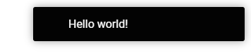
Show a basic message with the show() method:
this.toastr.show('Hello world!');This displays a default informational toast message with no title.
Show a Success Message
Display a green success message:
this.toastr.success('Operation completed successfully!');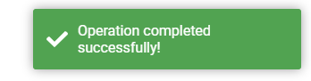
Show an Error Message
Display a red error message:
this.toastr.error('An error occurred, please try again.');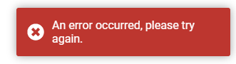
Additional Options
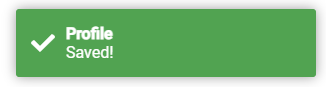
You can customize the messages by passing a configuration object:
this.toastr.success('Saved!', 'Profile', {
  timeOut: 2000
});
This displays a success message with title and 2 second timeout.
As you can see, Toastr makes displaying various message types incredibly easy! Next we’ll look at customizing Toastr further.
Customizing Toastr
One of the best features of Toastr is the ability to customize the appearance and behavior of the notifications. Here are some common options:
Positioning
By default, toasts are positioned in the top right corner. You can change this:
this.toastr.info('Info message', '', {
  positionClass: 'toast-bottom-left'
});
Supported positions are toast-top-right, toast-bottom-right, toast-bottom-left, toast-top-left, toast-top-full-width, and toast-bottom-full-width.
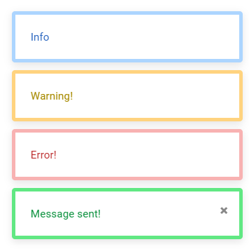
Custom Toastr CSS Style
We can apply custom classes or override the existing style of toastr notifications as well. For customer class we can use the toastClass property with class name.
    this.toastr.success('Message sent!', '', {
      toastClass: 'custom-toast-success',
      closeButton:true
    });
Following is the custom CSS style to override the existing style of ngx-toastr notifications, you can add a custom class and update the following code accordingly. Add the following CSS in the styles.css or scss file at the application root:
/* Toast Container */
.toast-container {
  position: fixed;
  top: 20px;
  right: 20px;
  z-index: 9999;
}

/* Toast Styles */
.toast-container > div {
  background: #fff;
  padding: 20px;
  border-radius: 4px;
  border: solid 5px;
  box-shadow: 0 3px 10px rgba(0,0,0,0.1);
  margin-top: 10px;
  width: 300px;
  animation: slideInRight 0.5s;
}

/* Close Button */
.toast-container > div button {
  top: 5px;
  right: 10px;
  font-size: 16px;
  color: #888;
}

/* Message */
.toast-message {
  margin: 0;
  font-size: 14px;
}

/* Toast Types */
.toast-success {
  border-color: #61e883!important;
}
.toast-success .toast-message {
  color: #078f3a;
}

.toast-error {
  border-color: #f8b2b2!important;
}
.toast-error .toast-message {
  color: #ba2525;
}

.toast-info {
  border-color: #acd5ff!important;
}
.toast-info .toast-message {
  color: #2c67c0;
}

.toast-warning {
  border-color: #ffd37f!important;
}
.toast-warning .toast-message {
  color: #a78a00;
}

/* Animations */
@keyframes slideInRight {
  from { transform: translateX(100%); }
  to { transform: translateX(0); }
}
Using Ngx-Toastr with Services
For large applications, it’s generally best practice to call Toastr methods from a service rather than directly in components. So that we don’t need to import the Toastr Module everywhere which also limits the maintenance and enhancements.
Here is an example of a Toast service that provides methods for showing, hiding, and clearing toasts:
import { Injectable } from '@angular/core';
import { ToastrService } from 'ngx-toastr';

@Injectable({
  providedIn: 'root'
})
export class ToastService {

  constructor(private toastr: ToastrService) {}

  showSuccess(message: string) {
    this.toastr.success(message);
  }

  showError(message: string) {
    this.toastr.error(message);
  }

  showInfo(message: string) {
    this.toastr.info(message);
  }

  showWarning(message: string) {
    this.toastr.warning(message);
  }

  hideToast(toastId: number) {
    this.toastr.remove(toastId);
  }

  hideSuccessToast() {
    this.toastr.clear(toastId);
  }

  hideErrorToast() {
   this.toastr.clear(toastId);
  }

  hideInfoToast() {
   this.toastr.clear(toastId);
  }

  hideWarningToast() {
    this.toastr.clear(toastId);
  }

  hideAllToasts() {
    this.toastr.clear();
  }

}
You can place this ToastService in the utils or any other accessible directory inside your project. Components can call the service methods to show notifications.
This is how you can access the ToastService methods in any component of your application:
constructor(private toastService: ToastService) {}

this.toastService.showSuccess('Message sent!');

this.toastService.hideAllToasts();
This service will encapsulate all Toastr methods for consistency and separate and keep them in one place. The components will only interact with the service rather than the library methods again and again.
Conclusion
We have completed the installation of ngx-toastr package and also discussed the major features and customizations for our Angular project.
We discussed how to set up and configure the Toastr plugin, and show various types of notifications like success, Error, Warning or information. By using the toastClass property easily we can customize the UI style of the notifications.
In our example, we also created a ToastrService that will have all the ngx-toastr related methods so that we can encapsulate the available methods and configure them at the same place. This helps in easy maintenance and enhancements in one place.