Other than Tables, Applications may have lists, cards, containers, elements etc, that are populated from a bulky data object. In this tutorial, you will learn How to add a paginator on nearly anything in the Angular application. To implement pagination, we will discuss two methods:
- Utilizing the ngx-pagination NPM package.
- Angular Material Paginator using MatPaginatorModule.
We usually see a paginator component beneath a datatable grid to roan across its various rows. The Paginator component adds an offset number to directly jump to any page of the table. Moreover, the Next, previous, First and last buttons add to a great usability feature.
Pagination using ngx-pagination NPM package
The ngx-pagination is well-known and widely used in applications which are not using Material like UI libraries. It supports a number of properties, events and methods to control the pagination behaviour over an iterable list or tables rows or any element on the page.
Installation
Quickly install the package by executing the below command:
npm install ngx-pagination --saveUpdate App Module
Afterwards, open the app.module.ts file and add the NgxPaginationModule in imports array:
import { BrowserModule } from '@angular/platform-browser';
import { NgModule } from '@angular/core';
import { AppComponent } from './app.component';

import {NgxPaginationModule} from 'ngx-pagination';

@NgModule({
  declarations: [
    AppComponent
  ],
  imports: [
    BrowserModule,
    NgxPaginationModule  // <-- import the module
  ],
  providers: [],
  bootstrap: [AppComponent]
})
export class AppModule { }
Using NGX-Pagination in Component
While implementing the pagination, we add a PaginatePipe to control the viable set of listings and the pagination-controls component.
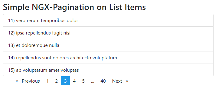
In the Template, HTML add the following list having Bootstrap style classes. The collection array of objects is fetching the items from a remote API.
<ul class="list-group">
    <li class="list-group-item" *ngFor="let item of collection | paginate: { itemsPerPage: 10, currentPage: page }">
      {{item.id}}) {{item.title}}
    </li>
</ul>

<pagination-controls (pageChange)="page = $event"></pagination-controls>
Properties of PaginatePipe
The PaginatePipe takes objects with the following properties:
itemsPerPage[number] – required The number of items to display on each page.currentPage[number] – required The current (active) page number.id[string] – To add multiple instances of pagination we can define the id attribute. We will discuss the implementation in the next section.totalItems[number] The total number of items in the collection. Only useful when doing server-side paging, where the collection size is limited to a single page returned by the server API. For in-memory paging, this property should not be set, as it will be automatically set to the value ofcollection.length.
Update Component Class with javascript fetch method to get set of items to populate collection Array.
import { Component, VERSION } from '@angular/core';

@Component({
  selector: 'my-app',
  templateUrl: './app.component.html',
  styleUrls: ['./app.component.css']
})
export class AppComponent {

  collection: any = [];
  page: any;

  ngOnInit(): void {
    this.getCollectionData();
  }

  getCollectionData() {
    fetch('https://jsonplaceholder.typicode.com/todos')
      .then(response => response.json())
      .then(json => {
        this.collection = json;
      });
  }
}
How to Multiple NGX-Paginators on the Same Page?
To add multiple paginators, you need to define the “id” property on both PaginatePipe and pagination-controls component.
Secondly, you need to define a different variable name for the current page number
<h4>First List</h4>
<ul class="list-group">
  <li class="list-group-item"
    *ngFor="let item of collection | paginate: { itemsPerPage: 5, currentPage: page, id:'first' }">
    {{item.id}}) {{item.title}}
  </li>
</ul>

<pagination-controls (pageChange)="page = $event" id="first"></pagination-controls>

<h4>Second List</h4>
<ul class="list-group">
  <li class="list-group-item"
    *ngFor="let item of collection | paginate: { itemsPerPage: 3, currentPage: pageSecond, id:'second' }">
    {{item.id}}) {{item.title}}
  </li>
</ul>

<pagination-controls (pageChange)="pageSecond = $event" id="second"></pagination-controls>
Input Properties and Events on Pagination Component
There are a number of Input binding properties to configure various labels, making pagination responsive, text labels and event handling can be used as shown below:
<ul class="list-group">
  <li class="list-group-item" *ngFor="let item of collection | paginate: config">
    {{item.id}}) {{item.title}}
  </li>
</ul>

<pagination-controls [id]="config.id" (pageChange)="onPageChange($event)"
  (pageBoundsCorrection)="onPageBoundsCorrection($event)" [maxSize]="maxSize" [directionLinks]="true" [autoHide]="true"
  [responsive]="true" previousLabel="< Prev" nextLabel="Next >" screenReaderPaginationLabel="Pagination"
  screenReaderPageLabel="page" screenReaderCurrentLabel="You're on page">
</pagination-controls>
Update component class as shown below:
export class ControlsComponent implements OnInit {
  collection: any = [];
  page: any;
  maxSize = 9;

  public config: PaginationInstance = {
    id: 'advanced',
    itemsPerPage: 4,
    currentPage: 1
  };

  ngOnInit(): void {
    this.getCollectionData();
  }

  getCollectionData() {
    fetch('https://jsonplaceholder.typicode.com/todos')
      .then(response => response.json())
      .then(json => {
        this.collection = json;
      });
  }

  onPageChange(number: number) {
    this.config.currentPage = number;
  }

  onPageBoundsCorrection(number: number) {
    this.config.currentPage = number;
  }
}
Custom CSS UI Style Using Pagination Template
To customize the CSS style of the Pagination component, we can deploy the <pagination-template/> with each of its elements having a custom CSS style. This makes the paginator component easy to customise by adding our own CSS style.
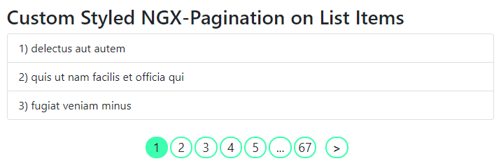
Just add the following pagination Template:
<h2>Custom Styled NGX-Pagination on List Items</h2>
<ul class="list-group">
  <li class="list-group-item" *ngFor="let item of collection | paginate: config">
    {{item.id}}) {{item.title}}
  </li>
</ul>

<pagination-template #p="paginationApi" [id]="config.id" (pageChange)="config.currentPage = $event">


  <div class="custom-pagination">
    <div class="paginator-nav-btns" *ngIf="!p.isFirstPage()" [class.disabled]="p.isFirstPage()">
      <a (click)="p.previous()">
        < </a>
    </div>

    <div *ngFor="let page of p.pages" [class.current]="p.getCurrent() === page.value">
      <a (click)="p.setCurrent(page.value)" *ngIf="p.getCurrent() !== page.value">
        <span>{{ page.label }}</span>
      </a>
      <div *ngIf="p.getCurrent() === page.value">
        <span>{{ page.label }}</span>
      </div>
    </div>

    <div class="paginator-nav-btns" *ngIf="!p.isLastPage()" [class.disabled]="p.isLastPage()">
      <a (click)="p.next()"> > </a>
    </div>
  </div>

</pagination-template>
We have a custom CSS class with the following style kept in style file:
.custom-pagination .paginator-nav-btns {
  margin: 0px 10px;
  font-weight: bold;
}

.custom-pagination > div.current {
  background-color: #3dffaf;
}

.custom-pagination > div {
  border: 2px solid #3dffaf;
  margin-right: 3px;
  border-radius: 50px;
  cursor: pointer;
  flex: 1;
  font-size: 18px;
  text-align: center;
  -moz-user-select: none;
  -webkit-user-select: none;
  -ms-user-select: none;
}

.custom-pagination {
  display: flex;
  max-width: 300px;
  margin: auto;
}
Server Side Implementation on NGX Pagination
Implmentation of server-side pagination is really simple using the ngx-pagination component. We need to handle the (pageChange) event. We will keep a method to fetch remote items by passing the current page number and sending the limit of items per page.
Update template HTML as below:
<div *ngIf="!loading">

  <ul class="list-group">
    <li class="list-group-item" *ngFor="let item of collection | paginate: config">
      {{item.id}}) {{item.title}}
    </li>
  </ul>

  <pagination-controls (pageChange)="getCollectionData($event)" id="server"></pagination-controls>

</div>

<div *ngIf="loading">Loading...</div>
In the component class, we will call the getCollectionData() and manage pageNumber and fetch items from server response for each page change request.
import { Component, OnInit } from '@angular/core';
import { PaginationInstance } from 'ngx-pagination/dist/ngx-pagination.module';

@Component({
  selector: 'app-server-side',
  templateUrl: './server-side.component.html',
  styleUrls: ['./server-side.component.css']
})
export class ServerSideComponent implements OnInit {

  page: number = 1;
  total: number = 50;
  loading: boolean = false;
  collection: any;

  public config: PaginationInstance = {
    id: 'server',
    itemsPerPage: 3,
    currentPage: this.page,
    totalItems: this.total
  };

  ngOnInit() {
    this.getCollectionData(1);
  }

  getCollectionData(page: any) {
    this.page = page;
    this.loading = true;
    fetch(
      `https://jsonplaceholder.typicode.com/posts?_page=${page}&_limit=${
        this.config.itemsPerPage
      }`
    )
      .then(response => response.json())
      .then(json => {
        this.config.currentPage = page;
        this.collection = json;
        this.total = 50;
        this.loading = false;
      });
  }
}
View Working Demo
You can check the working demo on stackblitz below:
Conclusion
We discussed how to use NGX Pagination to list items with multiple examples. It supports multiple properties and events to configure the usage in your application.
Moreover, we discussed how to customize the UI style by overriding various elements and add your own CSS style.
The server-side pagination is useful for showing records with huge data of the backend to dump at once. During page change, each set of items are fetched from a remote server.
Hope this was helpful … in the next tutorial we will discuss the Material Paginator API to implement similar use-cases.