Angular tutorial for implementation of Drag Button Slider using the ng5-slider NPM module package.
Slider or Range Slider plays an important role to add a custom control in page for users to select values by simply dragging a button on the scale provided. This type of control can be used to select a value or select a range by dragging two slider buttons.
In this article, we will learn How to add a Range Slider in Angular application using an awsome module the ng5-slider. We will discuss its various available features and customize its style according to our needs by using CSS styles.
Let’s get started!
Install & Configure the ng5-slider package
To use slider first, install the ng5-slider package in your Angular application by executing below NPM command in the terminal at project root:
$ npm install --save ng5-slider</pre> <h6>Adding in App Module</h6> After installation, open the <strong>app.module.ts</strong> file to import the <code>Ng5SliderModulethen add in imports array as shown below:// app.module.ts import { Ng5SliderModule } from 'ng5-slider'; ... @NgModule({ ... imports: [ ... Ng5SliderModule, ... ], ... }) export class AppModule {}Adding the Slider
The
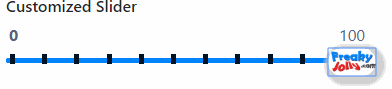
ng5-slidercomponent directive is added in the HTML component template to create a slider with[options]required property as shown below:<ng5-slider [(value)]="value" [options]="options"></ng5-slider></pre> In the component class, import the <code>Optionsclass fromng5-slider. It is used to add configuration for our Slider.import { Options } from 'ng5-slider'; ... @Component({...}) export class AppComponent { value: number = 100; options: Options = { floor: 0, ceil: 200 }; }</pre> By adding the above code, our basic slider will be created as shown below: <img class="alignnone wp-image-3609 size-full" src="https://www.freakyjolly.com/wp-content/uploads/2020/04/Pasted-into-Angular-789-Range-Drag-Slider-Bar-using-ng5-slider.png" /> This is the basic implementation, you can check more advanced implementation in guide <a href="https://angular-slider.github.io/ng5-slider/docs" target="_blank" rel="nofollow noopener noreferrer">documentation</a> and <a href="https://angular-slider.github.io/ng5-slider/demos" target="_blank" rel="nofollow noopener noreferrer">demo</a> page. <h2>Input Properties and Output Events</h2> Following are Input and Output properties available for ng5-slider component directive: <pre><code class="language-markup"><ng5-slider [(value)]="<number>" [(highValue)]="<number>" [options]="<options object>" [manualRefresh]="<event emitter>" [triggerFocus]="<event emitter>" (userChangeStart)="<event handler>" (userChange)="<event handler>" (userChangeEnd)="<event handler>" (valueChange)="<event handler>" (highValueChange)="<event handler>" ></ng5-slider></pre> <h2>Options</h2> To configure slider's various properties we can import the <code>Optionsclass in component to manipulates its view and usability. All options and its usage is well explained in the documentation here.Customize Style for Ng5Slider
We can customize the slider style by simply adding a class on the wrapper as shown below:
<div class="custom-slider"> <ng5-slider [(value)]="minValue" [(highValue)]="maxValue" [options]="options"></ng5-slider> </div>Then add the following CSS in the component Style file:
// We need to use ::ng-deep to overcome view encapsulation ::ng-deep { .custom-slider .ng5-slider .ng5-slider-bar { background:#0084FF; height: 5px; } .custom-slider .ng5-slider .ng5-slider-pointer { width: 48px; height: 28px; top: auto; /* to remove the default positioning */ bottom: 0; background-image: url(https://www.freakyjolly.com/wp-content/plugins/phastpress/phast.php/https-3A-2F-2Fwww.freakyjolly.com-2Fwp-2Dcontent-2Fuploads-2F2017-2F08-2Fcropped-2Dfjlogo2.png/service=images/width=248/height=140/cacheMarker=1569606953-2D8457/token=9b3bc6a406ae60d6/__p__.png); background-size: cover; background-color:#ffffff; top: -10px; box-shadow: 3px 3px 5px 6px #ccc; } .custom-slider .ng5-slider .ng5-slider-pointer:after { display: none; } .custom-slider .ng5-slider .ng5-slider-bubble { bottom: 14px; } .custom-slider .ng5-slider .ng5-slider-limit { font-weight: bold; color: blue; } .custom-slider .ng5-slider .ng5-slider-tick { width: 5px; height: 10px; margin-left: 4px; border-radius: 0; background: #001324; top: -1px; } }
Category: Angular