It’s always a boon that Angular developers have some great packages which not only provide the required solution for behavior but also sometimes adds up to the value.
One of a package is @ng-select in our top list to convert traditional HTML select form control into an advanced selection component with many features:
- Search Filter
- Optimized for large values using Virtual Scroll
- Customized template for options
- Single and Multi-selection in form of Tags
- And many more…
We have already discussed its easy implementation steps here and some advanced features in some of our previous posts you must check them.
In this post, we will discuss some tweaks to adapt the @ng-select component in some situations.
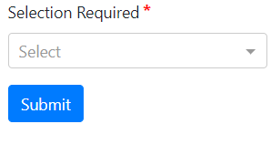
Validation of NgSelect in Template Driven Form
For template-driven form, we will discuss how to make them required and highlight if left unselected by using on form submission.
In our component template HTML added below code to create a form and added ng-select with an object to populate some random values:
    <form role="form" #MySelectForm="ngForm" (submit)="onFormSubmit()">

        <div class="form-group">
            <fieldset class="form-group">
                <label>Selection Required</label>
                <ng-select
                [items]="selectOptions"
                [(ngModel)]="mySelectModel"
                name="licenseAuthorityId"
                bindValue="customId"
                bindLabel="customText"
                placeholder="Select"
                required
                [disabled]="isFormDisabled">
                </ng-select>
              </fieldset>
        </div>

        <div class="form-group">
            <fieldset class="form-group">
                <button class="btn btn-primary">Submit</button>
              </fieldset>
        </div>

    </form>
Here we used bindValue and bindLabel properties of ng-select as we have custom properties for ID and option text in the selectOptions object.
Simple template form-based validation is added using ngForm. Don’t forget to add FormsModule in imports array of app.module.ts file.
Check component class code given below:
// ngselect.component.ts
import { Component, OnInit, ViewChild } from '@angular/core';
import { NgForm } from '@angular/forms';

@Component({
  selector: 'app-ngselect',
  templateUrl: './ngselect.component.html',
  styleUrls: ['./ngselect.component.css']
})
export class NgselectComponent implements OnInit {

  @ViewChild('MySelectForm', { static: false })
  mySelectForm: NgForm;

  isFormDisabled: boolean;
  mySelectModel: number;

  selectOptions = [
    {
      customId: 1,
      customText: 'Some Random Text'
    }, {
      customId: 2,
      customText: 'To Show Custom Values'
    }, {
      customId: 3,
      customText: 'With Custom Text Binding'
    }, {
      customId: 4,
      customText: 'My Validation'
    },
  ]

  constructor() { }

  ngOnInit() {
  }

  onFormSubmit() {
    this.mySelectForm.form.markAllAsTouched();
    if (this.mySelectForm.form.invalid) {
      console.log('Please fill valid details!');
      return false;
    }

    console.log('Form Submitted!');
  }
}
Now to add red color highlight effect to ng-select let’s add following CSS style in styles.css file.
/* Border Color */
.ng-select.ng-invalid.ng-touched .ng-select-container{
    border-color: red;
}
/* Arrow Color */
.ng-select.ng-invalid.ng-touched .ng-arrow-wrapper .ng-arrow{
    border-color: red transparent transparent
}
/* Placeholder Color */
.ng-select.ng-invalid.ng-touched .ng-select-container .ng-placeholder{
    color: red;
}
Note: For asterisk(*) sign on required ng-select, check this post where you can learn on how to create a custom directive to auto add star in required form fields at once.
Custom Property Binding
For custom Id’s and text to show for ng-select we can use bindValue and bindLabel if we have properties other then id and name which used by default. This solves the property binding problem if we have different properties to bind in the select box. Like we have in our example above.
                <ng-select
                [items]="selectOptions"
                [(ngModel)]="mySelectModel"
                name="licenseAuthorityId"
                bindValue="customId"
                bindLabel="customText"
                placeholder="Select"
                required
                [disabled]="isFormDisabled">
                </ng-select>
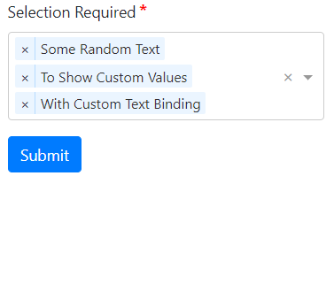
Multi Selection in @ng-select
Using the ng-select component we can enable single as well as multi-selection of option values in the drop-down. The selected values are added up as tags which can be easily removed by clicking on cross icon on each selected value tag.

To enable Multi-selection just to add [multiple] properties which takes a boolean value.
                <ng-select
                [multiple]="true"
                [items]="selectOptions"
                [(ngModel)]="mySelectModel"
                name="licenseAuthorityId"
                bindValue="customId"
                bindLabel="customText"
                placeholder="Select"
                required
                [disabled]="isFormDisabled">
                </ng-select>
For default selection of values in the select box, just provides values in the model as an array of ID’s which is customId here.
// ngselect.component.ts
import { Component, OnInit, ViewChild } from '@angular/core';
import { NgForm } from '@angular/forms';

@Component({
  selector: 'app-ngselect',
  templateUrl: './ngselect.component.html',
  styleUrls: ['./ngselect.component.css']
})
export class NgselectComponent implements OnInit {

  @ViewChild('MySelectForm', { static: false })
  mySelectForm: NgForm;

  isFormDisabled: boolean;
  mySelectModel: number[];

  selectOptions = [
    {
      customId: 1,
      customText: 'Some Random Text'
    }, {
      customId: 2,
      customText: 'To Show Custom Values'
    }, {
      customId: 3,
      customText: 'With Custom Text Binding'
    }, {
      customId: 4,
      customText: 'My Validation'
    },
  ]

  constructor() { }

  ngOnInit() {
    this.mySelectModel = [2,3];
  }

  onFormSubmit() {
    this.mySelectForm.form.markAllAsTouched();
    if (this.mySelectForm.form.invalid) {
      console.log('Please fill valid details!');
      return false;
    }

    console.log('Form Submitted!');
  }
}
Note: You need to take care that type of ids must match it’s a number in the object then you can’t bind with string as shown below:
    // WILL NOT WORK
    this.mySelectModel = ['2','3'];
Another useful property you can use is [hideSelected], which will not show the selected values in options. This keeps the search clean.
Checkboxes for Multiselect using @ng-select
In @ng-select component for multi-select, we can also add checkboxes to enhance user viewability.
For that we will override the option template as shown below:
               <ng-select
                [multiple]="true"
                [items]="selectOptions"
                [(ngModel)]="mySelectModel"
                name="licenseAuthorityId"
                bindValue="customId"
                bindLabel="customText"
                placeholder="Select"
                required
                [disabled]="isFormDisabled"
                [closeOnSelect]="false">
                    <ng-template ng-option-tmp let-item="item" let-item$="item$" let-index="index">
                        <input id="item-{{index}}" type="checkbox" name="item-{{index}}" [ngModel]="item$.selected"/> {{item.customText}}
                    </ng-template>
                </ng-select>
Above also added the [closeOnSelect] property set to false so the options will not close immediately close after each select but on clicking outside.
That’s it here we discussed some of the features of @ng-select component for Angular’s latest versions like how we can bind custom properties, validation alert styling, checkboxes in multiselection.