In this Angular 9/8 tutorial, we’ll learn how to install NgBootstrap in Angular application and implement Popover UI Component by examples.
What are Bootstrap Popovers?
A popover is a small overlay that is used to show information in a floating container. It is shown at a specified position by user actions like Click or Hover beside an element. Popovers act like a tooltip but can have complex template HTML structures. These can be controlled to be triggered by click, hover, mouseover, etc events.
What is ng-bootstrap?
A bootstrap framework is known for its wide variety of UI components that are readily available to create a responsive and multi-platform supportive application. The ng-bootstrap package is exclusively created to convert the jQuery based Bootstrap UI components for the Angular framework. The ng-bootstrap package provides almost all Bootstrap components that can be easily used in an Angular project
Let,s create a new Angular project, then install the ng-bootstrap package to implement its Popover UI component in our project.
Create an Angular Project
For demonstration from scratch, here we will create a new Angular project.
Run following ng command in terminal to create a new project:
$ ng new ng-bootstrap-popover-demoInstall ng-bootstrap
After creating the project, we will install ng-bootstrap in the project by running the following npm command:
$ npm install --save @ng-bootstrap/ng-bootstrapThe ng-bootstrap includes UI components only, so for adding styling to these components we need to include CSS styling file in the index.html at Angular project root
<link rel="stylesheet" href="https://stackpath.bootstrapcdn.com/bootstrap/4.3.1/css/bootstrap.min.css" >
Update App Module
Import NgbModule ( Bootstrap module ) & FormsModule ( for Angular as we will use [(ngModel)] ) in the app.module.ts file
// app.module.ts
import { BrowserModule } from '@angular/platform-browser';
import { NgModule } from '@angular/core';

import { AppRoutingModule } from './app-routing.module';
import { AppComponent } from './app.component';

import { NgbModule } from '@ng-bootstrap/ng-bootstrap';

@NgModule({
  declarations: [
    AppComponent
  ],
  imports: [
    BrowserModule,
    AppRoutingModule,
    NgbModule
  ],
  providers: [],
  bootstrap: [AppComponent]
})
export class AppModule { }
Adding Bootstrap Popover
Check the following ways using which we can implement NgBootstrap Popovers in Angular app:
Basic Popovers
These are the basic and simplest Popover implementation method, where you just need to add placement, ngbPopover, and popoverTitle properties:
<button type="button" class="btn btn-outline-secondary mr-2" ngbPopover="Popover content" popoverTitle="Simple Popover"> Show Popover </button>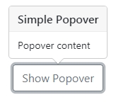
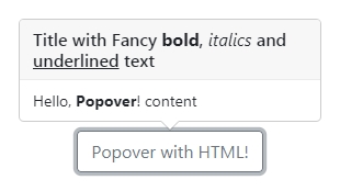
HTML in Popovers
To customized content with HTML in popovers, we can use ng-template tags to specific content as shown below:
<ng-template #popContent>Hello, <b>Popover</b>! content</ng-template>
<ng-template #popTitle>Title with Fancy <b> bold</b>, <i>italics</i> and <u>underlined</u> text</ng-template>

<button type="button" class="btn btn-outline-secondary" [ngbPopover]="popContent" [popoverTitle]="popTitle">
  Popover with HTML!
</button>
Here we provided Template Reference variables #popContent and #popTitle template elements then provided them to [ngbPopover] and [popoverTitle] properties of the button.
Configuration Properties of Popovers
Following are the configuration properties provided by ng-bootstrap Popovers:
<strong>ngbPopover</strong>:This is required directive property which takes a string ortemplateRefvariable to show content.<strong>placement</strong>:Position of popover container respective of the parent element can be changed with values :"top","top-left","top-right","bottom","bottom-left","bottom-right","left","left-top","left-bottom","right","right-top","right-bottom"<strong>popoverClass</strong>:A custom class can be added using this property to a popover container.<strong>container</strong>:Default popovers elements are appended to thebody, but we can specify any other selector to append.<strong>popoverTitle</strong>:The title of the popover can take string ortemplateRef.<strong>triggers</strong>:Events to show Popovers can be changed from default click to mouseover. exampletriggers="mouseenter:mouseleave"<strong>disablePopover</strong>:Default is false, if set to true, popover won’t be displayed.<strong>closeDelay</strong>:The closing delay in ms.<strong>autoClose</strong>:Indicates whether the popover should be closed on Escape key and inside/outside clicks:true– closes on both outside and inside clicks as well as Escape presses
false– disables the autoClose feature (NB: triggers still apply)
"inside"– closes on inside clicks as well as Escape presses
"outside"– closes on outside clicks (sometimes also achievable through triggers) as well as Escape presses
Global Configurations
Instead of adding HTML properties to each tooltip, we can add a global option configuration object in the component class.
Import NgbPopoverConfig then add in providers array under component’s meta information. Also, add in the class constructor.
import {Component} from '@angular/core';
import {NgbPopoverConfig} from '@ng-bootstrap/ng-bootstrap';

@Component({
  selector: 'ngbd-popover-config',
  templateUrl: './popover-config.html',
  providers: [NgbPopoverConfig] // add NgbPopoverConfig to the component providers
})
export class NgbdPopoverConfig {
  constructor(config: NgbPopoverConfig) {
    // customize default values of popovers used by this component tree
    config.placement = 'right';
    config.triggers = 'hover';
  }
}
Conclusion
We have discussed how to use Bootstrap popovers in an Angular project by installing the ng-bootstrap package and use its Popover UI component. The Popover component can be customized by using its various properties.