Angular Material provides an awesome fully-featured data-table component that can be easily implemented in an Angular application. The datatable UI component provided by Material is based on the material design provides many features like Pagination, Sortable columns, Filter data, Frozen Columns, and Rows, etc.
Although Material data-tables provides high-end functionalities, small things can eat-up most of our time.
One such case is sometimes developers find it difficult to fix the width of columns according to needs. In Angular Material data-table each column is equally divided according to the width of the container where it is kept.
But there are some cases where we may want some columns to have fix width having only icons or some ID.
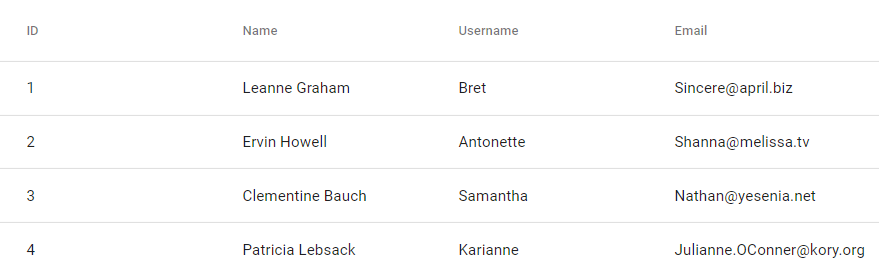
Before:
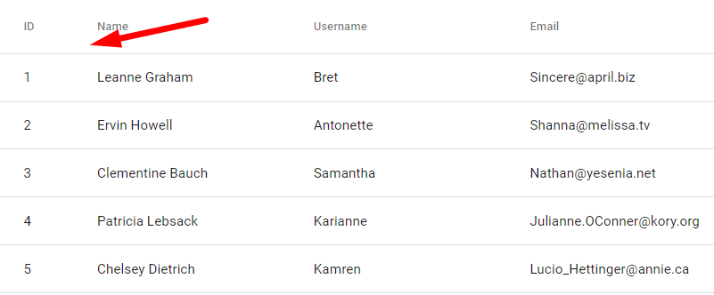
After:
Let’s create a Material table to implement these tricks:
Version Check:
Angular CLI: 9.0.6
Node: 12.15.0
Create an Angular project
Using NG CLI create new Angular project by running the following command:
$ ng new ng-material-table-demo ? Would you like to add Angular routing? Yes ? Which stylesheet format would you like to use? SCSS</pre> Move to project root: <pre class="wp-block-prismatic-blocks"><code class="language-javascript">$ cd ng-material-table-demo</pre> <h3>Install Angular Material</h3> After creating the project, install the Material package in the project to use data-table component UI. Run the following command to install the Material package by answering a few questions: <pre class="lang:js mark:1 decode:true ">$ ng add @angular/material ? Choose a prebuilt theme name, or "custom" for a custom theme: Indigo/Pink ? Set up global Angular Material typography styles? Yes ? Set up browser animations for Angular Material? Yes</pre> <h3>Add Material Data Table</h3> To use data-table add the <code>MatTableModulein app.module.ts file:// app.module.ts import { BrowserModule } from '@angular/platform-browser'; import { NgModule } from '@angular/core'; import { AppRoutingModule } from './app-routing.module'; import { AppComponent } from './app.component'; import { BrowserAnimationsModule } from '@angular/platform-browser/animations'; import { HttpClientModule } from '@angular/common/http'; import { MatTableModule } from '@angular/material/table'; @NgModule({ declarations: [ AppComponent ], imports: [ BrowserModule, AppRoutingModule, BrowserAnimationsModule, HttpClientModule, MatTableModule ], providers: [], bootstrap: [AppComponent] }) export class AppModule { }We also need
HttpClientModuleto fetch remote data to build data-table.Update app.component.ts file to define data-table columns and fetch data by calling the
getRemoteData()as shown below:// app.component.ts import { Component } from '@angular/core'; import { HttpClient } from '@angular/common/http'; import { MatTableDataSource } from '@angular/material/table'; @Component({ selector: 'app-root', templateUrl: './app.component.html', styleUrls: ['./app.component.scss'] }) export class AppComponent { title = 'ng-material-table-demo'; dataList = new MatTableDataSource(); displayedColumns: string[] = ['id', 'name', 'username', 'email', 'phone', 'website']; constructor( private http: HttpClient, ) { } ngOnInit() { this.getRemoteData(); } getRemoteData() { this.http .get<any>('https://jsonplaceholder.typicode.com/users') .subscribe((response) => { console.log(response); this.dataList.data = response; }, error => { console.log(error); }) } } </pre> In the <strong>app.component.html</strong> file replace below HTML code: <pre><code class="language-markup"><router-outlet></router-outlet> <table mat-table [dataSource]="dataList"> <ng-container matColumnDef="id"> <th mat-header-cell *matHeaderCellDef> id </th> <td mat-cell *matCellDef="let element"> {{element.id}} </td> </ng-container> <ng-container matColumnDef="name"> <th mat-header-cell *matHeaderCellDef> name </th> <td mat-cell *matCellDef="let element"> {{element.name}} </td> </ng-container> <ng-container matColumnDef="username"> <th mat-header-cell *matHeaderCellDef> username </th> <td mat-cell *matCellDef="let element"> {{element.username}} </td> </ng-container> <ng-container matColumnDef="email"> <th mat-header-cell *matHeaderCellDef> email </th> <td mat-cell *matCellDef="let element"> {{element.email}} </td> </ng-container> <ng-container matColumnDef="phone"> <th mat-header-cell *matHeaderCellDef> phone </th> <td mat-cell *matCellDef="let element"> {{element.phone}} </td> </ng-container> <ng-container matColumnDef="website"> <th mat-header-cell *matHeaderCellDef> website </th> <td mat-cell *matCellDef="let element"> {{element.website}} </td> </ng-container> <tr mat-header-row *matHeaderRowDef="displayedColumns;"></tr> <tr mat-row *matRowDef="let row; columns: displayedColumns;"></tr> </table></pre> Now we have a data-table to apply our tricks: <h5>Custom Width on Material Data Table Columns</h5> To apply custom width to columns we can create helper classes with width provided in pixes as shown below: <pre><code class="language-scss">.w-75{ width: 75px; } .w-100{ width: 100px; }</pre> You can create any number of these custom width classes according to your requirements. After that just add them to the <code><th>element in the table above.... <ng-container matColumnDef="id"> <th class="w-75" mat-header-cell *matHeaderCellDef> id </th> <td mat-cell *matCellDef="let element"> {{element.id}} </td> </ng-container> ...How to Align Text in columns of data-table?
In a similar way just create classes as shown below:
.th-center{ text-align: center; } .th-left{ text-align: left; } .th-right{ text-align: right; }</pre> Which can be added to <code><th>elements:... <ng-container matColumnDef="id"> <th class="w-75 th-center" mat-header-cell *matHeaderCellDef> id </th> <td mat-cell *matCellDef="let element"> {{element.id}} </td> </ng-container> ...For Data-Tables using Component Elements as shown below:
<mat-table [dataSource]="dataList" class="mat-elevation-z8"> <ng-container matColumnDef="id"> <mat-header-cell *matHeaderCellDef [ngClass]="'w-75'"> id </mat-header-cell> <mat-cell *matCellDef="let element" [ngClass]="'w-75'"> {{element.id}} </mat-cell> </ng-container> <ng-container matColumnDef="name"> <mat-header-cell *matHeaderCellDef> name </mat-header-cell> <mat-cell *matCellDef="let element"> {{element.name}} </mat-cell> </ng-container> <ng-container matColumnDef="username"> <mat-header-cell *matHeaderCellDef> username </mat-header-cell> <mat-cell *matCellDef="let element"> {{element.username}} </mat-cell> </ng-container> <ng-container matColumnDef="email"> <mat-header-cell *matHeaderCellDef> email </mat-header-cell> <mat-cell *matCellDef="let element"> {{element.email}} </mat-cell> </ng-container> <ng-container matColumnDef="phone"> <mat-header-cell *matHeaderCellDef> phone </mat-header-cell> <mat-cell *matCellDef="let element"> {{element.phone}} </mat-cell> </ng-container> <ng-container matColumnDef="website"> <mat-header-cell *matHeaderCellDef> website </mat-header-cell> <mat-cell *matCellDef="let element"> {{element.website}} </mat-cell> </ng-container> <mat-header-row *matHeaderRowDef="displayedColumns"></mat-header-row> <mat-row *matRowDef="let row; columns: displayedColumns;"></mat-row> </mat-table></pre> We can use <code>[ngClass]directive to add classes to Column and Cells but instead of width, we need to usemax-widthto columns as well as to cells because components use FLEX layout to define widths. Update CSS classes:.w-75{ max-width: 75px; } .w-100{ max-width: 100px; }
Category: Angular