In this Angular tutorial, you will learn how to add the action column with the drop-down menu on the material table. The Angular Material table will have a dynamic column on which we will add an action column with a multi-level drop-down action menu
The material table represents multiple rows of data, on which users can trigger some action. These row’s actions could be Edit, Delete, Apply, Link, Freeze etc. By adding an action column on each row, we can assign multiple action menu items on which a user can act.
In this guide, you will learn how to create a Material table with dynamic rows and columns and assign action items to the last or any columns using the custom template technique. We can use [ngTemplateOutlet] and [ngTemplateOutletContext] properties to defining custom templates in Material table.
How to add an Action Column with Menu DropDown in Material Table?
Step 1 – Create an Angular App
Step 2 – Add Material Library
Step 3 – Update AppModule
Step 4 – Create Material Table with Action Column
Step 5 – See In Action
Step 1 – Create Angular App
To enable the ng command in the terminal window, make sure to instal the angular cli tool. If you already have, you can update it as well.
# Install NG CLI
npm install -g @angular/cli

#Update NG CLI
ng update
Afterwards, you can hit the following command to create a new angular project with the name provided:
ng new angular-material-table-appMove inside the application folder
cd angular-material-table-appStep 2 – Install Material Library
Thereafter creating and moving the terminal to the application folder, we will install the Material library by executing the ng add command. This makes the installation of the material library very easy, you can choose options while installation as shown below:
ng add @angular/material

# ? Choose a prebuilt theme name, or "custom" for a custom theme: Indigo/Pink
# ? Set up global Angular Material typography styles? No
# ? Set up browser animations for Angular Material? Yes
This will update the "styles" property array inside the angular.json file, which you can change anytime.
Step 3 – Import Material Module
The Material library provides huge set of usable API’s for its various modules and components. So we need to import only those modules, that we’re going to use in our application. This keeps out app more optimized and size-efficient.
We will import Table, Icon, Button and Menu-related modules into the App Module.
Open the app.module.ts file and update the imports array:
import { NgModule } from '@angular/core';
import { BrowserModule } from '@angular/platform-browser';

import { AppComponent } from './app.component';
import { BrowserAnimationsModule } from '@angular/platform-browser/animations';

// Material Modules
import { MatTableModule } from '@angular/material/table';
import { MatMenuModule } from '@angular/material/menu';
import { MatIconModule } from '@angular/material/icon';
import { MatButtonModule } from '@angular/material/button';

@NgModule({
  declarations: [AppComponent],
  imports: [
    BrowserModule,
    BrowserAnimationsModule,
    MatTableModule,
    MatMenuModule,
    MatIconModule,
    MatButtonModule,
  ],
  providers: [],
  bootstrap: [AppComponent],
})
export class AppModule {}
Step 4 – Create Material Table with Action Column
Now, open the app.component.html file and add the table with mat-table component. Here we have created dynamic columns and cells using the ngFor loop iterator.
Update the file as shown below:
<div class="table-container" tabindex="0">
  <mat-table [dataSource]="dataSource">

    <ng-container matColumnDef="{{col}}" *ngFor="let col of displayedColumns;">
      <mat-header-cell *matHeaderCellDef> <b>{{col}}</b> </mat-header-cell>

      <mat-cell *matCellDef="let element; let i = index">
        <ng-template [ngTemplateOutlet]="testTemp" [ngTemplateOutletContext]="{
                              context: {
                                  element: element,
                                  index: i
                                }
                              }"></ng-template>

        <!-- Custom Template -->

        <ng-template #testTemp let-context="context">

          <ng-container *ngIf="col === 'Column_3'; else elseTemplate">

            <!-- Action Menu Items -->
            <button mat-icon-button [matMenuTriggerFor]="mainMenu">
              <mat-icon>more_vert</mat-icon>
            </button>
            <mat-menu #mainMenu="matMenu">
              <button mat-menu-item [matMenuTriggerFor]="subMenu">Action Menu 1</button>
              <button mat-menu-item (click)="rowAction('action_2',element)">Action 2</button>
            </mat-menu>

            <mat-menu #subMenu="matMenu">
              <button mat-menu-item (click)="rowAction('sub_action_1',element)">Sub Action 1</button>
              <button mat-menu-item (click)="rowAction('sub_action_2',element)">Sub Action 2</button>
            </mat-menu>


          </ng-container>
          <ng-template #elseTemplate>
            <!-- Normat table cell values -->
            {{element[col]}}
          </ng-template>

        </ng-template>
      </mat-cell>

    </ng-container>

    <mat-row mat-header-row *matHeaderRowDef="displayedColumns;"></mat-row>
    <mat-row *matRowDef="let row; columns: displayedColumns;"></mat-row>

  </mat-table>
</div>
Three important things to notice over here:
1) Used the ngFor directive to iterate all columns and Rows
2) Use Template : We have used the templates to define the Action menu item using the IfElse component. The [ngTemplateOutlet] and [ngTemplateOutletContext] helps to assign a custom template to cells.
3) We used If Else component to define a Menu for the specific column which is ‘Column_3‘ in our case to show the action menu
Next, update the component class file app.component.ts with the following:
import { Component } from '@angular/core';

@Component({
  selector: 'app-root',
  templateUrl: './app.component.html',
  styleUrls: ['./app.component.css'],
})
export class AppComponent {
  displayedColumns: any[] = [];
  dataSource: any[] = [];
  rcs = 4; //Row Column Size

  constructor() {
    // Generate columns
    for (let c = 0; c < this.rcs; c++) {
      this.displayedColumns.push('Column_' + c);
    }

    // Generate rows
    for (let r = 0; r < this.rcs; r++) {
      const row: any = new Object();
      for (let c = 0; c < this.rcs; c++) {
        row[this.displayedColumns[c]] = 'Row_' + c;
      }
      this.dataSource.push(row);
    }
    console.log(this.displayedColumns);
    console.log(this.dataSource);
  }

  // Row action
  rowAction(actionType: any, rowElement: any) {
    console.log(actionType, rowElement);
  }
}
Step 5 – See In Action
Now, you can run the application by hitting npm start and see the table with Action Menu.
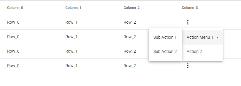
We have defined the rowAction method in our class to know which action is clicked for which row to control and use actions appropriately.