In this Angular Material tutorial, we’ll learn how to implement badge numbers indicating a message or notification and also how to customize it using Material UI in the Angular 12 application.
Badges are designed to display the count in numbers or characters over another element like a button or icon to display or highlight that there is some information that can be checked on some action.
A badge acts and inspired similar to Android or iOS application icons which show a count of notification related to that application. Badges are usually added to attract user attention and at the same time inform about intensity in form of number count.
In Angular application, we can easily display badges using Material components and also customize them according to our needs.
Let’s start implementation in a new Angular application.
How to Add Material Badges in Angular App?
Create a New Angular Application
Run the following ng command to create a new Angular project
$ ng new angular-material-badges-app
# ? Would you like to add Angular routing? No
# ? Which stylesheet format would you like to use? SCSS
Enter the project directory
$ cd angular-material-badges-appRun the application
$ ng serve --open
Install Material Package
After creating the Angular project, install the Material UI library by hitting the following ng command
$ ng add @angular/material
? Choose a prebuilt theme name, or "custom" for a custom theme: Indigo/Pink
? Set up global Angular Material typography styles? No
? Set up browser animations for Angular Material? Yes
Update App Module
To use Badges in the Angular project, we need to import the required API modules.
Open the app.module.ts file then import the MatBadgeModule then add in the imports array:
// app.module.ts
import { BrowserModule } from '@angular/platform-browser';
import { NgModule } from '@angular/core';

import { AppComponent } from './app.component';
import { BrowserAnimationsModule } from '@angular/platform-browser/animations';

import { MatBadgeModule } from '@angular/material/badge';

@NgModule({
  declarations: [
    AppComponent
  ],
  imports: [
    BrowserModule,
    BrowserAnimationsModule,

    MatBadgeModule

  ],
  providers: [],
  bootstrap: [AppComponent]
})
export class AppModule { }
Adding Material Badges in Angular Application
After importing the MatBadgeModule, the badges can be easily added to adding the matBadge property to any element in the template HTML.
<span matBadge="4">My Notifications</span>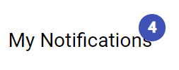
In a similar way, Badges can be added to buttons and icons as well.
<p>
    <button matBadge="8" mat-raised-button color="warn">
      Action
    </button>
  </p>

  <p>
    <mat-icon matBadge="5">notifications</mat-icon>
  </p>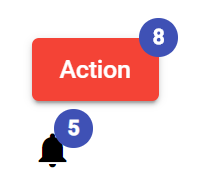
Note: We also need to import the MatIconModule and MatButtonModule modules to add buttons and icons.
Configurations for Material Badges
Following are important configuration properties for Material Badges
Color
matBadgeColor: The color of the badge. Can be primary, accent, or warn.
<p>
    <button matBadge="8" mat-raised-button matBadgeColor="primary">
      Primary
    </button>
  </p>
  <p>
    <button matBadge="8" mat-raised-button matBadgeColor="accent">
      Accent
    </button>
  </p>
  <p>
    <button matBadge="8" mat-raised-button matBadgeColor="warn">
      Warn
    </button>
  </p>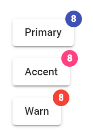
Hidden
matBadgeHidden: Whether the badge is hidden.
<button matBadge="8" mat-raised-button [matBadgeHidden]="isBadgeHidden" (click)="isBadgeHidden = !isBadgeHidden">
      Toggle Badge
</button>
Badge Description
matBadgeDescription: The message used to describe the decorated element via aria-describedby.
Badge Content
matBadge: The content for the badge.
<p>
    <button matBadge="8" mat-raised-button>
      Number Badge
    </button>
  </p>
  <p>
    <button matBadge="$15" mat-raised-button>
      Cart Details
    </button>
  </p>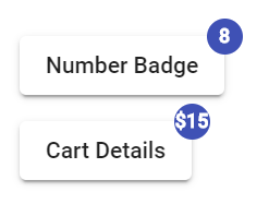
Disabled Badge
matBadgeDisabled: Whether the component is disabled.
<button matBadge="8" mat-raised-button [matBadgeDisabled]="isBadgeDisabled"
      (click)="isBadgeDisabled = !isBadgeDisabled">
      Disable Badge
    </button>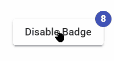
Badge Overlapping
matBadgeOverlap: Whether the badge should overlap its contents or not.
<button matBadge="8" mat-raised-button [matBadgeOverlap]="isBadgeOverlapped"
      (click)="isBadgeOverlapped = !isBadgeOverlapped">
      Toggle Overlapping Badge
    </button>
Positioning Badge
matBadgePosition: Position the badge should reside. Accepts any combination of ‘above’|’below’ and ‘before’|’after’.
<p>
    <button matBadge="4" mat-raised-button matBadgePosition="'above'">
      Badge Above
    </button>
  </p>
  <p>
    <button matBadge="4" mat-raised-button matBadgePosition="'below'">
      Badge Below
    </button>
  </p>
  <p>
    <button matBadge="4" mat-raised-button matBadgePosition="'before'">
      Badge Before
    </button>
  </p>
  <p>
    <button matBadge="4" mat-raised-button matBadgePosition="'after'">
      Badge After
    </button>
  </p>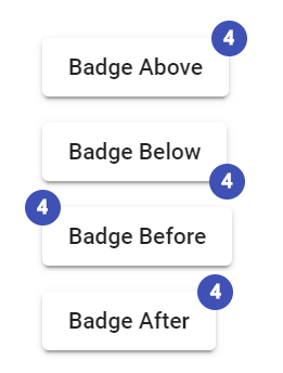
Size
matBadgeSize: Size of the badge. Can be ‘small’, ‘medium’, or ‘large’.
<p>
  <button matBadge="4" mat-raised-button matBadgeSize="small">
    Badge Small
  </button>
</p>
<p>
  <button matBadge="4" mat-raised-button matBadgeSize="medium">
    Badge Medium
  </button>
</p>
<p>
  <button matBadge="4" mat-raised-button matBadgeSize="large">
    Badge Large
  </button>
</p>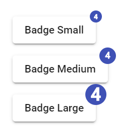
Conclusion
Badges in Angular application can be easily implemented using Material MatBadgeModule API. They support a number of properties to control its behavior in the project requirements.