Material Datepicker with To From Date Range selection Example; In this Angular Material tutorial, we’ll learn how to implement Material UI styles Datepicker and Timepicker with Range selection feature.
Usually the Material date and time picker only allows a user to select a single value. But here we’ll learn how to enable a user to select Start and End date with a range in Angular 12 application.
Date and Time pickers provided by Material UI library are awesome, but in situations where we need to allow a user to select a range of dates including Start/From to End/To dates, developers feel challenges.
Today in this tutorial, we’re going to discuss if you are using Material UI library in Angular project, then how can you display a Date/ Time range selection UI component with lots of features and amazing usability.
To enhance the existing Material Date-picker, we’re going to install another package named ngx-daterangepicker-material. We’ll discuss many other configuration and features available to help you out and make you work super easy.
Note: This package will result in Date-picker with Material UI styles, but you don’t need to install the Material UI package in your Angular project.
Let’s get started!
How to add Range Selection in Material Datepicker?
Create a New Angular Application
Run the following ng command to create a new Angular project
$ ng new angular-ngx-daterangepicker-material-app
# ? Would you like to add Angular routing? Yes
# ? Which stylesheet format would you like to use? SCSS
Enter the project directory
$ cd angular-ngx-daterangepicker-material-appRun the application
$ ng serve --open
Install ngx-daterangepicker-material Package
Now execute following npm command to install the ngx-daterangepicker-material package in your Angular application
$ npm install ngx-daterangepicker-material --save
Install Moment as Dependency
The ngx-daterangepicker-material package uses Moment as a dependencies to render and parse Dates more accurately. So execute following command to install Moment if it is not already there in your Angular project.
$ npm install moment @angular/material-moment-adapter
Update App Module
Open the app.module.ts file, then Import the NgxDaterangepickerMd module to make it available across your application. Also we added the FormsModule to enable use of NgModel on form controls.
// app.module.ts
import { NgModule } from '@angular/core';
import { FormsModule } from '@angular/forms';
import { BrowserModule } from '@angular/platform-browser';
import { NgxDaterangepickerMd } from 'ngx-daterangepicker-material';

import { AppRoutingModule } from './app-routing.module';
import { AppComponent } from './app.component';

@NgModule({
  declarations: [
    AppComponent
  ],
  imports: [
    BrowserModule,
    AppRoutingModule,
    FormsModule,
    NgxDaterangepickerMd.forRoot()
  ],
  providers: [],
  bootstrap: [AppComponent]
})
export class AppModule { }
Adding the Date-Range Picker
Finally, we’re done with configuration part. To show the date-picker with Range selection add following input control in the HTML template.
<input type="text" ngxDaterangepickerMd [(ngModel)]="selected" />
  <div>Selected : {{selected | json}}</div>
Also, define the selected variable with type inside the component class
// app.component.ts
import { Component } from '@angular/core';
import { Moment } from 'moment';
@Component({
selector: 'app-root',
templateUrl: './app.component.html',
styleUrls: ['./app.component.scss']
})
export class AppComponent {
title = 'angular-ngx-daterangepicker-material-app';
selected: { startDate: Moment, endDate: Moment };
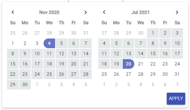
constructor() { }
}Now, if you run your app it will display as shown below:

Show Date Range Picker as Inline Component
We can also display the Date Range picker as inline embedded component which will be shown on the view like any other UI component.
For that we need to place the <ngx-daterangepicker-material/> component directive as shown below:
<ngx-daterangepicker-material (choosedDate)="choosedDate($event)">
  </ngx-daterangepicker-material>
Also define the choosedDate method in component class as shown below to get selected value when APPLY button is clicked
choosedDate(event) {
    console.log({ event });
  }
Configurations Available
Now lets have a list of properties and methods available to configure the default behavior of Date Range picker.
Boolean Properties:
These properties can be provided on <input> or <ngx-daterangepicker-material/> for inline calendar.
autoApply : If set to true the selected range will be applied as soon as To or End date is choosed.
closeOnAutoApply : If set to true the Datepicker will be auto closed as soon as To or End date selected.
singleDatePicker : To show only single or two calendars.
showClearButton : To show clear button.
showCancel : Show cancel button.
linkedCalendars If set to true, both calendar will be next or previous of each other.
singleDatePicker : If true, only single calendar with single Date selection will be displayed.
showWeekNumbers : Set true to show week numbers of year.
For example:
<input
      ngxDaterangepickerMd
      [closeOnAutoApply]="true"
      [autoApply]="true"
      [singleDatePicker]="true"
      [linkedCalendars]="true"
      [(ngModel)]="selected">
Functions Available to Filter Dates
These methods are available o modify or filter each date on the Calendar.
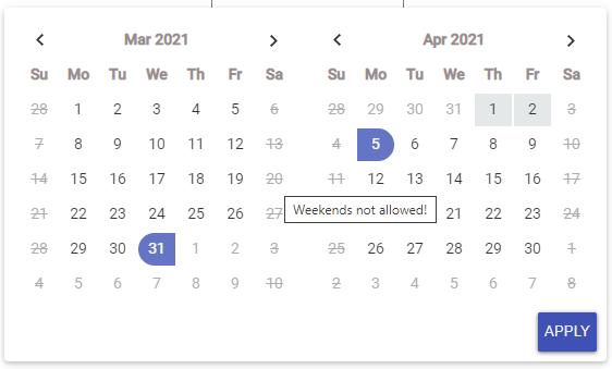
<strong>isCustomDate</strong> : Used to custom style any date in calender using CSS styles.
<strong>isInvalidDate</strong> : Check if to enable or disable a particular date like disable Weekends or a date of a month.
<strong>isTooltipDate</strong> : Parse each date to show a custom tooltip text.
For example:
<input type="text"
    ngxDaterangepickerMd
    [(ngModel)]="selected"
    [isInvalidDate]="isInvalidDate"
    [isTooltipDate]="isTooltipDate" />
Update methods in component class
// app.component.ts
import { Component } from '@angular/core';
import * as moment from 'moment';
import { Moment } from 'moment';

@Component({
  selector: 'app-root',
  templateUrl: './app.component.html',
  styleUrls: ['./app.component.scss']
})
export class AppComponent {
  title = 'angular-ngx-daterangepicker-material-app';

  selected: { startDate: Moment, endDate: Moment };

  invalidDates: moment.Moment[] = [];

  tooltips = [
    { date: moment(), text: 'Today is just unselectable' },
    { date: moment().add(2, 'days'), text: 'Yeeeees!!!' }
  ];

  constructor(
  ) { }

  isInvalidDate = (m: moment.Moment) => {
    // Disbale Sundays and Saturdays
    return m.weekday() === 0 || m.weekday() === 6;
  }

  isTooltipDate = (m: moment.Moment) => {
    const tooltip = m.weekday() === 0 || m.weekday() === 6;
    if (tooltip) {
      return 'Weekends not allowed!';
    } else {
      return false;
    }
  }

}
Set Maximum and Minimum Date Validations
The minDate and maxDate properties can be used to add Min and Max dated allowed in the datepicker for selection.
Locale or Text configuration
The [locale] property can be used to pass an object with various configuration including the textual changes as shown below:
{
    format: 'MM/DD/YYYY', // could be 'YYYY-MM-DDTHH:mm:ss.SSSSZ'
    displayFormat: 'MM/DD/YYYY', // default is format value
    direction: 'ltr', // could be rtl
    weekLabel: 'W',
    separator: ' To ', // default is ' - '
    cancelLabel: 'Cancel', // detault is 'Cancel'
    applyLabel: 'Okay', // detault is 'Apply'
    clearLabel: 'Clear', // detault is 'Clear'
    customRangeLabel: 'Custom range',
    daysOfWeek: moment.weekdaysMin(),
    monthNames: moment.monthsShort(),
    firstDay: 1 // first day is monday
}
As you can see the 'format' property can be used to use a custom date/time format.
Methods and Event Handlers Available
Following Methods/ Events are available to catch user actions:
(rangeClicked) : Fired when clicked on range, and send an object with range label and dates value, eg: {label: ‘This Month’, dates: [Moment, Moment]}
(datesUpdated) : Fires when the date model is updated, like applying (if you have activated the apply button), or when selecting a range or date without the apply button, and sends an object containing start and end dates, eg: {startDate: Moment, endDate: Moment}
(choosedDate) : Triggered when date range is selected and applied on Inline calendar.
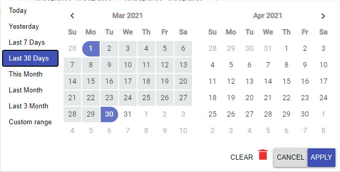
Show Default Range like Today, Yesterday, Last Month
The most awesome feature is showing the default ranges to user to select from. For this we need to add the [ranges] property as shown below:
<input type="text" ngxDaterangepickerMd [(ngModel)]="selected" [autoApply]="false" [showCustomRangeLabel]="true"
    [alwaysShowCalendars]="true" [ranges]="ranges" [linkedCalendars]="true" [showClearButton]="true"
    [keepCalendarOpeningWithRange]="true" />
Few properties like [keepCalendarOpeningWithRange] & [alwaysShowCalendars] make it to remain open even after user makes interactios.
Also add the ranges object as shown below in the component to handle logic for each:
ranges: any = {
    Today: [moment(), moment()],
    Yesterday: [moment().subtract(1, 'days'), moment().subtract(1, 'days')],
    'Last 7 Days': [moment().subtract(6, 'days'), moment()],
    'Last 30 Days': [moment().subtract(29, 'days'), moment()],
    'This Month': [moment().startOf('month'), moment().endOf('month')],
    'Last Month': [
      moment()
        .subtract(1, 'month')
        .startOf('month'),
      moment()
        .subtract(1, 'month')
        .endOf('month')
    ],
    'Last 3 Month': [
      moment()
        .subtract(3, 'month')
        .startOf('month'),
      moment()
        .subtract(1, 'month')
        .endOf('month')
    ]
  };
Conclusion
So here we discussed an awesome date-picker and time-picker package module which enables the Range selection feature with cool configurations. In similar manner we can also display time as well in the date pickers. you can check more details on this official documentations.
Do share your feedback and comments…Thanks…