In this Angular Material tutorial, we’ll learn how to implement the Bottom Sheet navigation menu with different examples and configurations to set position, pass dynamic data to show customized buttons using Material UI in the Angular 12 application.
The bottom Sheet slide-up menu is a very useful UI element that can help us in providing additional action space for a user. The bottom Action Sheet appears on the screen as an overlay layout over and above the existing content of the page. This not only makes a user focus on Actions but also helps in saving the page space and adds a beautiful elite experience.
This UI component is inspired by iOS, where a user can select from available action using an Action Sheet menu item.
We’re going to discuss, how to implement the Bottom Sheet UI component using the Material UI library in the Angular 11 project. Additionally, we’ll explore:
- How to use template and component option to add it on a page/ view.
- Pass data object to create dynamic menu items in Action Sheet.
- Check Input and Output methods available with examples.
let’s get started!
How to Add Material Bottom Sheet in Angular App?
Following are the quick steps, we will follow to implement the bottom action sheet menu.
Create a New Angular Application
Run the following ng command to create a new Angular project
$ ng new angular-material-bottom-sheet-app
# ? Would you like to add Angular routing? Yes
# ? Which stylesheet format would you like to use? SCSS
Enter the project directory
$ cd angular-material-bottom-sheet-appRun the application
$ ng serve --open
Install Material Package
After creating the Angular project, install the Material UI library by hitting the following ng command
$ ng add @angular/material
? Choose a prebuilt theme name, or "custom" for a custom theme: Indigo/Pink
? Set up global Angular Material typography styles? No
? Set up browser animations for Angular Material? Yes
Update App Module
To use the Bottom Sheet UI component in the Angular project, we need to import the required API modules.
Open the app.module.ts file then import the MatBottomSheetModule then add in the imports array:
// app.module.ts
import { NgModule } from '@angular/core';
import { BrowserModule } from '@angular/platform-browser';

import { AppRoutingModule } from './app-routing.module';
import { AppComponent } from './app.component';
import { BrowserAnimationsModule } from '@angular/platform-browser/animations';

import { MatBottomSheetModule } from '@angular/material/bottom-sheet';

@NgModule({
  declarations: [
    AppComponent
  ],
  imports: [
    BrowserModule,
    AppRoutingModule,
    BrowserAnimationsModule,

    MatBottomSheetModule
  ],
  providers: [],
  bootstrap: [AppComponent]
})
export class AppModule { }
Adding Bottom-Sheet in Angular Application
After importing the MatBottomSheetModule, the Bottom-Sheet can be easily added to the application by adopting any of the below options:
Add Bottom Sheet as Template inside existing Component
We can simply add a ng-template inside any existing component on which we are planning to show the Action/ Bottom Sheet menu to popup. This method of implementation is quick and easy to implement.
Step 1) Add ng-template inside HTML
Place following template HTML on bottom of app.component.html (for example)
<button (click)="openTemplateSheetMenu()">Open Template Bottom Sheet</button>

  <ng-template let-bottomSheetRef="bottomSheetRef" #templateBottomSheet>
    <ul>
      <li>Link 1</li>
      <li>Link 2</li>
      <li>Link 3</li>
      <li><button (click)="closeTemplateSheetMenu()">Dismiss Action Sheet</button></li>
    </ul>
  </ng-template>
There is a button to trigger the click event and execute open() method.
Step 2) Get Bottom Sheet Reference inside Component Class
As we have used template reference variable #templateBottomSheet, we can easily get its reference inside the Component class by using the TemplateRef class.
@ViewChild('templateBottomSheet') TemplateBottomSheet: TemplateRef<any>;
Also, import and add in constructor dependencies the MatBottomSheet class to expose all available methods, from we’ll use open() and dismiss() methods.
// app.component.ts
import { Component, TemplateRef, ViewChild } from '@angular/core';
import { MatBottomSheet } from '@angular/material/bottom-sheet';

@Component({
  selector: 'app-root',
  templateUrl: './app.component.html',
  styleUrls: ['./app.component.scss']
})
export class AppComponent {
  title = 'angular-material-bottom-sheet-app';

  @ViewChild('templateBottomSheet') TemplateBottomSheet: TemplateRef<any>;

  constructor(
    private bottomSheet: MatBottomSheet
  ) { }

  openTemplateSheetMenu() {
    this.bottomSheet.open(this.TemplateBottomSheet);
  }

  closeTemplateSheetMenu() {
    this.bottomSheet.dismiss();
  }

}
For the sake of simplify the example, we have not added any other Material UI component. But as now you have Bottom Sheet working you can easily modify its UI to place buttons, Nav or any action controls.

NOTE: But if we need the same Action sheet on multiple components/ view, this approach can be repetitive and again DRY (Don’t Repeat Yourself) practices.
Create a Component to be used as Bottom Sheet
Above, we implemented the quick way of adding a Bottom Action Sheet using an ng-template inside the component. Now we’ll learn how to show the Bottom Sheet from another separate component.
The major advantage of using this approach is keeping the code DRY. We can easily use the same Bottom Sheet component at multiple places in our application.
Step 1) Create the Bottom Sheet component
Execute following ng command to create a new Bottom Sheet component.
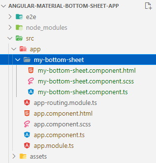
$ ng generate component my-bottom-sheetThis will create a new component as shown in below image and also update the App Module’s declarations array.
<button (click)="openComponentSheetMenu()">Open Component Bottom Sheet</button>
Step 3) Update Component Class
In component class, we’ll define the openComponentSheetMenu() method and simply call the open() method with MyBottomSheetComponent as shown below:
// app.component.ts
import { Component} from '@angular/core';
import { MatBottomSheet } from '@angular/material/bottom-sheet';
import { MyBottomSheetComponent } from './my-bottom-sheet/my-bottom-sheet.component';

@Component({
  selector: 'app-root',
  templateUrl: './app.component.html',
  styleUrls: ['./app.component.scss']
})
export class AppComponent {
  title = 'angular-material-bottom-sheet-app';

  constructor(
    private bottomSheet: MatBottomSheet
  ) { }

  openComponentSheetMenu() {
    this.bottomSheet.open(MyBottomSheetComponent);
  }

}
Step 4) Add Dismiss/ Close Button inside the Bottom Sheet Component
If you notice closely, now we need to handle the Dismiss/ Close event from inside the MyBottomSheetComponent.
Update the my-bottom-sheet.component.html file template
<div>
    <ul>
        <li>My Bottom Sheet Component</li>
        <li>Link 2</li>
        <li>Link 3</li>
        <li><button (click)="closeComponentSheetMenu()">Dismiss Action Sheet</button></li>
    </ul>
</div>
Then update the my-bottom-sheet.component.ts file class with closeComponentSheetMenu() method
// my-bottom-sheet.component.ts
import { Component, OnInit } from '@angular/core';
import { MatBottomSheet } from '@angular/material/bottom-sheet';

@Component({
  selector: 'app-my-bottom-sheet',
  templateUrl: './my-bottom-sheet.component.html',
  styleUrls: ['./my-bottom-sheet.component.scss']
})
export class MyBottomSheetComponent implements OnInit {

  constructor(
    private bottomSheet: MatBottomSheet
  ) { }

  ngOnInit(): void {
  }

  closeComponentSheetMenu() {
    this.bottomSheet.dismiss();
  }

}
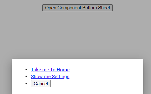
How to Sharing/Pass Date inside the Angular Material Bottom Action Sheet Component?
Next, we’ll learn how to dynamically pass data inside the Bottom Sheet component so that it can be used to create dynamic Action Buttons.
The open() method allows us to configure the Action/ Bottom Sheet in many ways. It also provides the data property to pass in JSON object as shown below:
...

  openComponentSheetMenu() {
    this.bottomSheet.open(MyBottomSheetComponent, {
      data: [
        {
          name: 'Take me To Home',
          link: '/home'
        },
        {
          name: 'Show me Settings',
          link: '/settings'
        },
        {
          name: 'Cancel',
          link: ''
        }
      ]
    });
  }

...
Inside the my-bottom-sheet.component.ts file, inject the MAT_BOTTOM_SHEET_DATA to fetch data passed as shown below:
// my-bottom-sheet.component.ts
import { Component, Inject, OnInit } from '@angular/core';
import { MatBottomSheet, MAT_BOTTOM_SHEET_DATA } from '@angular/material/bottom-sheet';

@Component({
  selector: 'app-my-bottom-sheet',
  templateUrl: './my-bottom-sheet.component.html',
  styleUrls: ['./my-bottom-sheet.component.scss']
})
export class MyBottomSheetComponent implements OnInit {

  actions: any;

  constructor(
    private bottomSheet: MatBottomSheet,
    @Inject(MAT_BOTTOM_SHEET_DATA) public data: {}
  ) {
    this.actions = data;
  }

  ngOnInit(): void {
  }

  closeComponentSheetMenu() {
    this.bottomSheet.dismiss();
  }

}
That’s it, now you can modify the my-bottom-sheet.component.html template to show dynamic data
<div>
    <ul>
        <li *ngFor="let action of actions">

            <ng-container *ngIf="action.link; else elseTemplate">
                <a [routerLink]="[action.link]">{{action.name}}</a>
            </ng-container>
            <ng-template #elseTemplate>
                <button (click)="closeComponentSheetMenu()">{{action.name}}</button>
            </ng-template>

        </li>
    </ul>
</div>
Methods Available
Following are useful methods available to be used inside the application:
<strong>afterDismissed()</strong> : Gets an observable that is notified when the bottom sheet is finished closing
<strong>afterOpened()</strong> : Gets an observable that is notified when the bottom sheet has opened and appeared.
<strong>backdropClick()</strong> : Gets an observable that emits when the overlay’s backdrop has been clicked.
<strong>dismiss()</strong> : Dismisses the bottom sheet.
<strong>keydownEvents()</strong> : Gets an observable that emits when key-down events are targeted on the overlay.
Configuration Properties
autoFocus : Whether the bottom sheet should focus the first focusable element on open.
backdropClass : Custom class for the backdrop.
closeOnNavigation : Whether the bottom sheet should close when the user goes backwards/forwards in history.
data : Data being injected into the child component.
direction : Text layout direction for the bottom sheet, 'ltr' | 'rtl'
disableClose : Whether the user can use escape or clicking outside to close the bottom sheet.
hasBackdrop : Whether the bottom sheet has a backdrop.
Source Code
Find source code of this application on GitHub in this repository.
Conclusion
In the above tutorial, we discussed how to implement Bottom Action Sliding Sheet in the Angular project. We used the material library. We can easily add it to our existing application using a template or component approach. But it is always preferred to create a separate Component so that maintainability and enhancement remain minimal.
Do share your feedback and comment…
Stay safe!