In this article, you will learn how to add the Material Card components to the Angular application. You will learn how to show Avatar, Images, Grid List and Item List in n Material Card with easy examples.
Angular Material is a component library, exclusively built for providing fully compatible UI components for Angular applications. This is developed and designed by the Angular team by keeping the material concepts in view. The UI components provided by Material are compatible with Web and Mobile applications.
The material card is added by using the mat-card component provided by MatCardModule of the material library. We will create an angular app and install the material library and discuss various examples of material card styles.
More Details on <mat-card> Components
The <mat-card> component acts as a wrapper to create basic material styles cards. Moreover, a card comprises multiple elements like text, images, lists, grids etc.
Have look at the following details displaying various sub-component directives available to be used inside the <mat-card>:
<mat-card-title>: Title of the respective card<mat-card-subtitle>: The subtitle of the respective card<mat-card-content>: All the data and information which is the body of the card needs to be written in this section.<mat-card-actions>: This tag is used to mention all the events like submit, cancel and etc
to be written in the card.<mat-card-header>: It is used to mention all the details on the header of the card like title, subtitle etc.mat-card-image: Directive used with <img> to show images.mat-card-avatar: Used to display avatar images in round circles.
Let’s go ahead and start implementation…
How to Add Material Card in Angular Application?
Follow these quick steps to add <mat-card> component:
- Step 1 – Create Angular App
- Step 2 – Install Material Library
- Step 3 – Update App Module
- Step 4 – Update Component HTML Template
- Step 5 – Run Application
- Step 6 – Material Card Examples
Step 1 – Create Angular App
To begin with, let’s quickly create a new angular application. if you already having one, you skip this step.
$ ng new angular-material-cards-appThen, move into the application directory:
$ cd angular-material-cards-appStep 2 – Install Material Library
After creating the angular application, install the material UI library into the application project. Keeping the terminal at application root, execute the following ng command to add material library.
$ ng add @angular/materialDuring installation, you will be asked about material configuration. you can hit enter to select defaults or change the selections.
? Choose a prebuilt theme name, or "custom" for a custom theme: Indigo/Pink
? Set up global Angular Material typography styles? No
? Set up browser animations for Angular Material? Yes
Step 3 – Update App Module
After the material UI is installed, head towards the app.module.ts file to import the required modules. You need to import the MatCardModuleand MatButtonModule into the imports array as shown below:
import { NgModule } from '@angular/core';
import { BrowserModule } from '@angular/platform-browser';
import { AppComponent } from './app.component';

import { BrowserAnimationsModule } from '@angular/platform-browser/animations';

import {MatCardModule} from '@angular/material/card';
import {MatButtonModule} from '@angular/material/button';

@NgModule({
  declarations: [
    AppComponent
  ],
  imports: [
    BrowserModule,
    BrowserAnimationsModule,
    MatCardModule,
    MatButtonModule
  ],
  providers: [],
  bootstrap: [AppComponent]
})
export class AppModule { }
Step 4 – Update Component HTML Template
Now, update the HTML template to include various Material Card components and directioves. We will add Heading Content, Footer with Avatar image and content image.
Open the app.component.ts file and update it with the following HTML template:
<div class="card-wrapper">

  <mat-card class="example-card">
    <mat-card-header>
      <img
        src="https://www.freakyjolly.com/wp-content/uploads/2021/07/cropped-cropped-fj-logo-192-removebg-preview-e1625997712615-1.png"
        mat-card-avatar />
      <mat-card-title>FreakyJolly.com</mat-card-title>
      <mat-card-subtitle>
        Learn Web Development with Easy Tutorials
      </mat-card-subtitle>
    </mat-card-header>
    <img mat-card-image style="width: 150px;" src="https://angular.io/assets/images/logos/angularjs/AngularJS-Shield.svg" alt="Angular Logo">
    <mat-card-content>
      <p>
        Lorem ipsum dolor sit amet, consectetur adipiscing elit, sed do eiusmod tempor incididunt ut labore et dolore
        magna aliqua. Ut enim ad minim veniam, quis nostrud exercitation ullamco laboris nisi ut aliquip ex ea commodo
        consequat.
      </p>
    </mat-card-content>

    <mat-card-actions>
      <button mat-raised-button color="accent">LIKE</button>
      <button mat-raised-button color="primary">SHARE</button>
    </mat-card-actions>
  </mat-card>

</div>
Step 5 – Run Application
Now, execute the following ng command to serve the application in the browser after starting the development server.
$ ng serve –open
It will open the application at following URL:
http://localhost:4200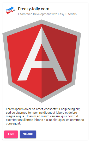
Step 6 – Material Card Examples
Let’s have a look at some other material card examples:
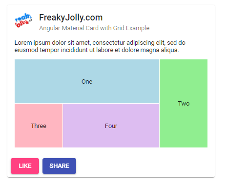
Angular Material Card with Grid Example
In this section, we will discuss the angular material card grid example. To show a Material Grid inside the card component, we need to import the MatGridListModule into the app.module.ts file.
....
import {MatGridListModule} from '@angular/material/grid-list';

@NgModule({
  declarations: [
    AppComponent
  ],
  imports: [
    ....
    MatGridListModule
  ],
  providers: [],
  bootstrap: [AppComponent]
})
After that update the app.component.html file with the following template.
<div class="card-wrapper">

  <mat-card class="example-card">
    <mat-card-header>
      <img
        src="https://www.freakyjolly.com/wp-content/uploads/2021/07/cropped-cropped-fj-logo-192-removebg-preview-e1625997712615-1.png"
        mat-card-avatar />
      <mat-card-title>FreakyJolly.com</mat-card-title>
      <mat-card-subtitle>
        Angular Material Card with Grid Example
      </mat-card-subtitle>
    </mat-card-header>
    <mat-card-content>
      <p>
        Lorem ipsum dolor sit amet, consectetur adipiscing elit, sed do eiusmod tempor incididunt ut labore et dolore
        magna aliqua.
      </p>

      <mat-grid-list cols="4" rowHeight="100px">
        <mat-grid-tile
            *ngFor="let tile of tiles"
            [colspan]="tile.cols"
            [rowspan]="tile.rows"
            [style.background]="tile.color">
          {{tile.text}}
        </mat-grid-tile>
      </mat-grid-list>
    </mat-card-content>

    <mat-card-actions>
      <button mat-raised-button color="accent">LIKE</button>
      <button mat-raised-button color="primary">SHARE</button>
    </mat-card-actions>
  </mat-card>

</div>
Also, update the app.component.ts file to add the tiles object with its interface:
import { Component } from '@angular/core';

export interface Tile {
  color: string;
  cols: number;
  rows: number;
  text: string;
}

@Component({
  selector: 'app-root',
  templateUrl: './app.component.html',
  styleUrls: ['./app.component.scss']
})
export class AppComponent {
  tiles: Tile[] = [
    {text: 'One', cols: 3, rows: 1, color: 'lightblue'},
    {text: 'Two', cols: 1, rows: 2, color: 'lightgreen'},
    {text: 'Three', cols: 1, rows: 1, color: 'lightpink'},
    {text: 'Four', cols: 2, rows: 1, color: '#DDBDF1'},
  ];
  constructor(){}
}
Now, the application will display the following Angular Card with Grid List:
Angular Material Card List Example
In this step, we will demonstrate the angular material card with a list example. Import the MatListModule into the app.module.ts file as shown below:
....
import {MatListModule} from '@angular/material/list';

@NgModule({
  declarations: [
    AppComponent
  ],
  imports: [
    ....
    MatListModule
  ],
  providers: [],
  bootstrap: [AppComponent]
})
export class AppModule { }
Next, update the app.component.html file with mat-list as shown below:
<div class="card-wrapper">

  <mat-card class="example-card">
    <mat-card-header>
      <img
        src="https://www.freakyjolly.com/wp-content/uploads/2021/07/cropped-cropped-fj-logo-192-removebg-preview-e1625997712615-1.png"
        mat-card-avatar />
      <mat-card-title>FreakyJolly.com</mat-card-title>
      <mat-card-subtitle>
        Angular Material Card with List Example
      </mat-card-subtitle>
    </mat-card-header>
    <mat-card-content>
      <p>
        Lorem ipsum dolor sit amet, consectetur adipiscing elit, sed do eiusmod tempor incididunt ut labore et dolore
        magna aliqua.
      </p>

      <mat-list role="list">
        <mat-list-item role="listitem">Angular 12 Tutorials</mat-list-item>
        <mat-list-item role="listitem">React 17 Tutorials</mat-list-item>
        <mat-list-item role="listitem">Ionic 5 Tutorials</mat-list-item>
      </mat-list>

    </mat-card-content>

    <mat-card-actions>
      <button mat-raised-button color="accent">LIKE</button>
      <button mat-raised-button color="primary">SHARE</button>
    </mat-card-actions>
  </mat-card>

</div>
It will look like this:
Conclusion
We are completed our tutorial on creating a content-rich material card component. We added images and avatar components as well which are ideally used in a card component. The various sub-components to show content, subheading, footer section bar were also implemented and used in our example. In one of our steps, we discussed how to easily customise the default UI styling with customised CSS code.