Angular Material Autocomplete is a powerful feature to enhance the user experience by showing real-time suggestions as a user starts typing into an input field. Autocomplete is useful when dealing with enormous amounts of data.
The Options shown may come from a static predefined source or a database. Usually, the Autocomplete component is used when there are huge numbers of options from which a user needs to search, so they are served from connected databases via HTTP Calls.
Angular Material Autocomplete with Server Side API response we are going to implement in this tutorial. This Material Auto Suggest, we will fetch remote API responses using HTTP Async operation. Moreover, on the client side, we will optimize the number of HTTP calls using the RxJS debounceTime and other functions.
The Angular Autocomplete using Material will have the following features in our working application:
1. Angular Material Autocomplete: Material Autocomplete or Auto suggestion allows users to type a term and fetch related results in the dynamic dropdown using HTTP calls.
2. OMDb API Integration: We will deploy the OMDb API to fetch movie data.
3. Debounce Time: We are adding a debounce time to the search input to improve performance. This means the API call will only be made after a user stopped typing for a specified amount of time. The debounceTime is provided by RxJS which helps in reducing the number of unnecessary API calls.
4. Minimum Search Term Length: There will be an optional minimum character limit, only after that the API call will be triggered. This filter is useful when results are huge in remote and min characters give more context to search from.
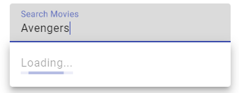
5. Loading Indicator: We added Material progress bar as a loading indicator to show when the search results are loading.
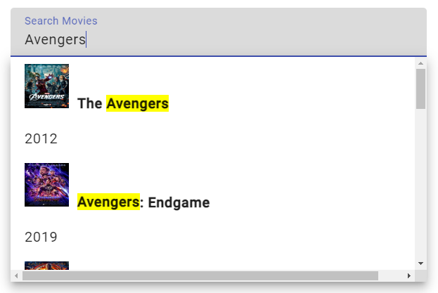
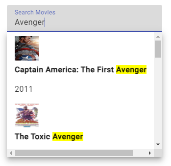
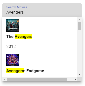
6. Highlight Matching Characters: To improve the user experience we will deploy the search matching highlight pipe which will match the search term and highlight the team with yellow background in auto suggestions.
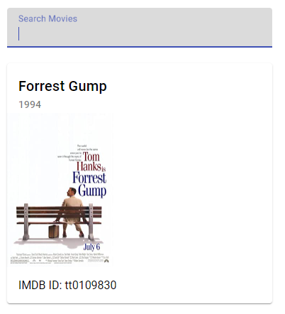
7. Display Selected Movie: On selecting an autosuggestion result, the selected item will be displayed as a Material card to show details.
8. Error Handling: By adding error handling to the API calls we ensure that the site will not break and improve user experience.
The Autocomplete feature we are going to develop will have most of the required features that an applicatication should have to improve user experience and usability and optimize server load at the same time. The use of RxJS debounceTime to control the HTTP API calls and text highlight in options makes a delay combo to make it more proficient.
How do Add Server-Side Material Autocomplete in Angular?
Go through these steps to create an Autocomplete suggestion box to fetch Server Side remote results via HTTP API calls:
Step 1 – Creating a New Angular Application
Step 2 – Install Material & Update App Module
Step 3 – Add Autocomplete with Loader and Card
Step 4 – Update Class with DebounceTime & FormControl
Step 5 – Create Movie Service
Step 6 – Create Highlight Text Pipe
Step 7 – Run Server Side Autocomplete
Step 1 – Creating a New Angular Application
First, we will create a new Angular application. Open your terminal and run the following command:
ng new autocomplete-app
After the Angular project is created, navigate inside the application directory by executing below command:
cd autocomplete-app
Step 2 – Install Material & Update App Module
Next, install the Angular Material library in our application. For that simply execute the following command and choose the default options asked by hitting enter for each:
ng add @angular/material
After installing the Material library, we will head towards the App Module to import the required modules that we will be using in our Autocomplete implementation.
Open the app.module.ts file and update it with the following:
import { BrowserModule } from '@angular/platform-browser';
import { NgModule } from '@angular/core';
import { ReactiveFormsModule } from '@angular/forms'; // For reactive forms
import { HttpClientModule } from '@angular/common/http'; // For making HTTP requests
import { BrowserAnimationsModule } from '@angular/platform-browser/animations'; // For Material animations

// Material modules
import { MatAutocompleteModule } from '@angular/material/autocomplete'; // For autocomplete
import { MatFormFieldModule } from '@angular/material/form-field'; // For form fields
import { MatInputModule } from '@angular/material/input'; // For input fields
import { MatProgressBarModule } from '@angular/material/progress-bar'; // For progress bar
import { MatCardModule } from '@angular/material/card'; // For card layout

import { AppComponent } from './app.component';
import { MovieService } from './movie.service'; // Movie service
import { HighlightPipe } from './highlight.pipe'; // Custom pipe for highlighting

@NgModule({
  declarations: [
    AppComponent,
    HighlightPipe, // Declare the custom pipe
  ],
  imports: [
    BrowserModule,
    ReactiveFormsModule,
    HttpClientModule,
    BrowserAnimationsModule,
    MatAutocompleteModule,
    MatFormFieldModule,
    MatInputModule,
    MatProgressBarModule,
    MatCardModule,
  ],
  providers: [MovieService], // Provide the movie service
  bootstrap: [AppComponent],
})
export class AppModule {}
We have included the HttpClientModule for making HTTP calls to a remote server. The ReactiveFormsModule will allow us to use Reactive Forms that we will use to control Input field behaviour.
Other than these we have imported various require Material modules as commented. Other than these we will be creating the Movie Service and Highlight Pipe in the upcoming steps.
Step 3 – Add Autocomplete with Loader and Card
Thereafter we will add the required HTML components into the App Component to create the Autocomplete inside Mat Form Field. There will be a Mat Progress bar as well, that will show the loading bar when results are loading.
Also, we will have a Mat Card to display the values of the selected items from Autocomplete Suggestions. Open the app.component.html file and update it with the following:
<div class="wrapper">
  <h1>Angular Autocomplete Server Side Search - FreakyJolly</h1>
  <mat-form-field class="full-width">
    <mat-label>Search Movies</mat-label>
    <input type="text" matInput [formControl]="myControl" [matAutocomplete]="auto">
    <mat-autocomplete #auto="matAutocomplete" [displayWith]="displayFn"
      (optionSelected)="selectedMovie = $event.option.value">
      <mat-option *ngIf="loading" disabled>
        Loading...
        <mat-progress-bar mode="query"></mat-progress-bar>
      </mat-option>
      <ng-container *ngIf="!loading">
        <mat-option *ngFor="let option of options" [value]="option" class="full-width">
          <img [src]="option.Poster" alt="Movie poster" class="movie-poster">
          <div>
            <strong [innerHTML]="option.Title | highlight:searchText"></strong>
            <p>{{option.Year}}</p>
          </div>
        </mat-option>
      </ng-container>
    </mat-autocomplete>
  </mat-form-field>

  <mat-card *ngIf="selectedMovie" class="movie-card">
    <mat-card-header>
      <mat-card-title>{{selectedMovie.Title}}</mat-card-title>
      <mat-card-subtitle>{{selectedMovie.Year}}</mat-card-subtitle>
    </mat-card-header>
    <img mat-card-image [src]="selectedMovie.Poster" style="width: 150px;" alt="Movie poster">
    <mat-card-content>
      <p>IMDB ID: {{selectedMovie.imdbID}}</p>
    </mat-card-content>
  </mat-card>
</div>
Step 4 – Update Class with DebounceTime & FormControl
To complete our Compoennt changes, we will now make changes to the App Component class file. Open the app.component.ts file and update it with the following code:
import { Component, OnInit } from '@angular/core';
import { FormControl } from '@angular/forms';
import { debounceTime, switchMap, tap, filter } from 'rxjs/operators';
import { MovieService } from './movie.service';

@Component({
  selector: 'app-root',
  templateUrl: './app.component.html',
  styleUrls: ['./app.component.css'],
})
export class AppComponent implements OnInit {
  myControl = new FormControl();
  options: any[] = [];
  loading = false;
  selectedMovie: any;
  searchText!: string;
  minSearchLength = 3; // Minimum characters required

  constructor(private movieService: MovieService) {}

  ngOnInit() {
    this.myControl.valueChanges
      .pipe(
        debounceTime(800), // Wait for 800ms after each keystroke before considering the term
        filter((value) => typeof value === 'string'), // Only proceed if the value is a string
        tap((value) => {
          this.searchText = value; // Update the search text
          this.loading = value.length >= this.minSearchLength;
        }),
        filter((value) => value.length >= this.minSearchLength), // Only proceed if search term is at least minSearchLength characters long
        switchMap((value) => this.movieService.searchMovies(value)) // Call the search service
      )
      .subscribe((response) => {
        this.options = response.Search; // Set the search results
        this.loading = false; // Set loading to false after getting the results
      });

    this.myControl.valueChanges.subscribe((movie) => {
      if (typeof movie !== 'string') {
        // If the value is not a string, it's a movie object
        this.selectedMovie = movie; // Set the selected movie
        this.myControl.reset(); // Clear the search input
      }
    });
  }

  displayFn(movie: any): string {
    return movie && movie.Title ? movie.Title : ''; // Display the movie title in the input field when a movie is selected
  }
}
We have added the inline comments to make it easy to understand the various code sections we have in our class. The most important part is how we are handling the input field Value Changes to trigger the HTTP API search call in a controlled manner.
We utilized the RxJS functions for various conditions and filter operations. At last, we have the displayFn to control the data we want to show inside the Autocomplete Options.
Step 5 – Create a Movie Service
Now create a new Moview Service named movie.service.ts inside the app folder. And update it with following:
import { HttpClient } from '@angular/common/http';
import { Injectable } from '@angular/core';
import { Observable } from 'rxjs';

@Injectable({
  providedIn: 'root',
})
export class MovieService {
  private API_URL = 'http://www.omdbapi.com/';
  private API_KEY = 'YouApiHere'; // replace with your actual API key

  constructor(private http: HttpClient) {}

  searchMovies(query: string): Observable<any> {
    return this.http.get(`${this.API_URL}?s=${query}&apikey=${this.API_KEY}`);
  }
}
We are only having a single function searchMovies to make an HTTP get call and fetch records from a remote server using the OMDB API.
Step 6 – Create Highlight Text Pipe
We also have added a very useful feature of highlighting the matching text in the search results which a user enters into the input field. This adds value and saves user time to identify the matching term keyword in searched results.
Create a new file highlight.pipe.ts and update with the following:
import { Pipe, PipeTransform } from '@angular/core';
import { DomSanitizer } from '@angular/platform-browser';

@Pipe({
  name: 'highlight',
})
export class HighlightPipe implements PipeTransform {
  constructor(private sanitizer: DomSanitizer) {}

  transform(text: string, search: string): any {
    if (search && text && typeof search === 'string') {
      let pattern = search.replace(
        /[\-\[\]\/\{\}\(\)\*\+\?\.\\\^\$\|]/g,
        '\\$&'
      );
      pattern = pattern
        .split(' ')
        .filter((t) => {
          return t.length > 0;
        })
        .join('|');
      const regex = new RegExp(pattern, 'gi');
      const highlighted = text.replace(
        regex,
        (match) => `<span class="highlight">${match}</span>`
      );
      return this.sanitizer.bypassSecurityTrustHtml(highlighted);
    } else {
      return text;
    }
  }
}
Make sure to add the following CSS style in the styles.css file at application root:
.highlight {
  background-color: yellow;
}
Step 7 – Run Server Side Autocomplete
Now we are ready to run our application and see the application working with Angular Material Autocomplete fetching Remote Server responses to populate the suggestions which can be selected by the user to display the details in the Mat Card.
Execute npm start to run the webserver to run your application at http://localhost:4200/

Summary
Finally, we have completed the implementation of Server Side response fetching Angular Autocomplete using Material UI Components. We implement various features like debounceTime to limit unnecessary server calls, matching term highlight feature, showing customer value in Autocomplete search suggestions etc.
You can extend this component as per your needs, I tried to implement each and every feature which can be possibly added at the time of development. Hope this will be helpful.