In this tutorial, we will demonstrate Angular material table with expand all and collapse all button, where each row can be expanded and collapse separately. We will use the material library in the Angular project to use its MatTableModule API to build the datatable.
Material Datatable with expandable row helps in representing data in a request and view manner. Where each row of the table display few important column details, that can be clicked by the user that allows to expand the row and display more details.
Using the Material Datatable we can easily alter the rows and columns structure where an alternate row can be fused, which will be used to display the expanded view data. We will get to know how to add animation effect to enable expand collapse of rows.
Material Datatables can be implemented in two possible ways in the HTML template: 1) Native HTML table elements including table, tr, td or 2) Using Display Flex with help of alternate Mat directives including mat-table, mat-row, mat-cell . We’ll demonstrate expand-collapse using both ways.
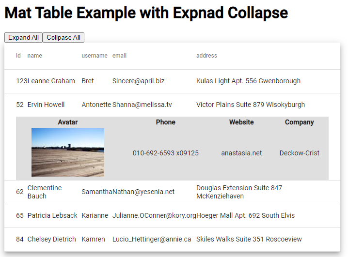
On top of the table, two buttons will be able to expand or collapse all the rows of the table at once. The rows of tables will be having an optional boolean property expanded to know which row is in an expanded state.
How to Add Expand Collapse in Material Datatable Rows?
- Step 1 – Create Angular App
- Step 2 – Install Material Library Package
- Step 3 – Import MatTableModule API
- Step 4 – Creating Material Datatable with Expand Collapse
- Step 5 – Run Angular Application
Step 1 – Create Angular App
Before creating a new Angular app, make sure you have installed the latest version of the angular CLI tool:
npm install -g @angular/cliAfter installing the ng cli, you can execute the following command to create a new angular project:
ng new angular-mat-table-examplemove inside the app folder directory
cd angular-mat-table-exampleopen project in Visual Studio code IDE
code .Step 2 – Install Material Library Package
Afterwards, you need to install the Material library package by simply executing the following command. you will be asked a few configurations question, you can change them or hit enter to choose default:
ng add @angular/material

# ? Choose a prebuilt theme name, or "custom" for a custom theme: Indigo/Pink
# ? Set up global Angular Material typography styles? No
# ? Set up browser animations for Angular Material? Yes
Step 3 – Import Mat Table Module API
On installing the Material package, you will be able to use any component by importing the required API Modules. In our tutorial, we are going to implement the Datatable, so we will import the MatTableModule.
Open the app.module.ts file and update it as shown below:
import { NgModule } from '@angular/core';
import { BrowserModule } from '@angular/platform-browser';

import { AppComponent } from './app.component';
import { BrowserAnimationsModule } from '@angular/platform-browser/animations';
import { MatTableModule } from '@angular/material/table';

@NgModule({
  declarations: [
    AppComponent
  ],
  imports: [
    BrowserModule,
    BrowserAnimationsModule,
    MatTableModule // <-- Added Module
  ],
  providers: [],
  bootstrap: [AppComponent]
})
export class AppModule { }
Step 4 – Creating Material Datatable with Expand Collapse
Now, we will create the Material Datatable with expandable rows. Open the app.component.html file and update it with the following code:
<div class="wrapper">

  <h1>
    Mat Table Example with Expnad Collapse
  </h1>
  <button (click)="manageAllRows(true)">Expand All</button>
  <button (click)="manageAllRows(false)">Collpase All</button>

  <table mat-table [dataSource]="dataSource" multiTemplateDataRows class="mat-elevation-z8">
    <ng-container matColumnDef="{{column}}" *ngFor="let column of columnsToDisplay">
      <th mat-header-cell *matHeaderCellDef> {{column}} </th>
      <td mat-cell *matCellDef="let element"> {{element[column]}} </td>
    </ng-container>

    <!-- Expanded Content Column - The detail row is made up of this one column that spans across all columns -->
    <ng-container matColumnDef="expandedDetail">
      <td mat-cell *matCellDef="let element" [attr.colspan]="columnsToDisplay.length">
        <div class="example-element-detail" [@detailExpand]="element.expanded ? 'expanded' : 'collapsed'">
          <table class="detail-table">
            <tr>
              <th>Avatar</th>
              <th>Phone</th>
              <th>Website</th>
              <th>Company</th>
            </tr>
            <tr>
              <td><img src="https://picsum.photos/id/{{element.id}}/150/100" alt="thumbnail"></td>
              <td>{{element.phone}}</td>
              <td>{{element.website}}</td>
              <td>{{element.company}}</td>
            </tr>
          </table>
        </div>
      </td>
    </ng-container>

    <tr mat-header-row *matHeaderRowDef="columnsToDisplay"></tr>
    <tr mat-row *matRowDef="let element; columns: columnsToDisplay;" class="example-element-row"
      [class.example-expanded-row]="element.expanded" (click)="toggleRow(element)">
    </tr>
    <tr mat-row *matRowDef="let row; columns: ['expandedDetail']" class="example-detail-row"></tr>
  </table>

</div>
On top of the table, we have two buttons to expand or collapse all the table row details. The ng-container with column definition named expandedDetail is used as an alternate table row, which will be toggle based on the expanded boolean value. The animation state is used to animate expand and collapse behaviour.
The expanded table row will show an inner table to display more details when expanded by the user manually or by clicking on the master expand button. You can also add a component in it that will lad dynamic data from either remote service API call.
Also, update the component class with the following code with table data and event handlers to collapse and expand rows. Open the app.component.ts file and update as shown below:
import { animate, state, style, transition, trigger } from '@angular/animations';
import { Component } from '@angular/core';

export interface User {
  id: number;
  name: string;
  username: string;
  email: string;
  address: string;
  phone: string;
  website: string;
  company: string;
  expanded: boolean;
}

const ELEMENT_DATA: User[] = [
  {
    "id": 123,
    "name": "Leanne Graham",
    "username": "Bret",
    "email": "Sincere@april.biz",
    "address": "Kulas Light Apt. 556 Gwenborough",
    "phone": "1-770-736-8031 x56442",
    "website": "hildegard.org",
    "company": "Romaguera-Crona",
    "expanded": false
  },
  {
    "id": 52,
    "name": "Ervin Howell",
    "username": "Antonette",
    "email": "Shanna@melissa.tv",
    "address": "Victor Plains Suite 879 Wisokyburgh",
    "phone": "010-692-6593 x09125",
    "website": "anastasia.net",
    "company": "Deckow-Crist",
    "expanded": false
  },
  {
    "id": 62,
    "name": "Clementine Bauch",
    "username": "Samantha",
    "email": "Nathan@yesenia.net",
    "address": "Douglas Extension Suite 847 McKenziehaven",
    "phone": "1-463-123-4447",
    "website": "ramiro.info",
    "company": "Romaguera-Jacobson",
    "expanded": false
  },
  {
    "id": 65,
    "name": "Patricia Lebsack",
    "username": "Karianne",
    "email": "Julianne.OConner@kory.org",
    "address": "Hoeger Mall Apt. 692 South Elvis",
    "phone": "493-170-9623 x156",
    "website": "kale.biz",
    "company": "Robel-Corkery",
    "expanded": false
  },
  {
    "id": 84,
    "name": "Chelsey Dietrich",
    "username": "Kamren",
    "email": "Lucio_Hettinger@annie.ca",
    "address": "Skiles Walks Suite 351 Roscoeview",
    "phone": "(254)954-1289",
    "website": "demarco.info",
    "company": "Keebler LLC",
    "expanded": false
  }
];


@Component({
  selector: 'app-root',
  templateUrl: './app.component.html',
  styleUrls: ['./app.component.css'],
  animations: [
    trigger('detailExpand', [
      state('collapsed', style({ height: '0px', minHeight: '0' })),
      state('expanded', style({ height: '*' })),
      transition('expanded <=> collapsed', animate('225ms cubic-bezier(0.4, 0.0, 0.2, 1)')),
    ]),
  ],
})
export class AppComponent {
  title = 'angular-mat-table-example';

  dataSource = ELEMENT_DATA;
  columnsToDisplay = ['id', 'name', 'username', 'email', 'address'];

  toggleRow(element: { expanded: boolean; }) {
    // Uncommnet to open only single row at once
    // ELEMENT_DATA.forEach(row => {
    //   row.expanded = false;
    // })
    element.expanded = !element.expanded
  }

  manageAllRows(flag: boolean) {
    ELEMENT_DATA.forEach(row => {
      row.expanded = flag;
    })
  }
}
To make expandable rows more aligned to the functionality and animation, add following CSS style in the app.component.css/scss file:
.example-detail-row {
  height: 0;
}

.example-element-row td {
  border-bottom-width: 0;
}

.example-element-detail {
  overflow: hidden;
  display: flex;
}

.detail-table {
  background: #b7b7b773;
  text-align: center;
}
Step 5 – Run Angular Application
Now we are all set to test the implementation of our Material Datatable with expanding collapse feature. Run the following ng command to deploy the webserver:
ng serve --openit will open the app at the following URL:
http://localhost:4200
Using Mat-table in Datatable
We can easily interchange the Native HTML table tags with <mat> to implement the display: flex based datatable using which we can easily customize the table style. Just place following HTML template and corresponding CSS style to achieve similar expand -collapse animation:
<h1>
    Mat Table Directive Example with Expand Collapse
  </h1>

  <mat-table [dataSource]="dataSource" multiTemplateDataRows class="mat-elevation-z8">
    <ng-container matColumnDef="{{column}}" *ngFor="let column of columnsToDisplay">
      <mat-header-cell *matHeaderCellDef> {{column}} </mat-header-cell>
      <mat-cell *matCellDef="let element"> {{element[column]}} </mat-cell>
    </ng-container>

    <!-- Expanded Content Column - The detail row is made up of this one column that spans across all columns -->
    <ng-container matColumnDef="expandedDetail">
      <mat-cell *matCellDef="let element" [attr.colspan]="columnsToDisplay.length">
        <div class="example-element-detail" [@detailExpand]="element.expanded ? 'expanded' : 'collapsed'">
          <table class="detail-table">
            <tr>
              <th>Avatar</th>
              <th>Phone</th>
              <th>Website</th>
              <th>Company</th>
            </tr>
            <tr>
              <td><img src="https://picsum.photos/id/{{element.id}}/150/100" alt="thumbnail"></td>
              <td>{{element.phone}}</td>
              <td>{{element.website}}</td>
              <td>{{element.company}}</td>
            </tr>
          </table>
        </div>
      </mat-cell>
    </ng-container>

    <mat-header-row *matHeaderRowDef="columnsToDisplay"></mat-header-row>
    <mat-row *matRowDef="let element; columns: columnsToDisplay;" class="example-element-row"
      [class.example-expanded-row]="element.expanded" (click)="toggleRow(element)">
    </mat-row>
    <mat-row *matRowDef="let row; columns: ['expandedDetail']" class="example-detail-row"></mat-row>
  </mat-table>
Also, replace the following CSS to control display flex layout.
.example-detail-row {
  height: 0;
  min-height: auto;
  display: inline-block;
  width: 100%;
}

.example-element-row td {
  border-bottom-width: 0;
}

.example-element-detail {
  overflow: hidden;
  display: flex;
  width: 100%;
}

.detail-table {
  background: #b7b7b773;
  text-align: center;
}
Conclusion
We have completed the implementation of material datatable with expanding collapse feature in which a user can simultaneously open multiple row details at the same time. You can uncomment the code provided to open only one row at once. We have used the table tags to create the datatable, in next post, we will discuss how to create the expand collapse feature using the mat-table tags in maerial.