In this Angular Material tutorial, we’ll discuss how to implement the Select box in the Angular 12 application by using the MatSelectModule. Also, we’ll check how to add validation and customize the options using configuration properties.
The Select component is used to enable a user to select single or multiple options available in the options drop-down. In Angular Material, the select component is created by adding the <mat-select/> or native <select/> components.
The<mat-select/> or <select/> component can be used in a form-field created by adding <mat-form-field/> component.
Let’s quickly start exploring the Material Mat Select component…
How to Add Material Selectbox in Angular App?
Create a New Angular Application
Run the following ng command to create a new Angular project
$ ng new angular-mat-select-app
# ? Would you like to add Angular routing? No
# ? Which stylesheet format would you like to use? SCSS
Enter the project directory
$ cd angular-mat-select-appRun the application
$ ng serve --open
Install Material Package
After creating the Angular project, install the Material UI library by hitting the following ng command
$ ng add @angular/material
? Choose a prebuilt theme name, or "custom" for a custom theme: Indigo/Pink
? Set up global Angular Material typography styles? No
? Set up browser animations for Angular Material? Yes
Update App Module
The material package provides a number of components, but we need to import the API modules for components we’re going to use in the application.
For implementing the mat-select, import the MatSelectModule module. Also, make sure to import FormsModule, MatInputModule & MatFormFieldModule modules as well otherwise you may face this issue saying:
Error: mat-form-field must contain a MatFormFieldControl.
Finally, the app.module.ts file will look like this:
// app.module.ts
import { BrowserModule } from '@angular/platform-browser';
import { NgModule } from '@angular/core';

import { AppComponent } from './app.component';
import { BrowserAnimationsModule } from '@angular/platform-browser/animations';

import { MatSelectModule } from '@angular/material/select';
import { FormsModule } from '@angular/forms';
import { MatFormFieldModule } from '@angular/material/form-field';
import { MatInputModule } from '@angular/material/input';


@NgModule({
  declarations: [
    AppComponent
  ],
  imports: [
    BrowserModule,
    BrowserAnimationsModule,
    FormsModule,
    MatInputModule,
    MatFormFieldModule,
    MatSelectModule
  ],
  providers: [],
  bootstrap: [AppComponent]
})
export class AppModule { }
Adding Material MatSelect
To create a Material select, the <mat-select/> or native <select/> component can be added as shown below:
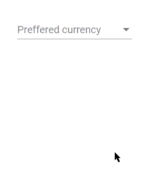
<mat-form-field>
    <mat-label>Preffered currency</mat-label>
    <mat-select [(value)]="selected">

      <mat-option *ngFor="let currency of currencies" [value]="currency.value">
        {{currency.text}}
      </mat-option>

    </mat-select>
</mat-form-field>
<p>
  Selected Value: {{selected}}
</p>
The <mat-option/> component creates a single option in the drop-down for selecting a value.
In the component class, add collection object currencies and selected to have selected value.
// app.component.ts
import { Component } from '@angular/core';

@Component({
  selector: 'app-root',
  templateUrl: './app.component.html',
  styleUrls: ['./app.component.scss']
})
export class AppComponent {
  title = 'angular-mat-select-app';

  selected: string;

  currencies = [
    { value: 'us', text: 'U.S. Dollar $' },
    { value: 'euro', text: 'Euro €' },
    { value: 'yen', text: 'Japanese Yen ¥' },
    { value: 'pound', text: 'Pounds £' },
    { value: 'inr', text: 'Indian Rupee ₹' }
  ];

}
Adding Material Native Select
The native <select/> control can also be used due to performance, accessibility, and usability advantages. To use a native select inside <mat-form-field>, add the matNativeControl attribute to the <select> element.
<mat-form-field>
  <mat-label>Preffered currency</mat-label>

  <select matNativeControl [(ngModel)]="selected">
    <option *ngFor="let currency of currencies" [value]="currency.value">{{currency.text}}</option>
  </select>
</mat-form-field>

<p>
  Selected Value: {{selected}}
</p>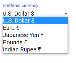
Open/ Close Option Panel on Button Click from Outside
The Select options panel can be controlled by adding a template variable then calling the methods programmatically.
<button (click)="mySelect.open()">Open</button>
<button (click)="mySelect.toggle()">Toggle</button>
<button (click)="mySelect.close()">Close</button>

  <mat-form-field>
    <mat-label>Select Color</mat-label>
    <mat-select #mySelect [(value)]="selected">
      <mat-option value="yellow">Yellow</mat-option>
      <mat-option value="black">Black</mat-option>
      <mat-option value="red">Red</mat-option>
    </mat-select>
  </mat-form-field>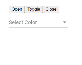
To get an instance of mat-select inside the component class, import the MatSelect class and get mat-select instance using @ViewChild as shown below:
// app.component.ts
import { Component, ViewChild } from '@angular/core';
import { MatSelect } from '@angular/material/select';

@Component({
  selector: 'app-root',
  templateUrl: './app.component.html',
  styleUrls: ['./app.component.scss']
})
export class AppComponent {
  title = 'angular-mat-select-app';

  @ViewChild('mySelect') mySelect: MatSelect;

  selected: string;

  OpenSel() {
    this.mySelect.open()
  }
}
Change Event Handling on Material MatSelect
The (selectionChange) event handler is triggered when a value is changed by methods or user actions.
<mat-select [(value)]="selected" (selectionChange)="OptionChanged()">
    ...
 </mat-select>
Custom CSS Style for Options Panel
The panelClass property can have a custom CSS class to style Panel options.
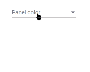
<mat-form-field>
    <mat-label>Panel color</mat-label>

    <mat-select [(value)]="selected" panelClass="my-panel-{{selected}}">
      <mat-option value="yellow">Yellow</mat-option>
      <mat-option value="black">Black</mat-option>
      <mat-option value="red">Red</mat-option>
    </mat-select>

</mat-form-field>
In the styles.scss file paste following CSS
.my-panel-yellow.mat-select-panel {
    background: yellow;
    .mat-option-text {
        color: black;
    }
}

.my-panel-black.mat-select-panel {
    background: black;
    .mat-option-text {
        color: white;
    }
}

.my-panel-red.mat-select-panel {
    background: red;
    .mat-option-text {
        color: white;
    }
}
Get Selected Value from MatSelect or Native Select
The mat-select component supports two-way data binding via [(value)] property as you can see in the first example to show selected value.
But when using the native select, we can simply use the [(ngModel)] like we use for other native controls.
Disable MatSelect/ Select or Option Values
The complete mat-select or native select control can be disabled by setting the [disabled]="true" as shown below:
<mat-select [disabled]="true">
  ....
</mat-select>

<select matNativeControl  [disabled]="true">
  ....
</select>
Each option value can also be disabled by adding the disabled property
Material Select with Checkboxes for Multiple Selection
The multiple property is added to mat-select to enable multiple option value selection at once.
<mat-form-field>
    <mat-label>Preffered currency</mat-label>

    <mat-select [(value)]="selected" multiple>
      <mat-option *ngFor="let currency of currencies" [value]="currency.value">{{currency.text}}</mat-option>
    </mat-select>
 </mat-form-field>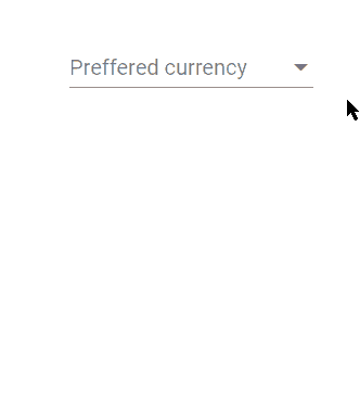
By default, the selected values are shown separated by a comma and three(…) dots after that. We can customize this representation by adding the mat-select-trigger component as shown below:
<mat-form-field>
    <mat-label>Preffered currency</mat-label>

    <mat-select [(value)]="selected" multiple>

      <mat-select-trigger>
        {{selected ? selected[0] : ''}}
        <span *ngIf="selected?.length > 1" class="example-additional-selection">
          (+{{selected.length - 1}} {{selected?.length === 2 ? 'other' : 'others'}})
        </span>
      </mat-select-trigger>

      <mat-option *ngFor="let currency of currencies" [value]="currency.value">{{currency.text}}</mat-option>
    </mat-select>
  </mat-form-field>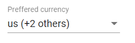
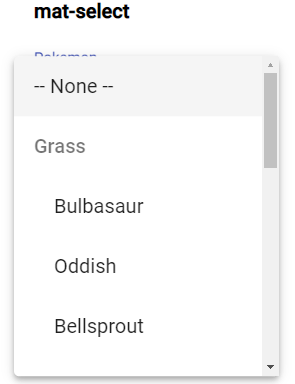
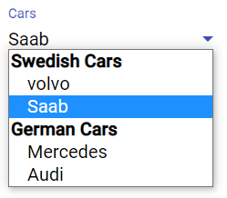
Grouping the Options
The options shown in the select control can have a grouping option by wrapping the mat-option with mat-optgroupin case of <mat-select/> and wrapping option with optgroup in case of native <select/>
<h4>mat-select</h4>
  <mat-form-field>
    <mat-label>Pokemon</mat-label>

    <mat-select>
      <mat-option>-- None --</mat-option>

      <mat-optgroup *ngFor="let group of pokemonGroups" [label]="group.name" [disabled]="group.disabled">
        <mat-option *ngFor="let pokemon of group.pokemon" [value]="pokemon.value">
          {{pokemon.viewValue}}
        </mat-option>
      </mat-optgroup>

    </mat-select>

  </mat-form-field>

  <h4>native html select</h4>
  <mat-form-field>

    <mat-label>Cars</mat-label>
    <select matNativeControl>

      <optgroup label="Swedish Cars">
        <option value="volvo">volvo</option>
        <option value="saab">Saab</option>
      </optgroup>

      <optgroup label="German Cars">
        <option value="mercedes">Mercedes</option>
        <option value="audi">Audi</option>
      </optgroup>

    </select>
  </mat-form-field>
Update class component with pokemonGroupscollection
pokemonGroups = [
    {
      name: 'Grass',
      pokemon: [
        { value: 'bulbasaur-0', viewValue: 'Bulbasaur' },
        { value: 'oddish-1', viewValue: 'Oddish' },
        { value: 'bellsprout-2', viewValue: 'Bellsprout' }
      ]
    },
    {
      name: 'Water',
      pokemon: [
        { value: 'squirtle-3', viewValue: 'Squirtle' },
        { value: 'psyduck-4', viewValue: 'Psyduck' },
        { value: 'horsea-5', viewValue: 'Horsea' }
      ]
    },
    {
      name: 'Fire',
      disabled: true,
      pokemon: [
        { value: 'charmander-6', viewValue: 'Charmander' },
        { value: 'vulpix-7', viewValue: 'Vulpix' },
        { value: 'flareon-8', viewValue: 'Flareon' }
      ]
    },
    {
      name: 'Psychic',
      pokemon: [
        { value: 'mew-9', viewValue: 'Mew' },
        { value: 'mewtwo-10', viewValue: 'Mewtwo' },
      ]
    }
  ];
Showing Dynamic Options in Material MatSelect
Now we’ll see how to fetch collection of data from the server through HTTP call and generate MatSelect options dynamically after component loads.
In the app.module.ts file, add HttpClientModule in the import array. Update the component class to make a GET HTTP call to a users API endpoint.
// app.component.ts
import { Component } from '@angular/core';
import { HttpClient } from '@angular/common/http';

@Component({
  selector: 'app-root',
  templateUrl: './app.component.html',
  styleUrls: ['./app.component.scss']
})
export class AppComponent {
  title = 'angular-mat-select-app';

  constructor(
    private http: HttpClient
  ) { }

  selected: string;
  collection = [];

  ngOnInit() {
    this.getCollection();
  }

  getCollection() {
    this.http
      .get<any>('https://jsonplaceholder.typicode.com/users').subscribe((res: any) => {
        this.collection = res;
      }, error => {
        console.log({ error });
      })
  }

}
Then update the template to show server response using *ngFor Angular directive.
<mat-form-field>
    <mat-label>Select User</mat-label>
    <mat-select [(value)]="selected">

      <mat-option *ngFor="let user of collection" [value]="user.id">
        {{user.name}}, {{user.email}}
      </mat-option>

    </mat-select>

</mat-form-field>
Conclusion
Angular Material select component is loaded with a number of options and configuration properties to customize its behavior. We can also customize the CSS style of the options panel dynamically. The mat-select component can have validation with form-control to display errors using the mat-error component as well.
You can check more details in the official documentation here.